30 IELTS Writing Task 1 (Table) Practice Questions with Sample Answers
In this article, we will look at 30 practice IELTS Writing Task 1 prompts based on tables, with full sample answers. Writing Task 1 asks you to describe a table in at least 150 words, summarising the main features and making comparisons where relevant. Each sample answer is written at a Band 7 level, the most common target for university and immigration applicants.
If you want the format, scoring rules, and strategies explained in depth, read our complete guide to IELTS Writing Task 1 first, then use the questions below to practice.
Question 1
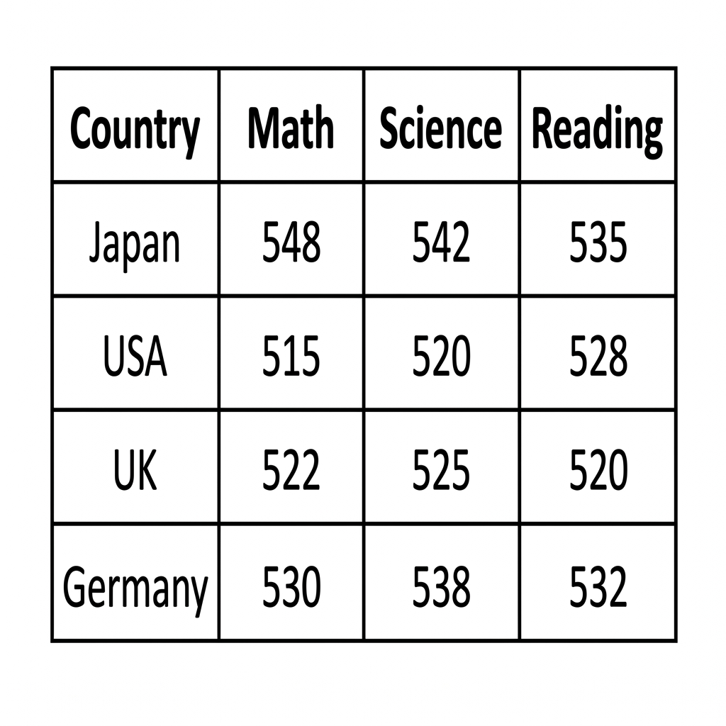
Prompt: The table below shows the average scores in Math, Science, and Reading for 15-year-old students in four different countries in the year 2019.
Example Answer:
The table compares the average test scores in math, science, and reading for 15-year-old students in four countries: Japan, the USA, the UK, and Germany.
Overall, Japan recorded the highest score in all three subjects, with Germany consistently in second place. The USA scored the lowest in math and science, while the differences between the four countries in reading were comparatively small.
Japan led in every category by a clear margin, achieving 548 in math, 542 in science, and 535 in reading. Germany followed in second across the board, with 530 in math, 538 in science, and 532 in reading. The gap between these two leaders and the other two countries was largest in math, where Japan sat 18 points above Germany and 33 points above the USA.
The UK and the USA produced more uneven results. The UK scored 522 in math, 525 in science, and 520 in reading, while the USA's results were 515 in math, 520 in science, and 528 in reading. Notably, the USA, which trailed in math and science, achieved a reading score that put it ahead of the UK.
Question 2
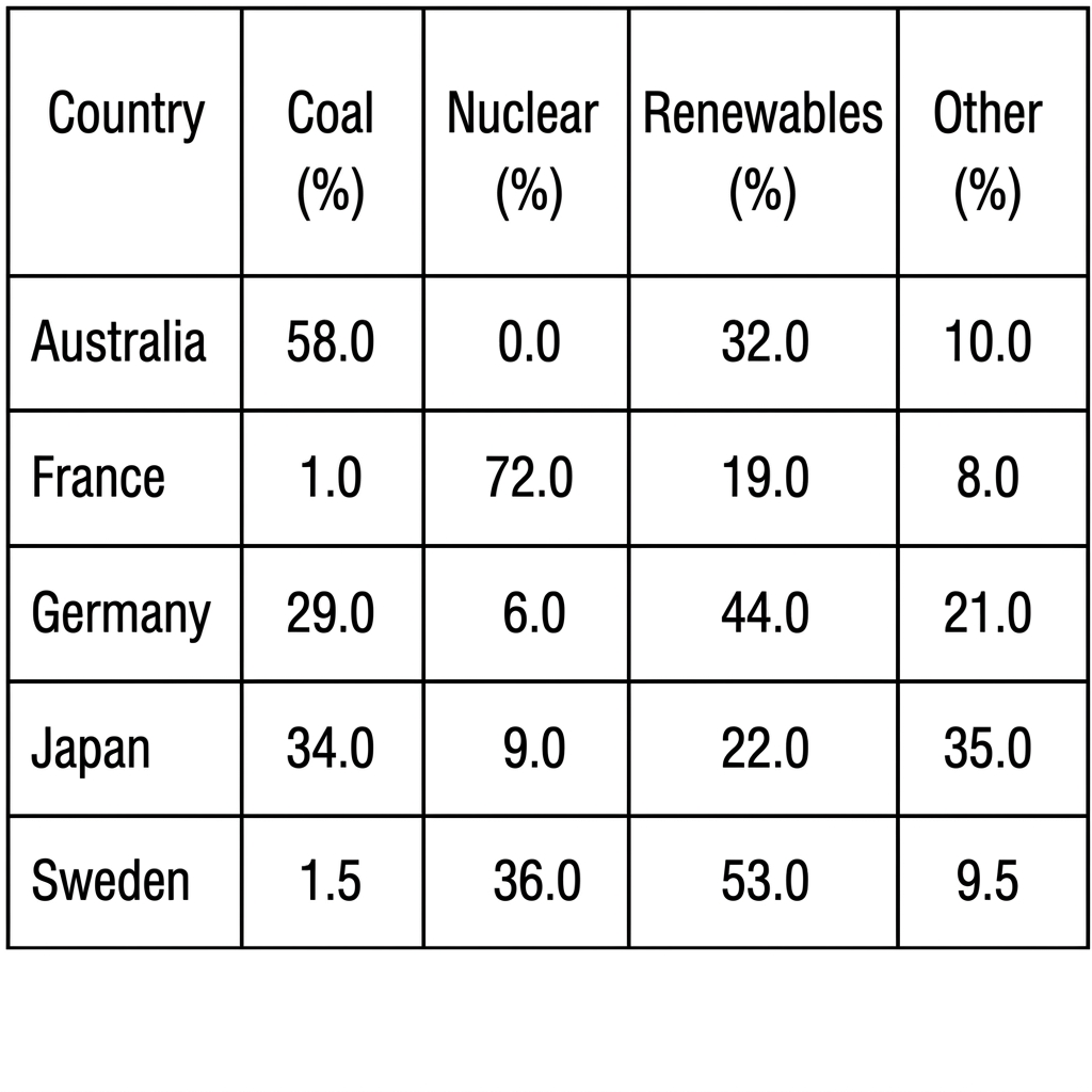
Prompt: The table below shows the percentage of electricity generated from different sources in five countries in 2020.
Example Answer:
The table compares the percentage share of electricity generated from coal, nuclear, renewables, and other sources in five countries: Australia, France, Germany, Japan, and Sweden.
Broadly speaking, the energy mix differs sharply between the five countries. Australia depends mainly on coal, France relies overwhelmingly on nuclear, Sweden draws most of its electricity from renewables, while Germany and Japan show more balanced mixes spread across all four categories.
Australia and France were the most extreme cases. Australia generated 58% of its electricity from coal and 32% from renewables, with no nuclear share at all. France, by contrast, sourced 72% from nuclear, with just 1% from coal, 19% from renewables, and 8% from other sources, the most lopsided distribution in the table.
Germany, Japan, and Sweden showed more diverse mixes. Germany drew 44% from renewables, 29% from coal, and 6% from nuclear, with 21% from other. Japan recorded the most evenly split mix, with 34% coal, 22% renewables, 9% nuclear, and 35% other. Sweden was the most renewables-led, with 53% from renewables and 36% from nuclear.
Question 3
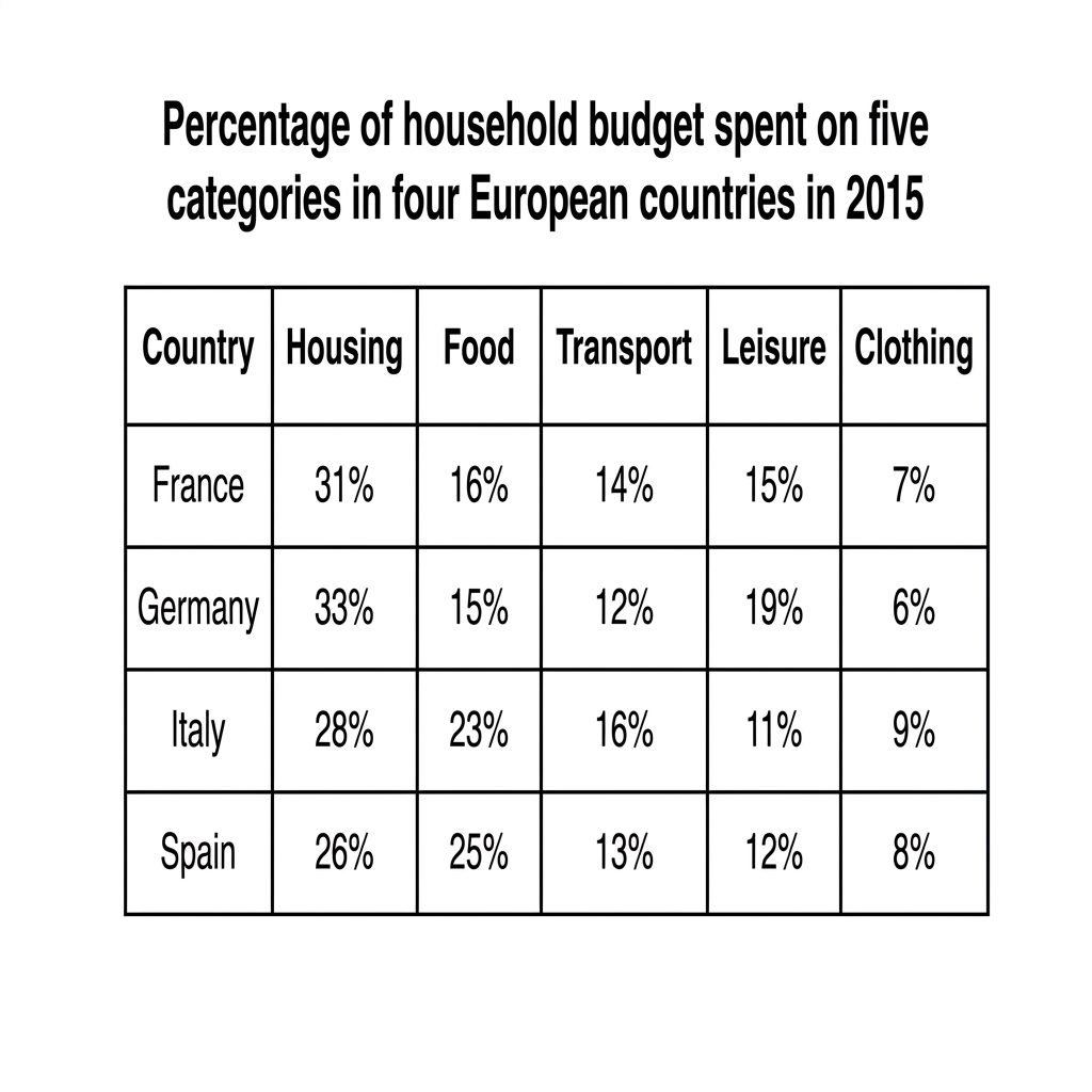
Prompt: The table below shows the percentage of household budget spent on five different categories in four European countries in 2015.
Example Answer:
The table compares the percentage of the household budget spent on five categories (housing, food, transport, leisure, and clothing) in four European countries (France, Germany, Italy, and Spain) in 2015.
On the whole, housing was the largest expense in every country, while clothing was the smallest. The northern European countries (France and Germany) spent more on housing and leisure, while the southern countries (Italy and Spain) spent noticeably more on food.
France and Germany followed similar patterns. French households allocated 31% of their budget to housing, 16% to food, 14% to transport, 15% to leisure, and 7% to clothing. Germany spent slightly more on housing at 33% and on leisure at 19%, with smaller shares for food at 15%, transport at 12%, and clothing at 6%.
Italian and Spanish households allocated noticeably more of their budgets to food. Italy spent 23% on food and 28% on housing, while Spain spent 25% on food and 26% on housing, the highest food shares in the table. Both spent less on leisure (11% and 12%) and more on clothing (9% and 8%) than the northern countries.
Question 4
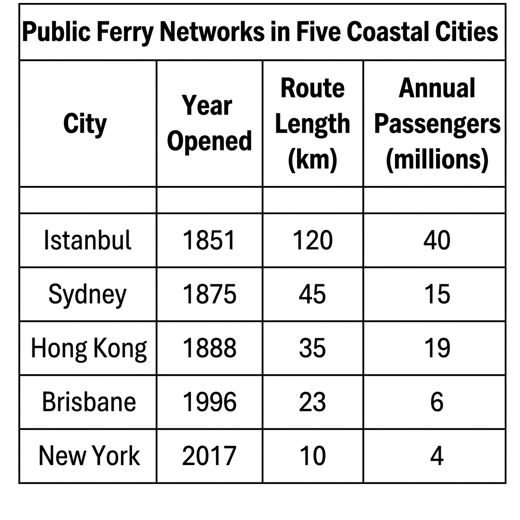
Prompt: The table below provides information about public ferry networks in five major coastal cities.
Example Answer:
The table compares the year a public ferry network opened, the route length in kilometres, and the annual passenger numbers in millions for five coastal cities: Istanbul, Sydney, Hong Kong, Brisbane, and New York.
Across the table, the older networks generally have longer routes and carry more passengers. Istanbul stands out as both the oldest and the largest network, while New York's network is the newest, the shortest, and the least used.
Istanbul's network, the oldest in the table, opened in 1851 and has the longest route at 120 km, carrying 40 million passengers annually, by far the highest of the five. The next two oldest networks, Sydney (1875) and Hong Kong (1888), have much shorter routes of 45 km and 35 km, and carry 15 million and 19 million passengers per year respectively.
The two newest networks, Brisbane (1996) and New York (2017), are noticeably smaller. Brisbane's route covers 23 km and carries 6 million passengers a year, while New York's network spans just 10 km and carries 4 million passengers annually, the lowest figures in the table for both route length and ridership.
Question 5
Prompt: The table below shows the percentage of adults who participated in four different outdoor recreational activities in four countries in 2021.
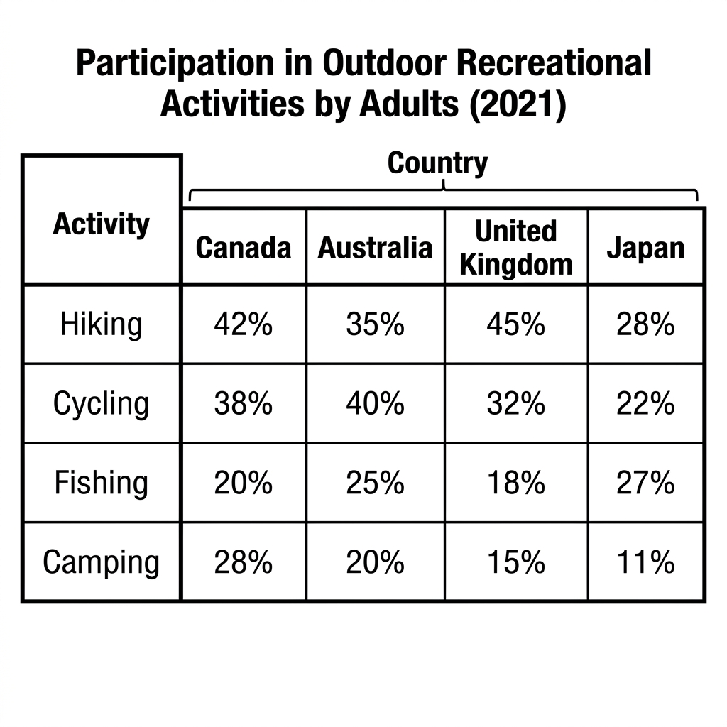
Example Answer:
The table compares the percentage of adults participating in four outdoor recreational activities (hiking, cycling, fishing, and camping) in Canada, Australia, the United Kingdom, and Japan in 2021.
Overall, hiking and cycling were the most popular activities across the four countries, while camping was the least popular. The UK led in hiking, Australia in cycling, Japan in fishing, and Canada in camping, with no single country dominating across all four activities.
Hiking and cycling drew the highest participation rates. The UK had the highest hiking rate at 45%, followed by Canada at 42%, Australia at 35%, and Japan at 28%. Cycling was led by Australia at 40%, with Canada close behind at 38%, the UK at 32%, and Japan again at the lowest, with 22%.
Fishing and camping showed more variation between countries. Japan had the highest fishing rate at 27%, ahead of Australia at 25%, Canada at 20%, and the UK at 18%. For camping, Canada led at 28%, followed by Australia at 20%, the UK at 15%, and Japan at just 11%, the lowest single figure in the table.
Question 6
Prompt: The table below shows the percentage of university graduates in different academic disciplines across four European countries in 2015.
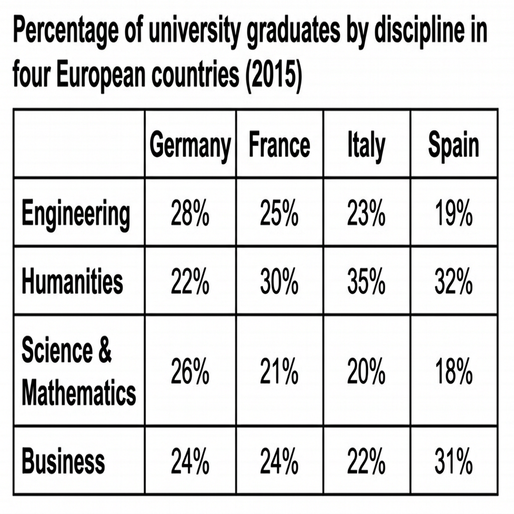
Example Answer:
The table compares the percentage of university graduates by discipline, engineering, humanities, science and mathematics, and business, in Germany, France, Italy, and Spain in 2015.
Overall, the most popular discipline differed by country. Germany produced the largest share of engineering graduates, while Italy led in humanities and Spain in business. Across all four countries, science and mathematics graduates accounted for a relatively modest share of the total.
Engineering was strongest in Germany, where 28% of graduates studied the subject, followed by France at 25%, Italy at 23%, and Spain at 19%. Humanities showed the opposite pattern: Italy led at 35%, with Spain on 32% and France on 30%, while Germany trailed at 22%, the lowest humanities share in the table.
Science and mathematics drew between 18% and 26% of graduates across the four countries, with Germany highest at 26% and Spain lowest at 18%. Business showed the most variation, with Spain ahead at 31%, well above the other three countries, which clustered tightly between 22% and 24%. Spain's business share was the largest single percentage of the table outside Italy's humanities figure.
Question 7
Prompt: The table below shows the percentage of adults aged 60-64 and 65-69 who were employed in four European countries in 2000, 2010, and 2020.
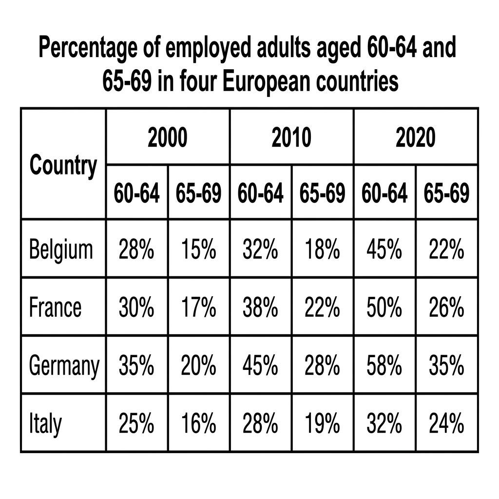
Example Answer:
The table compares the percentage of employed adults aged 60 to 64 and 65 to 69 in four European countries (Belgium, France, Germany, and Italy) in 2000, 2010, and 2020.
Broadly speaking, employment rates rose in every age group and country across the period. Germany consistently recorded the highest rates, while Italy recorded the lowest. Employment among the older 65 to 69 age group grew sharply in proportional terms.
In the 60 to 64 age group, Germany led throughout, rising from 35% in 2000 to 45% in 2010 and 58% by 2020. Belgium and France followed similar trajectories, with Belgium climbing from 28% to 45% and France from 30% to 50% over the 20-year period. Italy remained the lowest in this group, rising from 25% to 32%.
The 65 to 69 group showed lower rates but stronger growth. Germany rose from 20% in 2000 to 28% in 2010 and 35% by 2020, the highest figure in the table. Belgium rose from 15% to 22%, France from 17% to 26%, and Italy from 16% to 24%. The gap between Germany and the others widened by 2020.
Question 8
Prompt: The table below shows music concert attendance figures by age group in three different countries in 2022, in millions.
Example Answer:
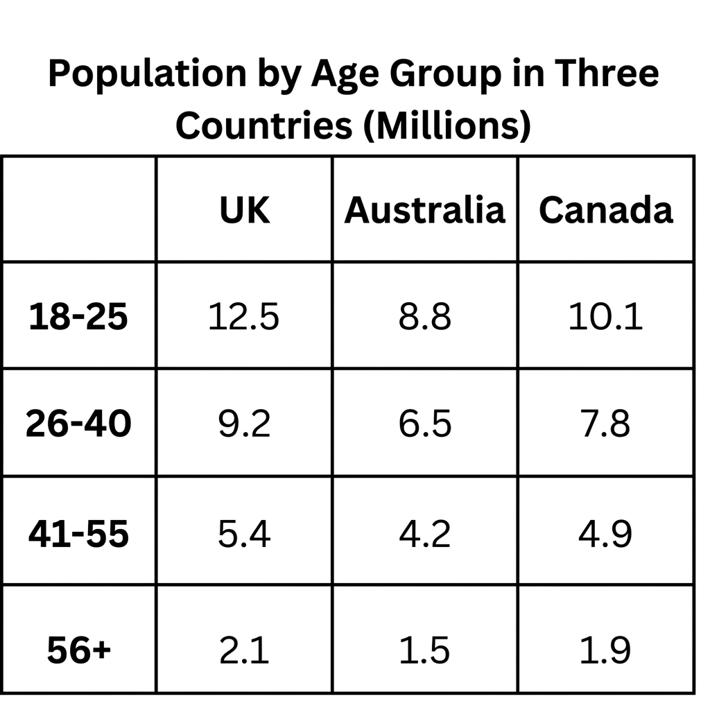
The table compares the population, in millions, in four age groups across three countries: the UK, Australia, and Canada.
On the whole, the UK had the largest population in every age group, while Australia had the smallest. Population fell sharply with age in all three countries, with each older age group around half the size of the previous one.
The 18 to 25 age group was the largest in every country. The UK led with 12.5 million people, ahead of Canada at 10.1 million and Australia at 8.8 million. The 26 to 40 group was smaller, with the UK at 9.2 million, Canada at 7.8 million, and Australia at 6.5 million, preserving the same ranking.
Population fell more sharply in the older age groups. The 41 to 55 group was around half the size of the youngest band, with 5.4 million in the UK, 4.9 million in Canada, and 4.2 million in Australia. The 56 and over group was the smallest in every country, ranging from 2.1 million in the UK to 1.5 million in Australia.
Question 9
Prompt: The table below shows the average annual spending of university students in three different countries in 2010 and 2020.
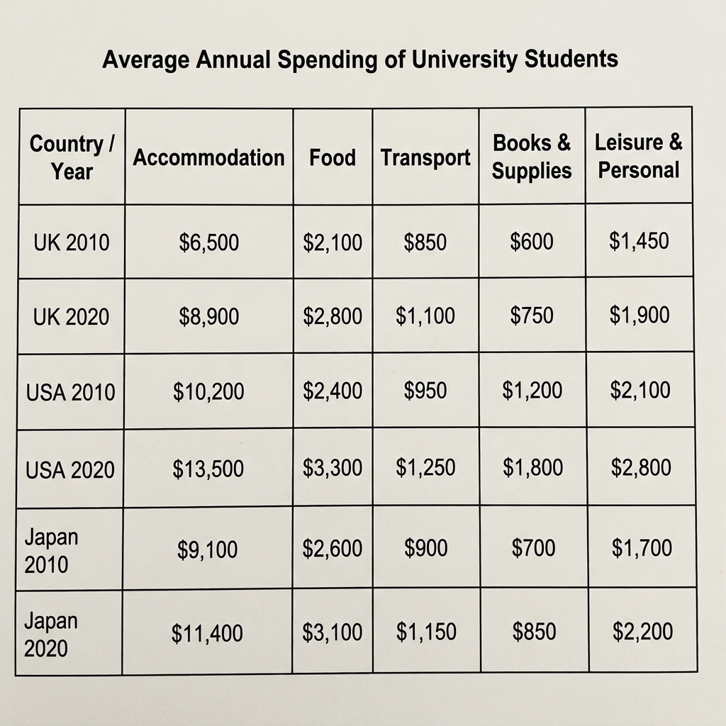
Example Answer:
The table compares the average annual spending of university students in five categories (accommodation, food, transport, books and supplies, and leisure and personal) in the UK, USA, and Japan in 2010 and 2020, all in US dollars.
Across the table, spending rose in every category in every country between 2010 and 2020. The USA recorded the highest figures throughout, with accommodation by far the largest single expense in all three countries.
Accommodation dominated student spending in every country. UK students paid $6,500 in 2010 and $8,900 in 2020, while in the USA the figure rose from $10,200 to $13,500, the highest in the table. Japanese students paid $9,100 in 2010 and $11,400 in 2020, sitting between the other two countries throughout.
The remaining four categories were much smaller. Food rose from $2,100 to $2,800 in the UK, $2,400 to $3,300 in the USA, and $2,600 to $3,100 in Japan. Transport, books and supplies, and leisure and personal each rose modestly across the period, with USA students consistently the heaviest spenders. The USA's leisure spend reached $2,800 by 2020, the highest non-accommodation figure of any country.
Question 10
Prompt: The table below shows the percentage of agricultural land dedicated to four different crops in three regions of a country in the years 2005 and 2015.
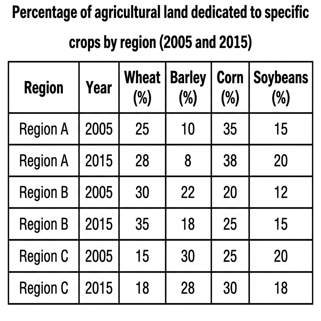
Example Answer:
The table compares the percentage of agricultural land dedicated to four crops (wheat, barley, corn, and soybeans) in three regions in 2005 and 2015.
Looking at the four countries together, every region increased its share of land for at least three of the four crops between 2005 and 2015. Region C was dominated by barley throughout, while Region A and Region B were led by wheat and corn.
Region A increased wheat from 25% to 28%, corn from 35% to 38%, and soybeans from 15% to 20%, while barley fell from 10% to 8%. Region B showed similar expansion, with wheat rising from 30% to 35%, corn from 20% to 25%, and soybeans from 12% to 15%. Barley fell from 22% to 18%.
Region C had the most distinctive pattern, dominated by barley throughout. Barley fell from 30% to 28%, but remained the highest single crop share in the table. Wheat rose from 15% to 18%, corn from 25% to 30%, and soybeans dropped from 20% to 18%. Region C remained the most barley-focused of the three.
Question 11
Prompt: The table below gives information about the public library systems in five major cities.
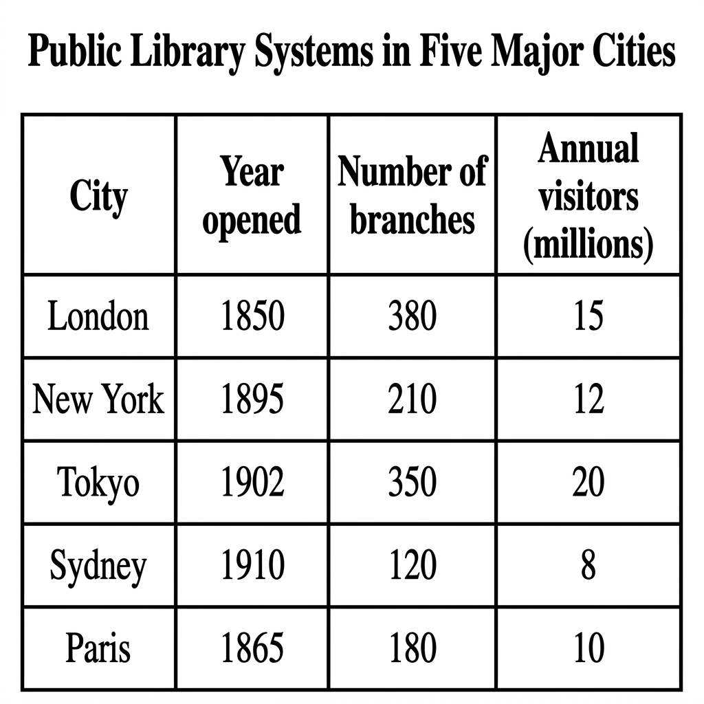
Example Answer:
The table compares the year of opening, branches, and annual visitor numbers in millions for the public library systems of five major cities: London, New York, Tokyo, Sydney, and Paris.
Overall, the older library systems tend to have more branches and more visitors. London is the oldest and has the largest network, while Tokyo, despite opening later, attracts the most visitors. Sydney is the smallest system on every measure.
London's library system, the oldest in the table, opened in 1850 and has 380 branches, the highest of the five. The next two oldest systems, Paris (1865) and New York (1895), have 180 and 210 branches respectively. Tokyo opened later, in 1902, but has built up the second-largest network, with 350 branches.
Annual visitor numbers do not match the order of branch counts. Tokyo, despite opening more recently, attracts 20 million visitors a year, the highest in the table, ahead of London at 15 million, New York at 12 million, and Paris at 10 million. Sydney, which opened most recently in 1910, has just 120 branches and the lowest visitor count at 8 million.
Question 12
Prompt: The table below shows the percentage of adults aged 65 and over living in three different types of accommodation in three European countries in the years 2010 and 2020.
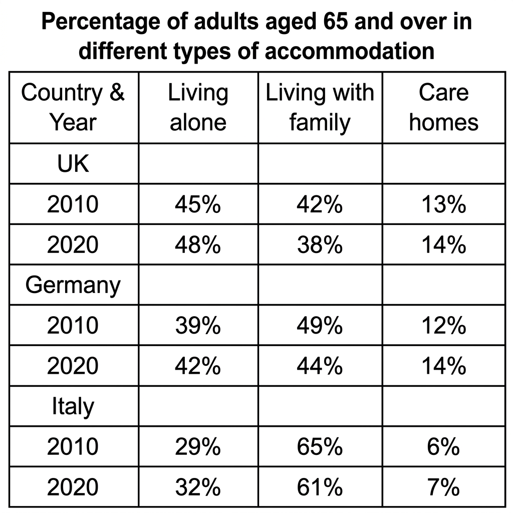
Example Answer:
The table compares the percentage of adults aged 65 and over living alone, living with family, or in care homes in the UK, Germany, and Italy in 2010 and 2020.
Broadly speaking, the share of older adults living alone rose in all three countries, while the share living with family fell. Italy stood out for the highest rate of family living, while the UK had the highest rate of living alone.
In the UK, living alone rose from 45% in 2010 to 48% in 2020, the highest figure across the three countries. Living with family fell from 42% to 38%, while care homes rose from 13% to 14%. Germany followed a similar pattern, with living alone rising from 39% to 42%, living with family falling from 49% to 44%, and care homes from 12% to 14%.
Italy showed the most distinctive pattern, with the highest family-living rate in both years. Living with family fell from 65% to 61%, still well above the other two countries. Living alone rose from 29% to 32%, while care homes had the lowest share, rising from 6% to 7%.
Question 13
Prompt: The table below gives information about high-speed rail networks in five countries in the year 2022.
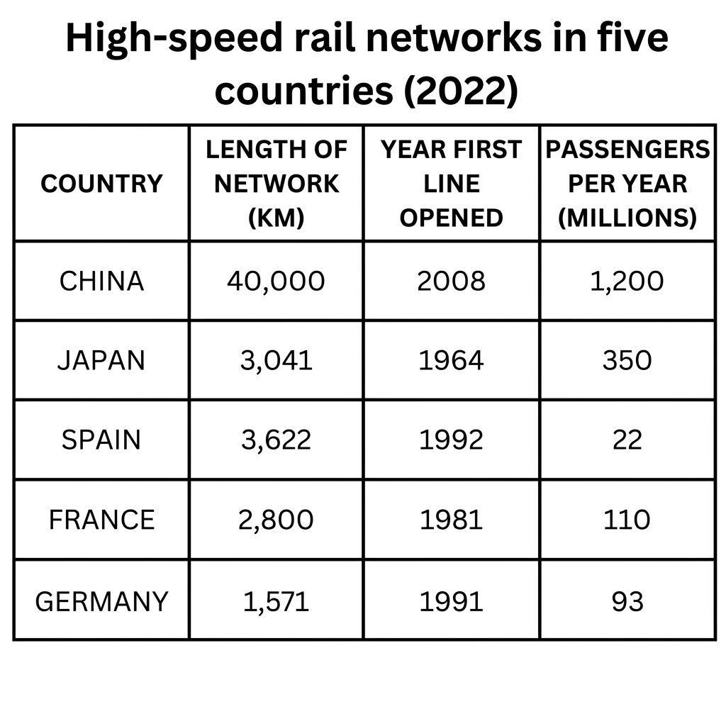
Example Answer:
The table compares the network length in kilometres, the year the first line opened, and annual passenger numbers in millions for the high-speed rail systems of five countries: China, Japan, Spain, France, and Germany.
On the whole, China dominates by a wide margin, with the longest network and most passengers, despite being the most recent to open a high-speed line. Japan's network is the oldest and carries large passenger volumes, while Spain has a long network but very few passengers.
China stands out on two of the three columns. Despite opening its first line in 2008, its network now extends 40,000 km, more than ten times the length of any other country. Annual passenger numbers reached 1,200 million, the highest by a wide margin.
Japan opened its first line in 1964, the earliest, and has a 3,041-km network carrying 350 million passengers a year. France (1981) and Germany (1991) carry 110 million and 93 million passengers on networks of 2,800 and 1,571 km. Spain has the second longest network at 3,622 km, but carries just 22 million passengers, by far the lowest figure.
Question 14
Prompt: The table below shows the percentage of students enrolled in different faculties at four universities in the year 2022.
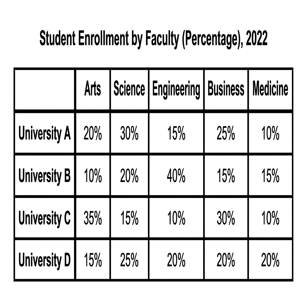
Example Answer:
The table compares the percentage of student enrolment by faculty (arts, science, engineering, business, and medicine) at four universities, labelled A to D, in 2022.
Across the table, each university shows a different specialism, although all draw at least 10% of students into every faculty. University B is the most engineering-focused, University C is the most arts-focused, and University D shows the most evenly balanced enrolment across the five faculties.
University A and University C had complementary profiles. University A's largest faculty was science at 30%, with business at 25% and arts at 20%, while medicine was the smallest at 10%. University C, by contrast, was led by arts at 35% and business at 30%, with much smaller shares for science (15%), medicine (10%), and engineering (10%).
Universities B and D differed in spread. University B was the most concentrated, with 40% in engineering, the highest single share. Arts trailed at 10%, while science, business, and medicine each had 15% to 20%. University D had the most even distribution, with shares from 15% in arts to 25% in science, and 20% in each remaining faculty.
Question 15
Prompt: The table below shows the proportion of different categories of waste recycled in four regions in 2012 and 2018.
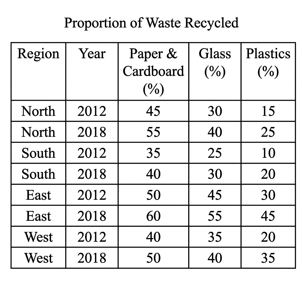
Example Answer:
The table compares the proportion of three waste materials, paper and cardboard, glass, and plastics, recycled in four regions (North, South, East, and West) in 2012 and 2018.
Looking at the four countries together, recycling rates rose for every material in every region between 2012 and 2018. The East region recorded the highest recycling rates throughout, while the South region recorded the lowest. Plastics saw the largest proportional gains across the four regions.
Paper and cardboard had the highest recycling rates. The East led with 50% in 2012, rising to 60% in 2018, while the North rose from 45% to 55%, the West from 40% to 50%, and the South from 35% to 40%. The North made the largest absolute gain at ten percentage points.
Glass and plastics rates were lower but rose consistently. Glass recycling climbed from 45% to 55% in the East, 35% to 40% in the West, 30% to 40% in the North, and 25% to 30% in the South. Plastics saw the strongest relative growth, rising from 30% to 45% in the East, with similar increases in every other region.
Question 16
Prompt: The table below shows information on the average monthly expenditure on housing and transport in three Australian cities in 2022.
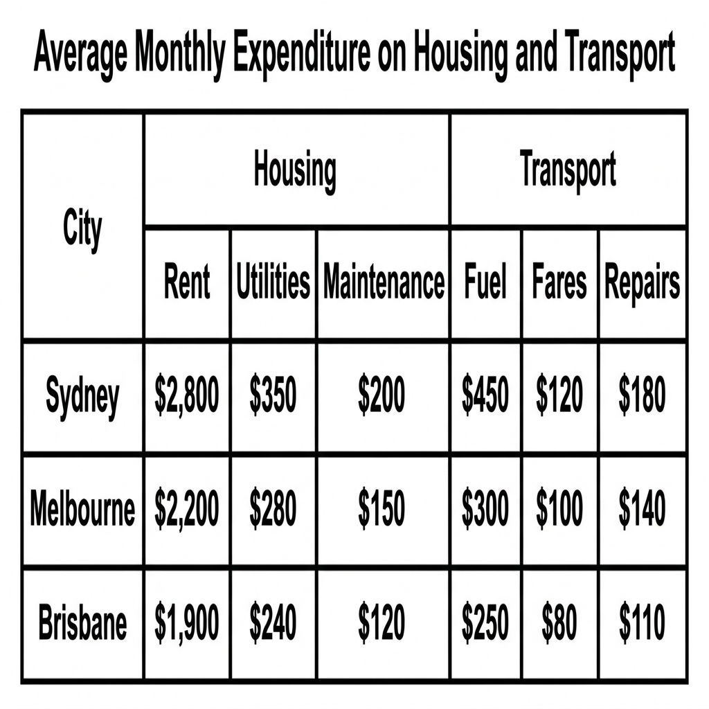
Example Answer:
The table compares average monthly expenditure on six items in three categories of housing (rent, utilities, maintenance) and transport (fuel, fares, repairs) for households in Sydney, Melbourne, and Brisbane.
Overall, Sydney households spent the most on every item, while Brisbane households spent the least. Rent was by far the largest single expense in every city, accounting for the majority of monthly housing and transport spending combined.
Sydney recorded the highest figures across all six categories. Households spent $2,800 on rent, $350 on utilities, and $200 on maintenance, with transport costs of $450 on fuel, $120 on fares, and $180 on repairs. Rent alone was over six times the next largest Sydney expense, fuel.
Melbourne and Brisbane households spent significantly less in every category. Melbourne's rent was $2,200, with utilities at $280 and maintenance at $150, while transport spending was $300 on fuel, $100 on fares, and $140 on repairs. Brisbane was the cheapest of the three across every line, with rent at $1,900, utilities at $240, and maintenance at $120, and transport costs of $250 on fuel, $80 on fares, and $110 on repairs.
Question 17
Prompt: The table below gives information about public bicycle sharing schemes in five major European cities in 2022.
Example Answer:
The table compares the year introduced, the number of bicycles, docking stations, and average daily rentals of public bicycle sharing schemes in five European cities in 2022.
Broadly speaking, Paris ran by far the largest scheme on every measure, while Berlin had the smallest by some metrics despite being the earliest to launch. Fleet size did not always match daily rentals, with Barcelona showing strong usage relative to its size.
Paris dominated the table. Its 20,000 bicycles and 1,400 docking stations were both the highest figures, and the scheme generated 100,000 daily rentals, more than twice as many as any other city. London came in second on most measures, with 12,000 bicycles, 800 docking stations, and 40,000 daily rentals.
The other three cities had much smaller schemes but contrasting usage. Barcelona had only 6,000 bicycles and 420 stations but recorded 35,000 daily rentals, close to London's figure. Berlin, the oldest scheme (2004), had 5,000 bicycles and 350 stations but just 10,000 daily rentals, the lowest figure in the table. Milan recorded 4,500 bicycles, 320 stations, and 15,000 daily rentals.
Question 18
Prompt: The table below shows the percentage of adults who read different genres of books in a European country in 2021, categorised by age group.
Example Answer:
The table compares the percentage of people in four age groups who read four book genres: fiction, non-fiction, biographies, and science fiction.
On the whole, each genre appealed to a different age group. Fiction and science fiction were most popular among younger readers and lost ground with age, while non-fiction and biographies showed the opposite pattern, becoming more popular as readers got older.
Fiction and science fiction declined with age. Fiction was read by 75% of those aged 15 to 24, 60% of 25 to 40, 50% of 41 to 60, and 40% of those aged 61 and over. Science fiction fell more sharply, from 60% in the youngest group to 45%, 20%, and just 10% in the oldest, the largest single drop in the table.
Non-fiction and biographies followed the opposite pattern. Non-fiction rose from 15% in the youngest group to 30%, 45%, and 55% in the oldest, more than tripling. Biographies showed the same upward shape from a lower base, climbing from 5% to 10%, 25%, and 40% among readers aged 61 and over, an eightfold increase.
Question 19
Prompt: The table below shows the percentage of the adult population engaged in volunteer work in four European countries in 2000, 2010, and 2020.
Example Answer:
The table compares the percentage of adults volunteering in four European countries, the UK, France, Germany, and Italy, in 2000, 2010, and 2020.
Overall, three of the four countries saw their volunteering rates rise across the 20-year period, while Germany was the exception, with rates falling from 2000 onwards. Germany began as the leader in 2000 but was overtaken by France by 2020, which became the highest of the four countries.
France and the UK both saw steady increases. France rose from 24% in 2000 to 28% in 2010 and 33% by 2020, the highest single figure in the table. The UK climbed from 15% in 2000 to 22% in 2010 and 25% by 2020, the largest absolute gain in the table, although it remained below the leading two.
Germany and Italy followed less consistent paths. Germany began the period at the highest rate of 31% but slipped to 29% in 2010 and 26% by 2020, the only country to record a sustained decline. Italy moved within a narrow range, beginning at 18%, peaking at 21% in 2010, and easing back to 19% by 2020.
Question 20
Prompt: The table below shows the number of theater tickets sold (in millions) for four different genres of performance in three European cities in 2019.
Example Answer:
The table compares the number of theatre tickets sold, in millions, across four genres (comedy, tragedy, musical, and historical) in three European cities (London, Paris, and Berlin) in 2019.
Looking at the four countries together, the most popular genre varied by city. London was dominated by musicals, Paris was led by comedy, and Berlin's audience was more evenly split. Historical theatre attracted the smallest audience in every city.
London sold by far the most tickets in any single category, with 12.1 million musical tickets, almost three times its next largest genre. Comedy was second at 8.5 million, followed by tragedy at 4.2 million and historical at just 3.4 million. The dominance of musicals made London the most genre-skewed city of the three.
Paris and Berlin were more evenly distributed across genres. In Paris, comedy was the leading genre at 7.1 million, followed by tragedy at 6.5 million, musical at 5.8 million, and historical at 4.0 million. Berlin showed a similar spread, with musical leading at 7.5 million, comedy at 6.2 million, historical at 4.5 million, and tragedy lowest at 3.8 million.
Question 21
Prompt: The table below shows the average weekly spending of international students in three different countries in 2022.
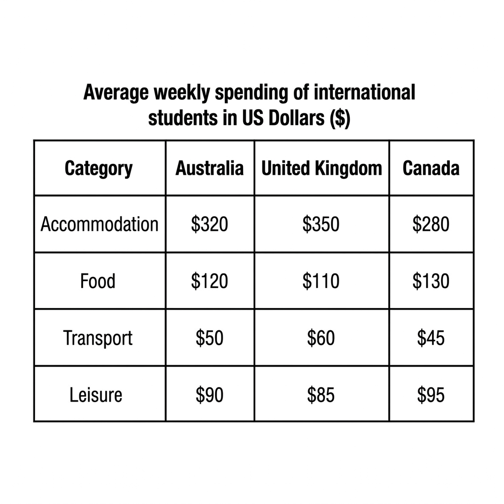
Example Answer:
The table compares the average weekly spending of international students, in US dollars, on four categories (accommodation, food, transport, and leisure) in Australia, the United Kingdom, and Canada.
Overall, accommodation was by far the largest weekly expense in every country. The UK was the most expensive country for accommodation and transport, while Canada was the most expensive for food and leisure. Australia fell between the other two on most measures.
Accommodation took the bulk of weekly spending in every country. UK students spent the most at $350, ahead of Australia at $320 and Canada at $280. Transport followed the same ranking, with the UK highest at $60, Australia at $50, and Canada lowest at $45. The UK was therefore the most expensive on the two largest categories.
Food and leisure showed the opposite ranking. Canadian students spent the most on food at $130 per week, ahead of Australia at $120 and the UK at $110. Leisure followed the same order, with Canada at $95, Australia at $90, and the UK at $85.
Question 22
Prompt: The table below shows the percentage of the national budget allocated to five different public sectors in three European countries in 2005 and 2015.
Example Answer:
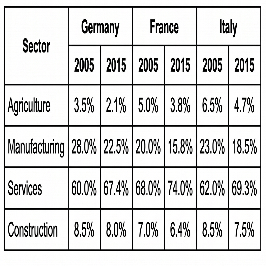
The table compares the percentage of the workforce employed in four sectors (agriculture, manufacturing, services, and construction) in Germany, France, and Italy in 2005 and 2015.
Broadly speaking, services dominated employment in every country and grew further between 2005 and 2015, while manufacturing and agriculture both shrank in every country. Construction also fell modestly across the period.
Services was the largest sector in every country and grew throughout the period. France led at 68% in 2005, rising to 74% by 2015, the highest single figure in the table. Italy rose from 62% to 69.3%, while Germany climbed from 60% to 67.4%. The shift toward services was therefore broadly consistent across the three countries.
Manufacturing and agriculture both shrank. Manufacturing fell from 28% to 22.5% in Germany, from 23% to 18.5% in Italy, and from 20% to 15.8% in France. Agriculture, the smallest sector in every year, slipped from 6.5% to 4.7% in Italy, 5% to 3.8% in France, and 3.5% to 2.1% in Germany. Construction declined modestly in all three countries, ending the period between 6.4% and 8%.
Question 23
Prompt: The table below shows the changes in the modes of transport used by residents to commute to work in a specific UK city between 2000 and 2020.
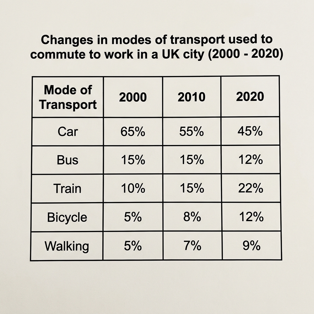
Example Answer:
The table compares the percentage of commuters using five modes of transport (car, bus, train, bicycle, and walking) to travel to work in a UK city in 2000, 2010, and 2020.
On the whole, car use fell sharply across the period, while train, bicycle, and walking all rose. Bus use was broadly stable but declined slightly by 2020. Together, these shifts produced a noticeable move away from cars and toward public and active transport.
Car was the dominant mode in every year but lost ground steadily, falling from 65% in 2000 to 55% in 2010 and 45% in 2020, a 20 percentage point drop. Bus use held flat at 15% across the first two surveys but slipped to 12% by 2020, the only mode without meaningful change.
The other three modes all increased their share. Train use more than doubled, from 10% in 2000 to 15% in 2010 and 22% by 2020, the largest absolute gain in the table. Bicycle commuting also more than doubled, from 5% to 8% to 12%. Walking grew steadily, from 5% in 2000 to 9% by 2020.
Question 24
Prompt: The table below shows the number of active memberships and the volume of different materials borrowed from a city library during the year before and the year after the launch of a new digital platform.
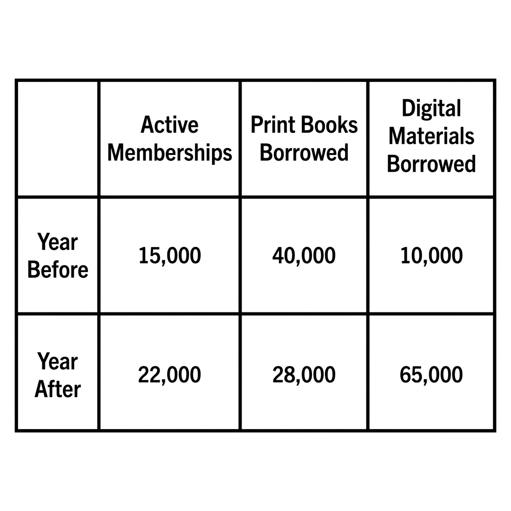
Example Answer:
The table compares three measures of activity at a city library, active memberships, print books borrowed, and digital materials borrowed, in the year before and the year after the launch of a new digital platform.
Across the table, the launch of the platform was associated with a sharp rise in active memberships and a dramatic increase in digital materials borrowed. Print books borrowed fell substantially over the same period, suggesting a shift in how members used the library.
Active memberships rose from 15,000 in the year before to 22,000 in the year after, an increase of around 47%, suggesting that the platform attracted new users. Print books borrowed, by contrast, fell from 40,000 to 28,000, a drop of 30%, indicating that existing members borrowed fewer printed materials.
Digital materials borrowed showed the most dramatic change. The figure rose from 10,000 in the year before the launch to 65,000 in the year after, more than a sixfold increase. By the second year, digital materials borrowed had become the most heavily used category, well ahead of both print books borrowed and active memberships.
Question 25
Prompt: The table below shows the number of visitors (in millions) to four different types of tourist attractions in three countries in 2022.
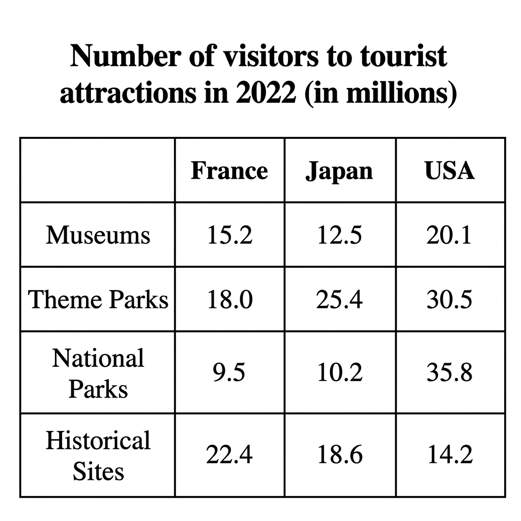
Example Answer:
The table compares the number of visitors, in millions, to four types of tourist attraction (museums, theme parks, national parks, and historical sites) in France, Japan, and the USA in 2022.
Overall, the USA recorded the highest visitor numbers in three of the four categories, with national parks especially dominant. France led only in historical sites, where its figure was the highest in the table. Japan recorded the highest theme park figure outside of the USA.
The USA was the leading destination for museums (20.1 million), theme parks (30.5 million), and national parks (35.8 million), the latter being the highest single figure in the table. National parks were a particular standout, drawing more than three times as many visitors in the USA as in Japan.
France and Japan led in different categories. France attracted the most historical sites visitors at 22.4 million, ahead of Japan at 18.6 million and the USA at 14.2 million. Japan's strongest category was theme parks at 25.4 million, well above France's 18 million. National parks drew the smallest French audience at 9.5 million, the lowest in the table.
Question 26
Prompt: The tables below show the proportion of water consumed for three different purposes in four climate zones, along with the average annual rainfall and total water consumption in those areas.
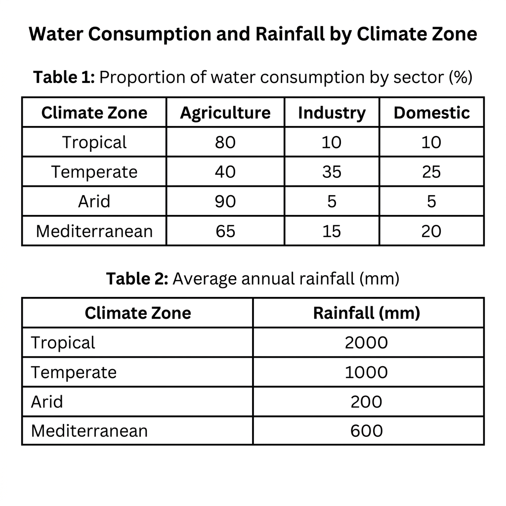
Example Answer:
The two tables compare the proportion of water consumption by sector (agriculture, industry, and domestic) and the average annual rainfall in millimetres across four climate zones: tropical, temperate, arid, and mediterranean.
Overall, agriculture dominates water use in every climate zone except temperate, where industry and domestic together account for the majority. Rainfall varies dramatically by zone, with tropical regions receiving ten times more annual rainfall than arid regions.
Agriculture took the largest share of water use in three of the four zones. Arid zones used 90% of water for agriculture, followed by tropical zones at 80% and mediterranean zones at 65%. Temperate zones were the exception, with agriculture using just 40%, while industry and domestic together accounted for 60%, the most balanced split of the four.
Rainfall patterns mirrored the geography of each zone. Tropical zones received 2,000 mm of rain a year, the highest in the table, while arid zones received only 200 mm, just one-tenth as much. Temperate zones received 1,000 mm and mediterranean 600 mm. Agriculture's share of water use appears highest in the driest zone.
Question 27
Prompt: The table below shows the average annual expenditure on three categories of consumer goods by households in three European countries in 2008 and 2018.
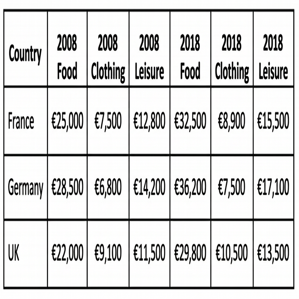
Example Answer:
The table compares average household spending on three categories (food, clothing, and leisure) in France, Germany, and the UK in 2008 and 2018, all in euros.
Broadly speaking, food was the largest single category in every country and year, and rose substantially across the decade. Leisure spending also rose in every country, while clothing spending was broadly stable, with smaller percentage changes than the other two categories.
Food remained the dominant household expense throughout. Germany spent the most at €28,500 in 2008, rising to €36,200 in 2018, the highest figure in the table. France grew from €25,000 to €32,500 over the same period, while UK households spent the least, rising from €22,000 to €29,800. The increase was around 30% in every country.
Leisure and clothing showed contrasting patterns. Leisure rose in every country, with Germany leading at €14,200 in 2008 and €17,100 in 2018. France climbed from €12,800 to €15,500, and the UK from €11,500 to €13,500. Clothing spending changed little, with the UK actually outspending Germany in 2018 (€10,500 versus €7,500), the only category where the UK led.
Question 28
Prompt: The table below shows the average weekly household expenditure on different food categories by family size in a European country in 2022.
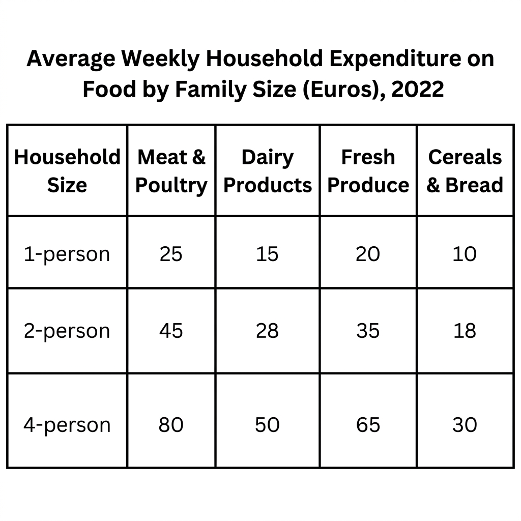
Example Answer:
The table compares the average weekly household expenditure on four food categories (meat and poultry, dairy products, fresh produce, and cereals and bread) by family size in 2022, all in euros.
On the whole, larger households spent more in every food category, with 4-person households spending around three times as much as 1-person households across the board. Meat and poultry was the single largest expense for every family size, while cereals and bread was the smallest.
Single-person households spent the least, with €25 on meat and poultry, €15 on dairy products, €20 on fresh produce, and €10 on cereals and bread, totalling €70 per week. Two-person households nearly doubled this in every category, spending €45, €28, €35, and €18 respectively, for a total of €126.
Four-person households spent the most by a wide margin. Meat and poultry rose to €80 per week, the highest single figure in the table, followed by fresh produce at €65, dairy products at €50, and cereals and bread at €30. The total of €225 per week was more than triple the 1-person figure.
Question 29
Prompt: The table below shows the average monthly costs of public transport and taxi fares, as well as the percentage of household income spent on transport, in four different cities in 2022.
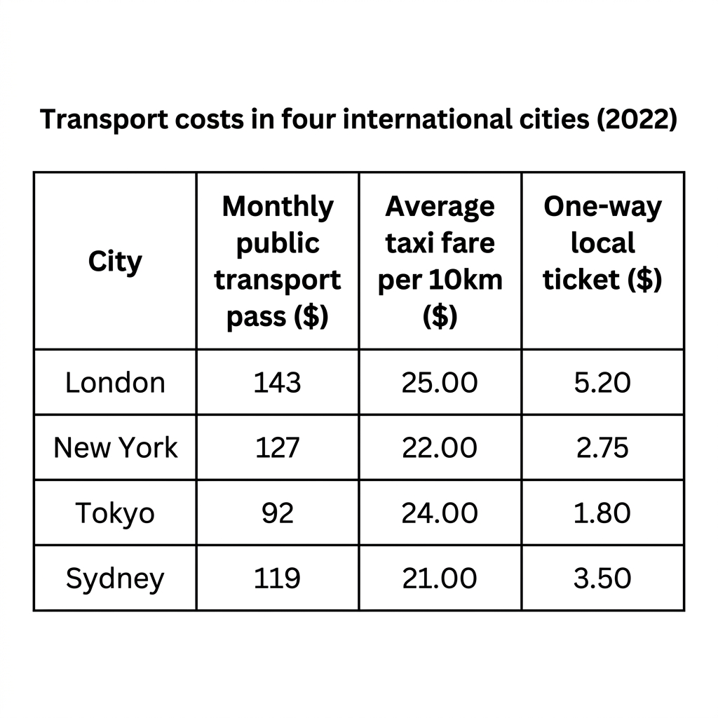
Example Answer:
The table compares three transport costs (monthly public transport pass, average taxi fare per 10 km, and one-way local ticket) in four cities (London, New York, Tokyo, and Sydney) in 2022, in US dollars.
Across the table, London was the most expensive on both the monthly pass and the one-way ticket, while Tokyo was the cheapest on those two measures. Taxi fares per 10 km were broadly similar across the four cities, with the largest gap being only $4.
London recorded the highest costs on the two ticket-based measures. Its monthly pass cost $143, ahead of New York at $127 and Sydney at $119, while Tokyo was much cheaper at $92. The one-way ticket showed the same ranking, with London at $5.20, Sydney at $3.50, New York at $2.75, and Tokyo lowest at $1.80.
Taxi fares per 10 km were more closely grouped. London again led at $25, followed by Tokyo at $24, New York at $22, and Sydney at $21. Although Tokyo's other transport costs were the lowest, its taxi fares were the second highest, suggesting that taxis differ from the public-transport cost pattern.
Question 30
Prompt: The table below shows the budget allocation by a local city council for four different public services in 2017, 2019, and 2021.
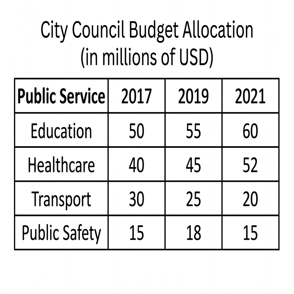
Example Answer:
The table compares the budget allocation, in millions of US dollars, by a city council to four public services (education, healthcare, transport, and public safety) in 2017, 2019, and 2021.
Overall, education and healthcare both received rising budgets, while transport spending fell each year. Public safety remained relatively stable, ending at the same level it began, despite a brief rise in 2019.
Education was the largest single budget item in every year, growing steadily from $50 million in 2017 to $55 million in 2019 and $60 million by 2021, an increase of 20%. Healthcare also rose every year, climbing from $40 million in 2017 to $45 million in 2019 and $52 million by 2021, the largest absolute increase among the four services.
Transport and public safety followed less consistent paths. Transport spending was cut every survey, falling from $30 million in 2017 to $25 million in 2019 and $20 million by 2021, the only category to decline. Public safety rose from $15 million in 2017 to $18 million in 2019, then fell back to $15 million by 2021, ending where it began.