30 IELTS Writing Task 1 (Chart/Graph) Practice Questions with Sample Answers
In this article, we will look at 30 practice IELTS Writing Task 1 prompts with full sample answers. Writing Task 1 asks you to describe a chart, graph, or table in at least 150 words, summarising the main features and making comparisons where relevant. Each sample answer is written at a Band 7 level, the most common target for university and immigration applicants.
If you want the format, scoring rules, and strategies explained in depth, read our complete guide to IELTS Writing Task 1 first, then use the questions below to practice.
Question 1
Prompt: The graph below shows the percentage of total energy generated from renewable sources in four different countries between 2000 and 2020.
Example Answer:
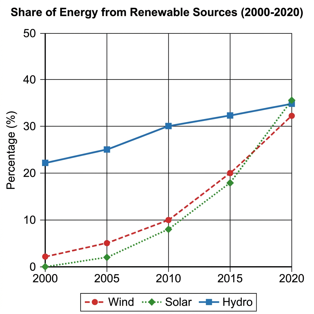
The line graph compares the share of total energy generated from three renewable sources, hydro, wind, and solar, between 2000 and 2020.
Overall, all three renewable sources increased over the period. Hydro began as the largest source and grew steadily, while wind and solar started near zero and rose much more sharply, with all three converging at similar levels by 2020.
Hydro accounted for the largest share throughout, beginning at around 22% in 2000 and rising gradually to 25% in 2005, 30% in 2010, and 32% in 2015. By 2020 it stood at approximately 35%, although by this point its lead had been almost entirely closed by the other two sources.
Wind and solar began the period near zero. Wind sat at about 2% in 2000 and climbed slowly to 5% in 2005 and 10% in 2010, before rising more quickly to 20% in 2015 and 32% in 2020. Solar started lowest at 0% but increased the most sharply over the second half of the period, reaching 35% in 2020 to draw level with hydro.
Question 2
Prompt: The bar chart below shows the percentage of electricity generated from three different sources in four countries in 2010 and 2020.
Example Answer:
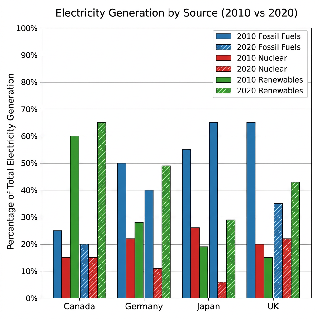
The bar chart compares the share of electricity generated from fossil fuels, nuclear, and renewables in Canada, Germany, Japan, and the UK in 2010 and 2020.
Broadly speaking, the share of renewables rose in every country, while fossil fuels fell in three of the four. Nuclear declined sharply in Germany and Japan but held roughly steady elsewhere. The UK saw the most dramatic shift away from fossil fuels.
Canada relied heavily on renewables in both years, with the figure rising from 60% in 2010 to 65% in 2020, while fossil fuels fell from 25% to 20% and nuclear remained at 15%. The UK saw the largest single shift, with fossil fuels dropping from 65% to 35% and renewables climbing from 15% to 43%.
Germany and Japan moved in different directions. In Germany, fossil fuels fell from 50% to 40%, nuclear was halved from 22% to 11%, and renewables grew from 28% to 49%. Japan, by contrast, increased its reliance on fossil fuels from 55% to 65% as nuclear collapsed from 26% to just 6%, with renewables rising modestly from 19% to 29%.
Question 3
Prompt: The line graph below shows changes in the consumption of three different types of beverages by adults in Germany from 1980 to 2010.
Example Answer:
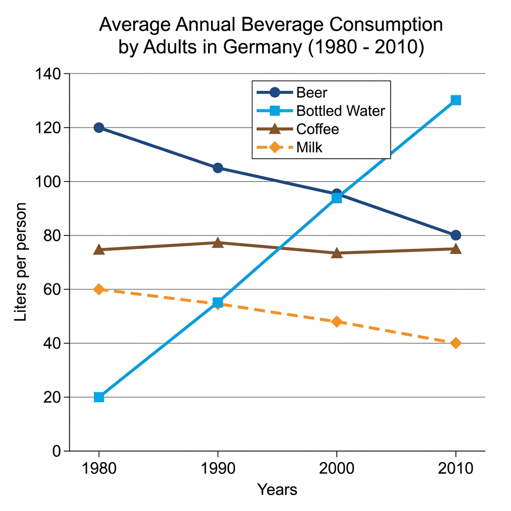
The line graph compares the average annual consumption of four beverages, beer, bottled water, coffee, and milk, by adults in Germany between 1980 and 2010.
On the whole, bottled water saw the most dramatic growth, overtaking beer to become the most consumed beverage by 2010. Beer and milk both declined over the period, while coffee remained broadly stable throughout.
In 1980, beer was the dominant beverage at around 120 litres per person, with coffee in second place at 75 litres. Beer consumption then fell steadily, dropping to 105 litres in 1990, 95 litres in 2000, and 80 litres in 2010. Coffee held nearly flat across the period, hovering between 73 and 78 litres throughout.
Bottled water followed an opposite trajectory, beginning at just 20 litres per person in 1980 and rising sharply to 55 litres in 1990, 95 litres in 2000, and 130 litres in 2010, when it became the most consumed beverage. Milk, meanwhile, declined steadily across the period, falling from 60 litres in 1980 to 55 in 1990, 48 in 2000, and 40 by 2010.
Question 4
Prompt: The graph below shows the average weekly consumption of three types of fast food in a European country from 1990 to 2020.
Example Answer:
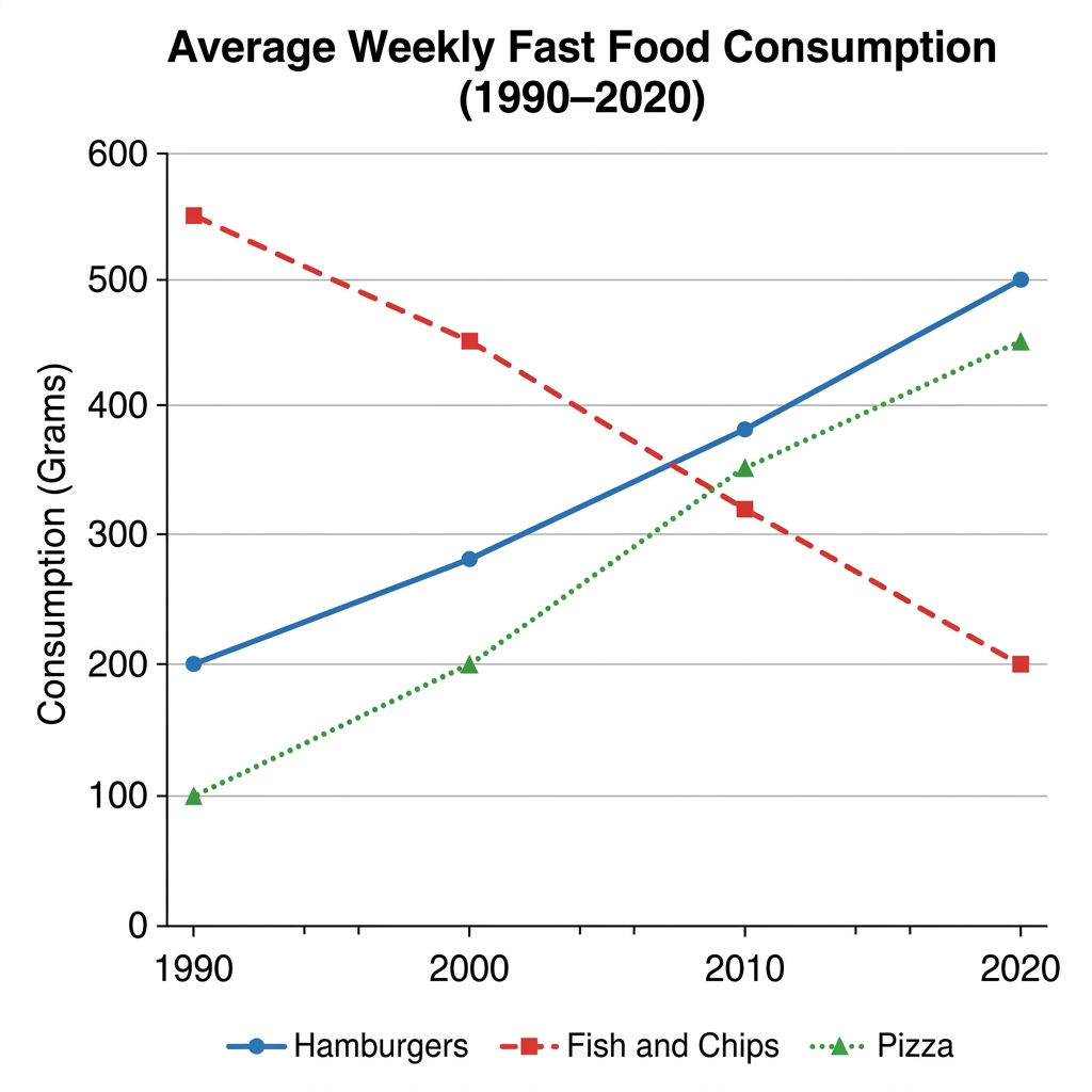
The line graph compares the average weekly consumption of three fast food items, hamburgers, fish and chips, and pizza, between 1990 and 2020.
In broad terms, hamburgers and pizza both grew substantially over the 30-year period, while fish and chips fell into steady decline. By 2020, hamburgers had become the most consumed of the three, overtaking fish and chips, which had been the leader at the start.
In 1990, fish and chips was the most consumed item at around 550 grams per week, with hamburgers second at 200 grams and pizza lowest at 100 grams. Hamburger consumption then rose steadily to 280 grams by 2000, climbed to 380 grams by 2010, and reached 500 grams in 2020.
Pizza followed a similar upward path, increasing to 200 grams in 2000, 350 grams in 2010, and around 450 grams by 2020. Fish and chips, by contrast, declined steadily across the entire period, dropping from 550 grams to 450 grams in 2000, then to 320 grams in 2010 and just 200 grams by 2020.
Question 5
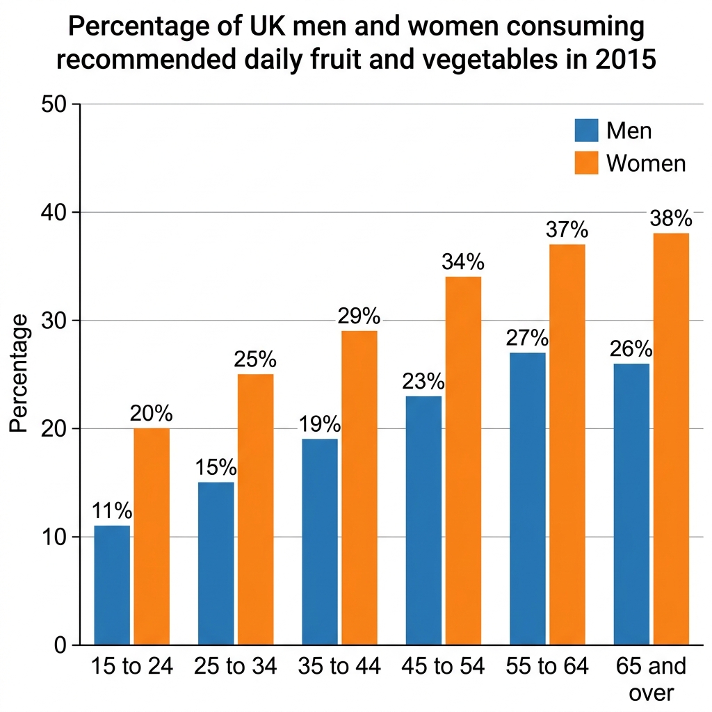
Prompt: The bar chart below shows the percentage of men and women in the UK across various age groups who consumed the recommended daily amount of fruit and vegetables in 2015.
Example Answer:
The bar chart compares the percentage of UK men and women in six age groups who consumed the recommended daily amount of fruit and vegetables in 2015.
Overall, women had higher consumption rates than men in every age group, and consumption rose with age in both groups. Women aged 65 and over recorded the highest figure overall, while men aged 15 to 24 were the lowest.
Among the youngest adults, just 11% of men aged 15 to 24 met the recommended intake, compared with 20% of women in the same band. The figures rose gradually across the next two age groups, reaching 19% for men and 29% for women aged 35 to 44, and 23% versus 34% in the 45 to 54 group.
The highest rates were recorded among older adults. Men peaked at 27% in the 55 to 64 group before slipping slightly to 26% among those aged 65 and over. Women, in contrast, continued to climb, reaching 37% at 55 to 64 and 38% at 65 and over. The gender gap was largest at this end of the chart, at 12 percentage points.
Question 6
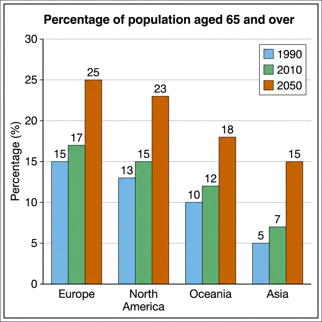
Prompt: The bar chart below shows the percentage of the population aged 65 and over in three different years in four global regions.
Example Answer:
The bar chart compares the percentage of the population aged 65 and over in four world regions, Europe, North America, Oceania, and Asia, in 1990, 2010, and projected to 2050.
Overall, the share of older adults rose in every region across the period, with the steepest increases projected between 2010 and 2050. Europe consistently had the largest elderly population, while Asia recorded the lowest.
In 1990, Europe led with 15% of its population aged 65 and over, followed by North America at 13%, Oceania at 10%, and Asia at just 5%. By 2010, the figures had risen modestly across the board to 17%, 15%, 12%, and 7% respectively, preserving the same ranking among the four regions.
The projections to 2050 show much sharper increases. Europe's share is expected to climb to 25% and North America's to 23%, with the two regions together forming the most aged populations. Oceania is projected to reach 18%, while Asia, despite tripling its 1990 figure, is forecast to reach 15%, still the lowest of the four. The gap between Europe and Asia widens slightly over the period.
Question 7
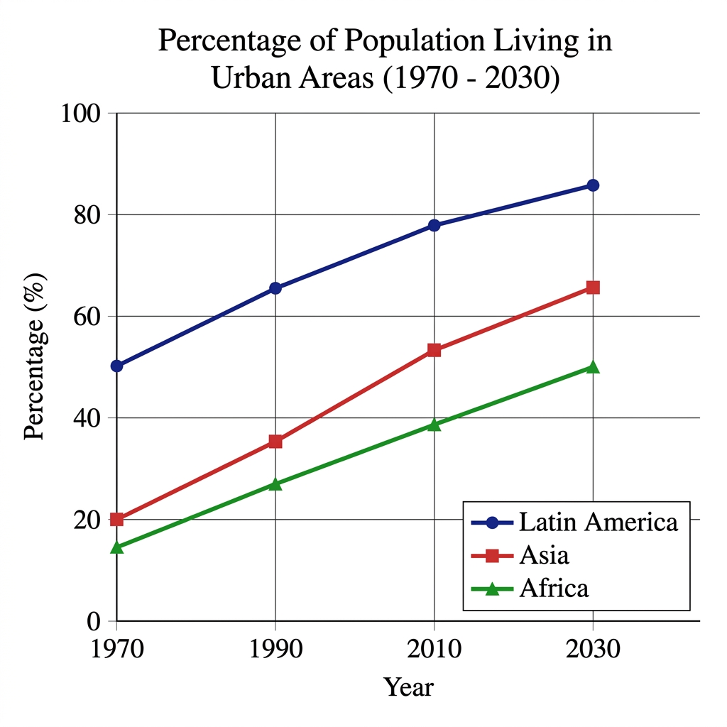
Prompt: The graph below shows the percentage of the population living in urban areas in three different regions of the world from 1970 to 2030.
Example Answer:
The line graph compares the percentage of the population living in urban areas in Latin America, Asia, and Africa between 1970 and 2030.
Broadly speaking, all three regions saw a rising share of their populations living in urban areas across the period. Latin America was the most urbanised throughout, while Africa remained the least urbanised, although the gap between Asia and Africa narrowed by 2030.
Latin America was already the most urbanised region in 1970, with around 50% of its population living in cities. The figure climbed steadily to 65% in 1990 and 78% in 2010, and is projected to reach 86% by 2030. The pace of growth slowed in the later part of the period as the region approached saturation.
Asia and Africa began the period with much lower urbanisation rates, at around 20% and 15% respectively in 1970. Asia grew more quickly, reaching 35% in 1990 and 53% in 2010, with a projection of 65% by 2030. Africa followed a similar but slower path, climbing from 15% to 27% in 1990, 38% in 2010, and a projected 50% by 2030.
Question 8
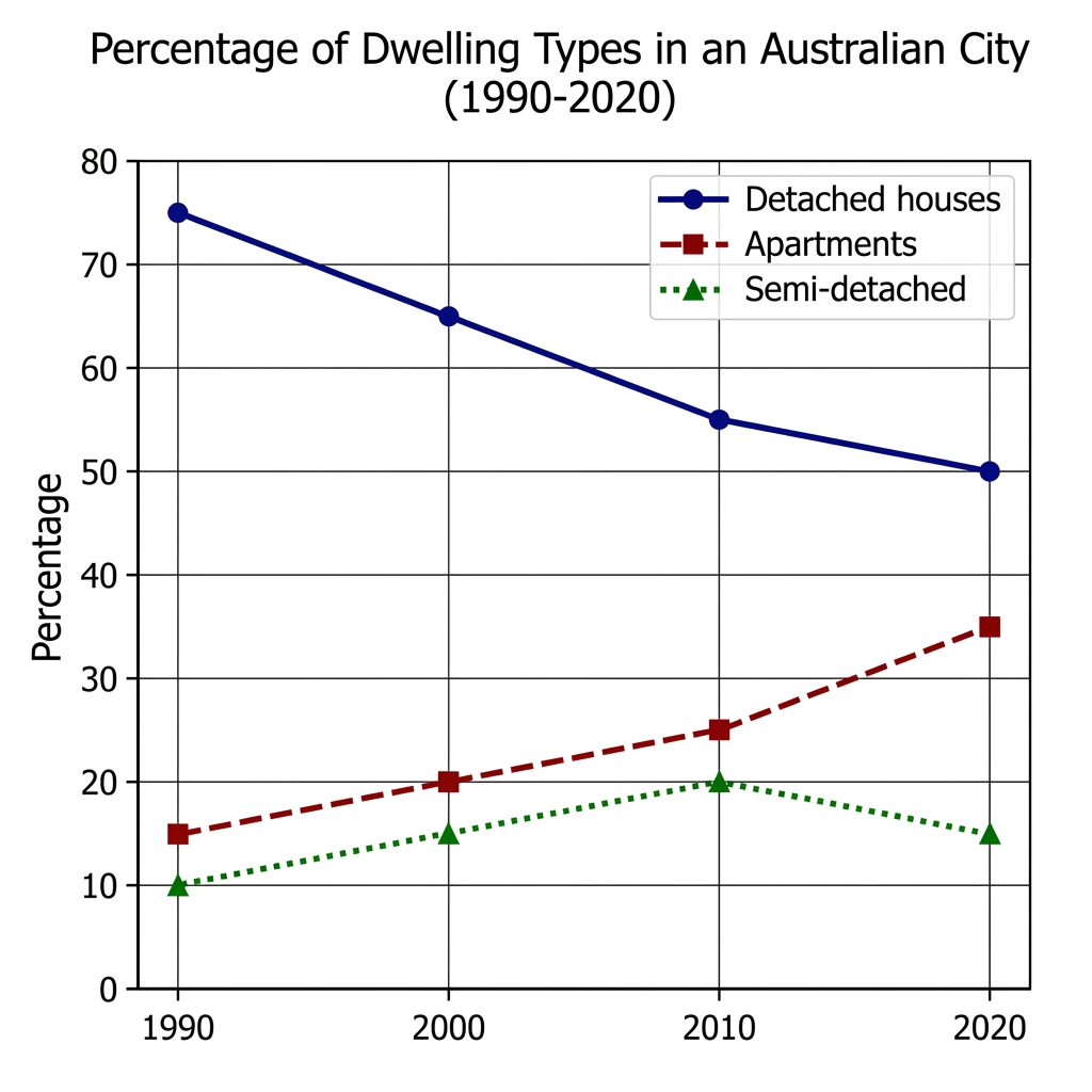
Prompt: The graph below shows the percentage of different dwelling types in an Australian city between 1990 and 2020.
Example Answer:
The line graph compares the percentage of an Australian city's population living in three types of dwelling, detached houses, apartments, and semi-detached houses, between 1990 and 2020.
On the whole, the share of detached houses fell sharply over the period, while apartments more than doubled. Semi-detached houses grew modestly before slipping back, leaving the city with a far more diverse housing mix in 2020 than in 1990.
Detached houses dominated throughout but lost ground steadily, falling from 75% in 1990 to 65% in 2000, 55% in 2010, and 50% by 2020. Despite the decline, detached houses remained the single most common dwelling type at the end of the period, accounting for half of the city's housing.
Apartments showed the opposite pattern, more than doubling their share from 15% in 1990 to 20% in 2000, 25% in 2010, and 35% by 2020, narrowing the gap with detached houses substantially. Semi-detached houses began at 10% in 1990, edged up to 15% in 2000 and peaked at 20% in 2010, before falling back to 15% by 2020.
Question 9
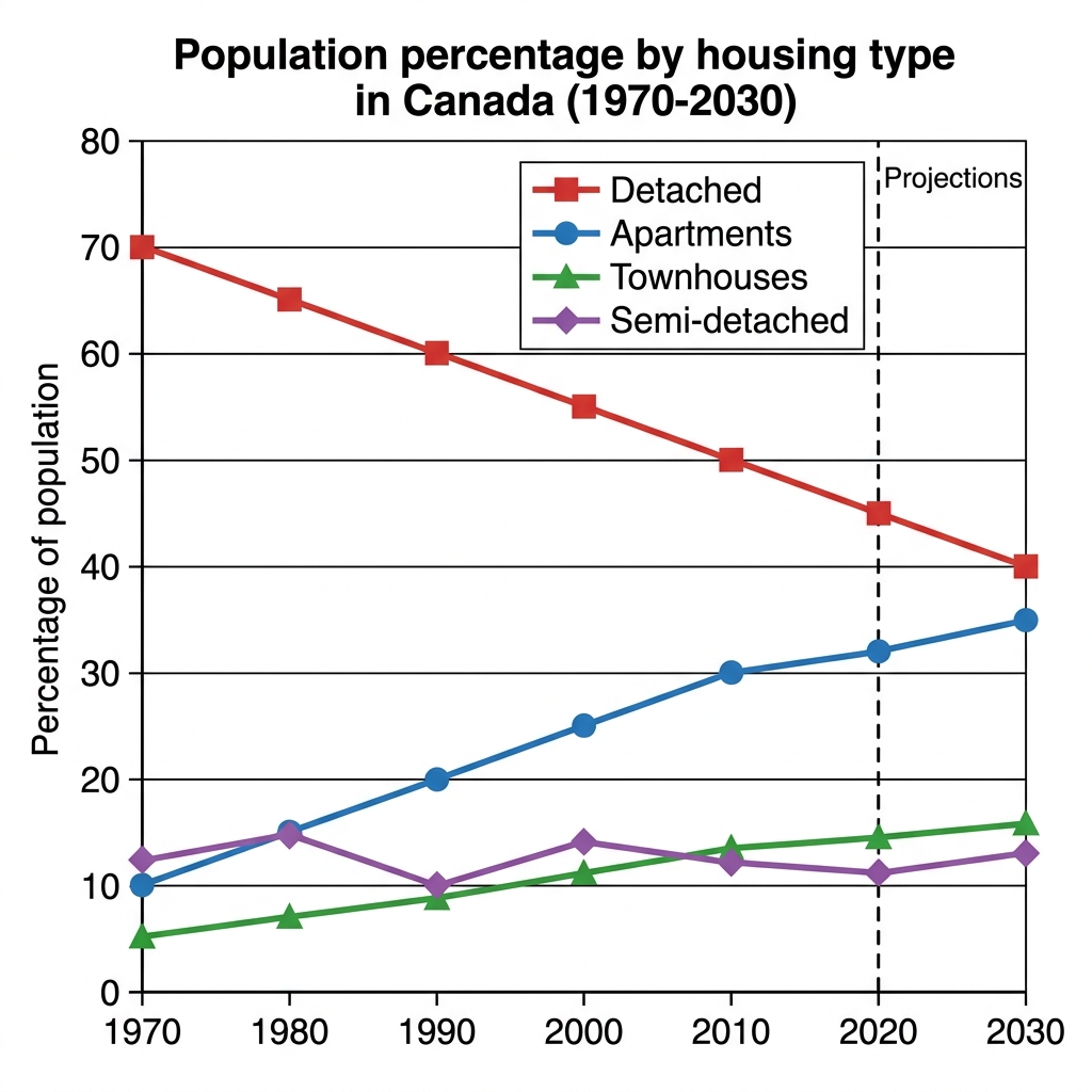
Prompt: The graph below shows the percentage of the population living in four different types of housing in Canada from 1970 to 2020, with projections to 2030.
Example Answer:
The line graph compares the percentage of Canada's population living in four types of housing, detached, apartments, townhouses, and semi-detached, between 1970 and 2030, with projections from 2020 onwards.
In broad terms, the share of detached housing fell steadily over the period, while apartments rose just as steadily. Townhouses grew modestly, and the share of semi-detached housing remained broadly flat throughout.
Detached housing was the dominant type throughout but lost ground in every decade, falling from 70% in 1970 to 60% in 1990, 50% in 2010, and a projected 40% by 2030. Apartments showed the opposite pattern, rising from 10% in 1970 to 20% in 1990 and 30% in 2010, with a projection of 35% by 2030.
Townhouses and semi-detached housing accounted for smaller shares of the population. Townhouses grew gradually, from 5% in 1970 to around 9% in 1990 and 13% in 2010, with a projected 16% by 2030. Semi-detached housing fluctuated between roughly 10% and 15% throughout, beginning at 12% in 1970 and ending at a projected 13% in 2030.
Question 10
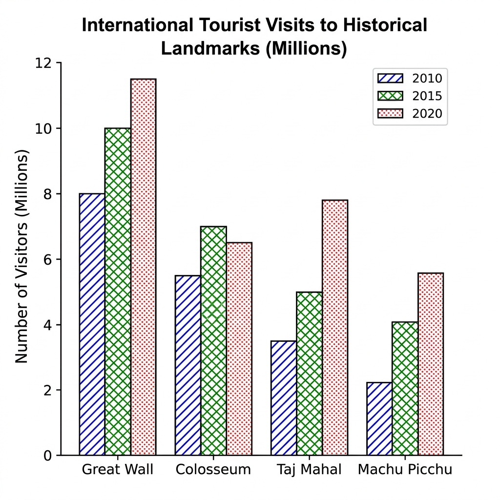
Prompt: The chart below shows the number of international tourists visiting four historical landmarks in a European country in three different years (2010, 2015, and 2020).
Example Answer:
The bar chart compares international tourist visits, in millions, to four historical landmarks (the Great Wall, the Colosseum, the Taj Mahal, and Machu Picchu) across 2010, 2015, and 2020.
Overall, three of the four landmarks attracted more visitors over the decade, with the Taj Mahal showing the most dramatic growth. The Great Wall remained the most visited site throughout, while Machu Picchu received the fewest visitors in every year.
The Great Wall was the leading attraction across all three years, drawing 8 million visitors in 2010, 10 million in 2015, and 11.5 million in 2020. The Colosseum recorded the second-highest figures in the first two years, rising from 5.5 million in 2010 to 7 million in 2015, before slipping back to 6.5 million in 2020.
The Taj Mahal showed the strongest growth, more than doubling its visitors from 3.5 million in 2010 to 5 million in 2015 and 7.8 million in 2020, overtaking the Colosseum to become the second most visited site. Machu Picchu remained the smallest attraction, climbing steadily from 2.2 million in 2010 to 4.1 million in 2015 and 5.6 million by 2020.
Question 11
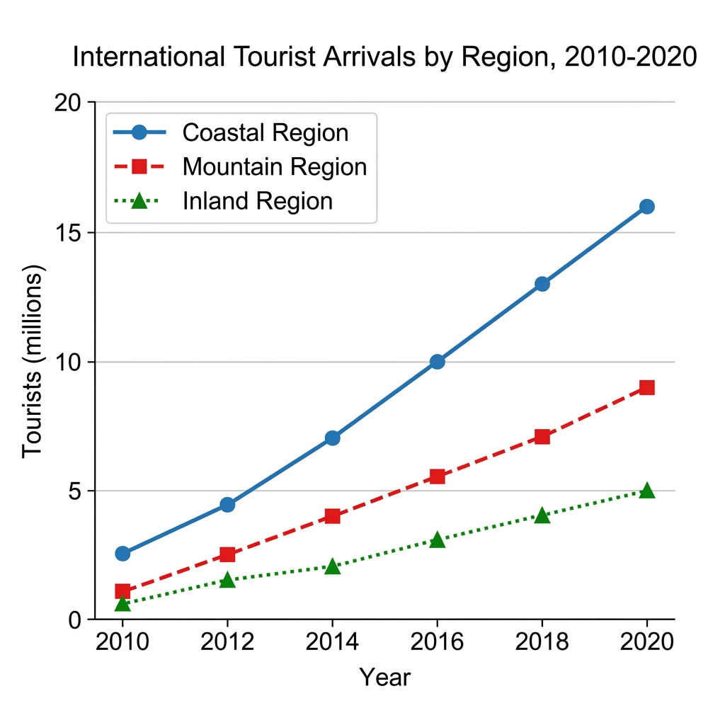
Prompt: The line graph below shows the number of international tourist arrivals to three distinct regions of a country between 2010 and 2020.
Example Answer:
The line graph compares the number of international tourist arrivals, in millions, to three regions (coastal, mountain, and inland) between 2010 and 2020.
Overall, all three regions saw rising tourist numbers across the decade, but the coastal region grew far more rapidly than the other two. By 2020, the gap between the leader and the trailing regions had widened substantially.
The coastal region was the most popular destination throughout. Arrivals stood at 2.5 million in 2010 and grew steadily, reaching 4.5 million by 2012, 7 million by 2014, and 10 million by 2016. Growth then accelerated, with figures climbing to 13 million in 2018 and 16 million by 2020, more than six times the 2010 level.
The mountain and inland regions also grew but at a more measured pace. The mountain region rose from 1 million in 2010 to 4 million in 2014 and 9 million by 2020. The inland region remained the smallest of the three, increasing gradually from just 0.5 million in 2010 to 2 million in 2014 and 5 million by 2020.
Question 12
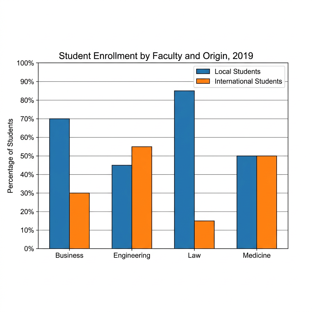
Prompt: The bar chart below shows the percentage of local and international students enrolled in four different faculties at a Canadian university in the year 2019.
Example Answer:
The bar chart compares the percentage of local and international students enrolled in four faculties, business, engineering, law, and medicine, in 2019.
Broadly speaking, local students made up the majority of enrolment in business and law, while international students were in the majority in engineering. Medicine attracted equal numbers of both groups, making it the most internationally balanced faculty of the four.
Law was the most heavily skewed towards local students, with local enrolment at 85% and international students accounting for just 15%. Business showed a similar but less extreme pattern, with 70% of students from local backgrounds and 30% from international ones. In both faculties, local students clearly dominated.
Engineering was the only faculty with an international majority. Local students made up 45% of enrolment, while international students accounted for 55%, the highest international share in the chart. Medicine, by contrast, was the most evenly split of the four, with local and international students each representing exactly 50% of enrolment, making it the most internationally balanced faculty.
Question 13
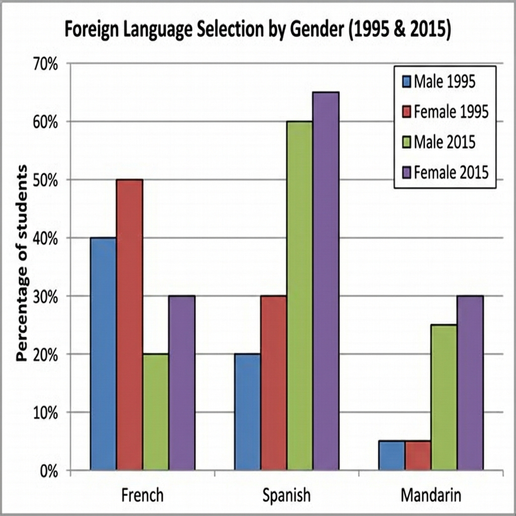
Prompt: The provided bar graph displays the proportion of male and female students choosing to study three different foreign languages in a particular high school in 1995 and 2015.
Example Answer:
The bar chart compares the percentage of male and female students choosing to study French, Spanish, and Mandarin as a foreign language in 1995 and 2015.
On the whole, French became substantially less popular over the 20-year period, while Spanish and Mandarin both saw significant increases in selection. Female students consistently chose foreign languages at higher rates than male students in both years across all three languages.
French was the most chosen language in 1995, with 40% of male students and 50% of female students selecting it. By 2015, however, both figures had halved, falling to 20% of males and 30% of females, marking a sharp decline in French's popularity. Female students continued to outnumber males in both years.
Spanish and Mandarin both grew substantially. Spanish rose from 20% of males and 30% of females in 1995 to 60% and 65% respectively in 2015, becoming by far the most popular language. Mandarin saw the most dramatic relative growth, climbing from just 5% for both genders in 1995 to 25% of males and 30% of females by 2015.
Question 14
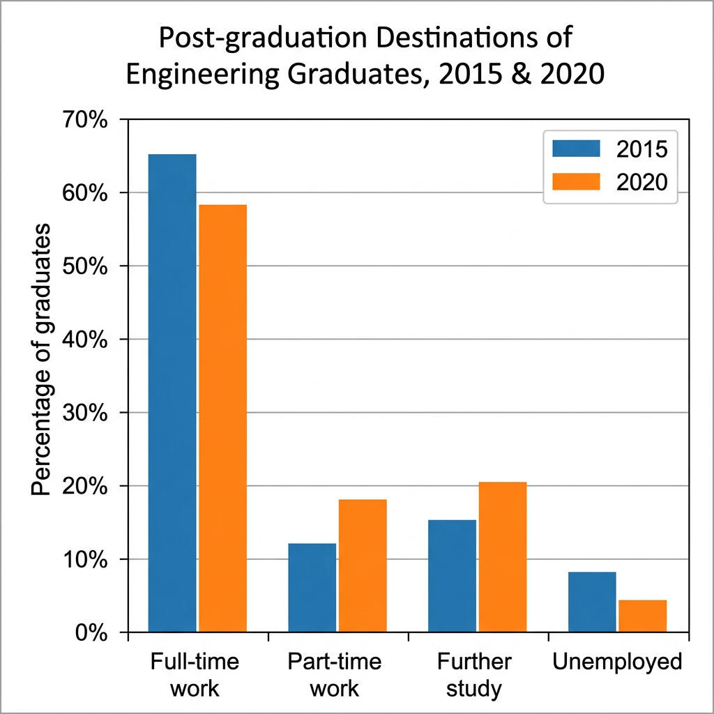
Prompt: The chart below shows the primary post-graduation destinations of engineering graduates from a university in Australia in 2015 and 2020.
Example Answer:
The bar chart compares the percentage of engineering graduates entering four post-graduation destinations, full-time work, part-time work, further study, and unemployment, in 2015 and 2020.
In broad terms, full-time work was the most common destination in both years, although its share fell over the period. Part-time work and further study both rose, while the unemployment rate halved, suggesting an overall shift away from immediate full-time employment toward more varied outcomes.
Full-time work was the dominant destination in both years, but its share fell from 65% in 2015 to 58% in 2020, a decrease of around seven percentage points. Even after this decline, full-time employment still accounted for well over half of all engineering graduates and remained the clear majority outcome.
The other three destinations all saw notable shifts. Part-time work increased from 12% to 18%, and further study rose from 15% to 20%, suggesting that more graduates were either working flexibly or pursuing additional qualifications. Unemployment fell from 8% to 4%, halving over the five-year period, the smallest category in both years.
Question 15
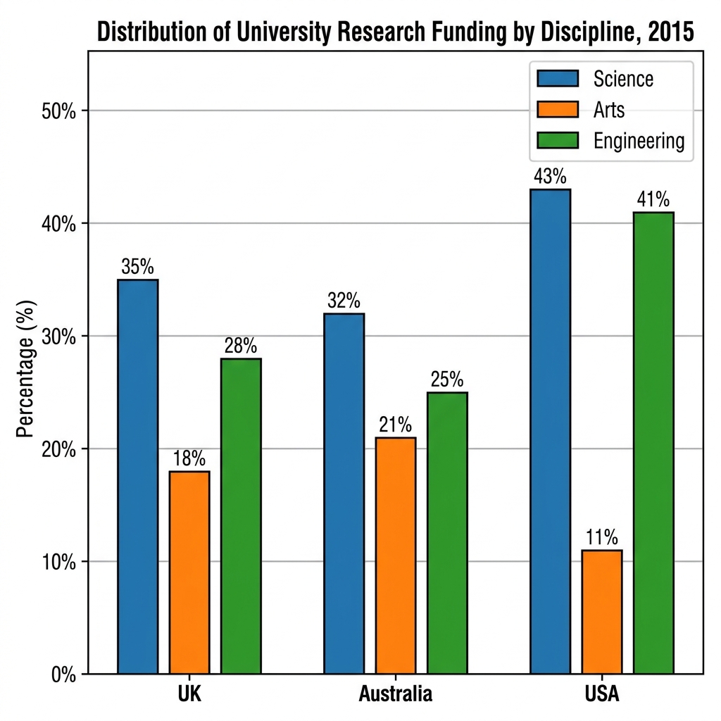
Prompt: The chart below shows the percentage of total university research funding distributed across four different academic disciplines in three countries in 2015.
Example Answer:
The bar chart compares the distribution of university research funding across three disciplines, science, arts, and engineering, in the UK, Australia, and the USA in 2015.
Looking at the chart as a whole, science attracted the largest share of research funding in all three countries, while arts received the smallest share everywhere. The USA showed the most uneven distribution, with science and engineering both well above 40% and arts at just 11%.
In the UK, science received the largest share of funding at 35%, followed by engineering at 28% and arts at 18%. Australia showed a similar but slightly less science-dominated pattern, with science at 32%, arts at 21%, and engineering at 25%, leaving the three disciplines relatively close together compared with the other two countries.
The USA had the most extreme distribution of the three. Science attracted 43% of research funding, narrowly ahead of engineering at 41%, while arts received only 11%. The combined science and engineering share in the USA was therefore around 84%, well above the equivalent figure in either the UK or Australia.
Question 16
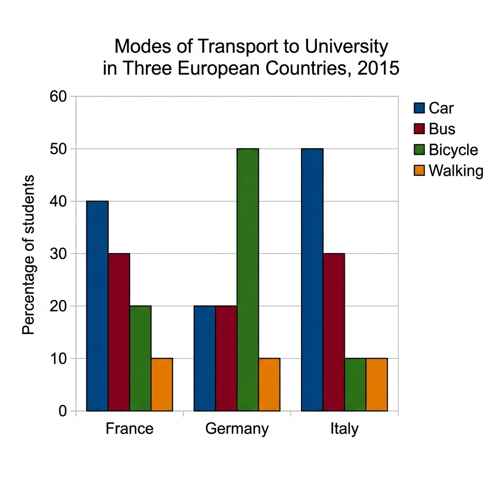
Prompt: The bar chart below shows the percentage of students using different modes of transport to travel to university in three European countries in 2015.
Example Answer:
The bar chart compares the percentages of students using four modes of transport (car, bus, bicycle, and walking) to travel to university in three European countries, France, Germany, and Italy, in 2015.
Overall, the car was the most common mode of travel in France and Italy, while German students were far more likely to cycle than students in either of the other countries. Walking was the least used mode in all three countries.
In France, 40% of students travelled to university by car, with 30% using the bus, 20% cycling, and 10% walking. Italy showed the heaviest car use, with car accounting for 50% of trips, followed by bus at 30% and 10% each for bicycle and walking. The two countries showed a similar reliance on motor transport.
Germany stood out as a clear contrast. Bicycle was the dominant mode at 50%, while car and bus each accounted for 20% of journeys, and walking made up the remaining 10%. Cycling in Germany was therefore more than twice as common as in France and five times as common as in Italy.
Question 17
Prompt: The chart below shows the percentage of male and female adults using different modes of transport for their daily commute in a specific city in 2015.
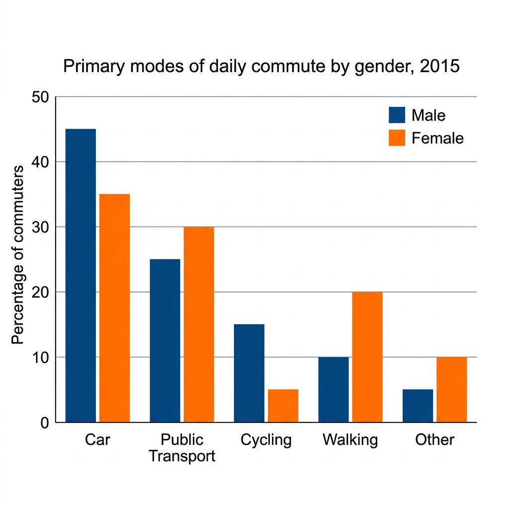
Example Answer:
The bar chart compares the percentages of male and female commuters using five primary modes of daily commute, car, public transport, cycling, walking, and other, in 2015.
Broadly speaking, car was the most common mode for both genders, although a smaller share of women drove than men. Women were more likely than men to use public transport and to walk, while men cycled at three times the female rate.
Car was the dominant mode of commute for both groups, with 45% of men and 35% of women travelling by car. Public transport was the second most common mode for both genders, used by 25% of men and 30% of women, making it the only category outside of walking and other where the female share was higher than the male share.
The remaining categories showed sharper gender differences. Cycling accounted for 15% of male commutes but only 5% of female commutes, the largest gender gap in the chart. Walking was three times more common among women, at 20% versus 10% for men, while the other category was used by 5% of men and 10% of women.
Question 18
Prompt: The pie charts below show the average weekly spending by households in two different income groups in the UK in the year 2018.
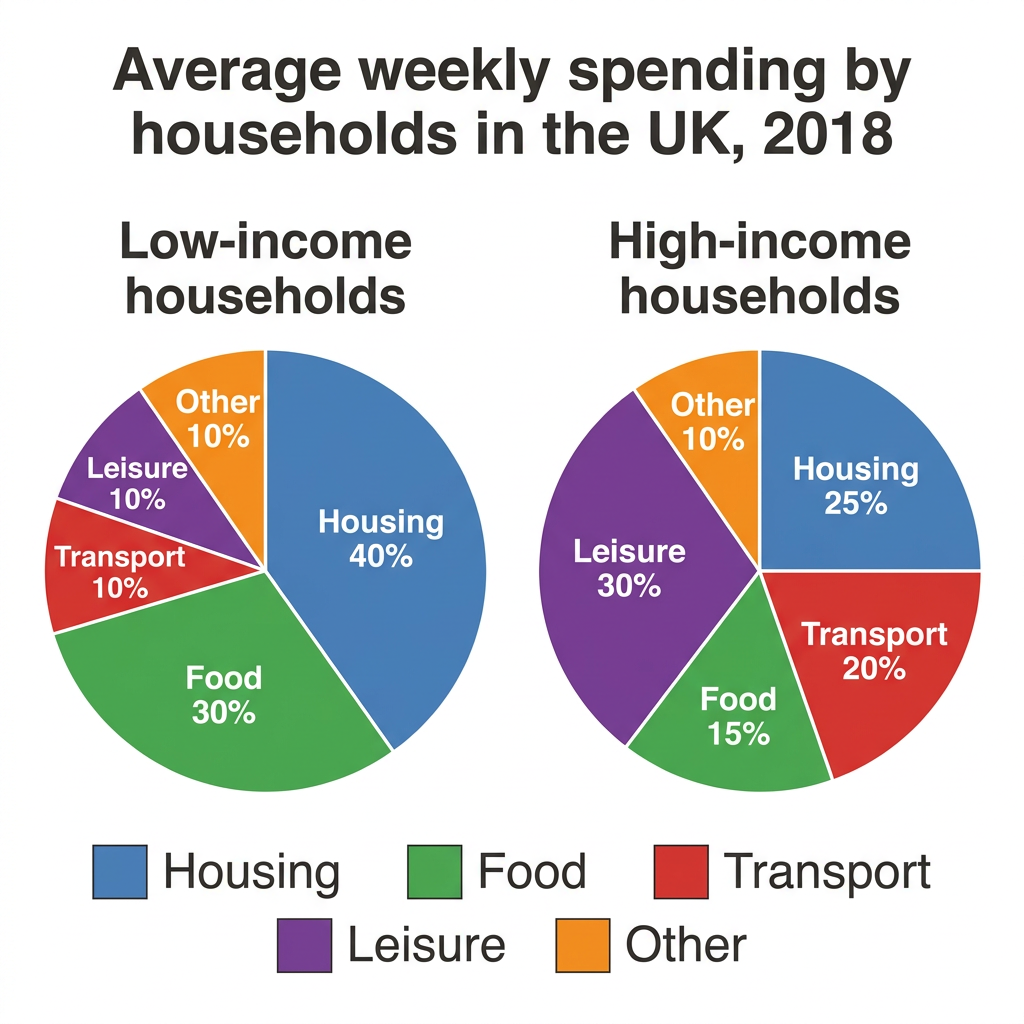
Example Answer:
The two pie charts compare the average weekly spending of low-income and high-income UK households across five categories (housing, food, transport, leisure, and other) in 2018.
On the whole, low-income households devoted a much larger share of their spending to housing and food, while high-income households allocated significantly more to leisure and transport. The other category accounted for the same share in both groups.
Housing was the largest expense for low-income households, accounting for 40% of weekly spending, compared with just 25% in high-income households. Food was the second largest item for the low-income group at 30%, twice the 15% spent by high-income households. Together, housing and food therefore made up 70% of low-income spending but only 40% of high-income spending.
High-income households spent a much greater share on discretionary categories. Leisure made up 30% of high-income spending but only 10% of low-income spending, the single largest gap between the two groups. Transport accounted for 20% of high-income spending versus 10% for low-income households. The other category remained equal at 10% in both groups.
Question 19
Prompt: The line graph below shows the percentage of average household income spent on three different food categories in Japan from 1990 to 2020.
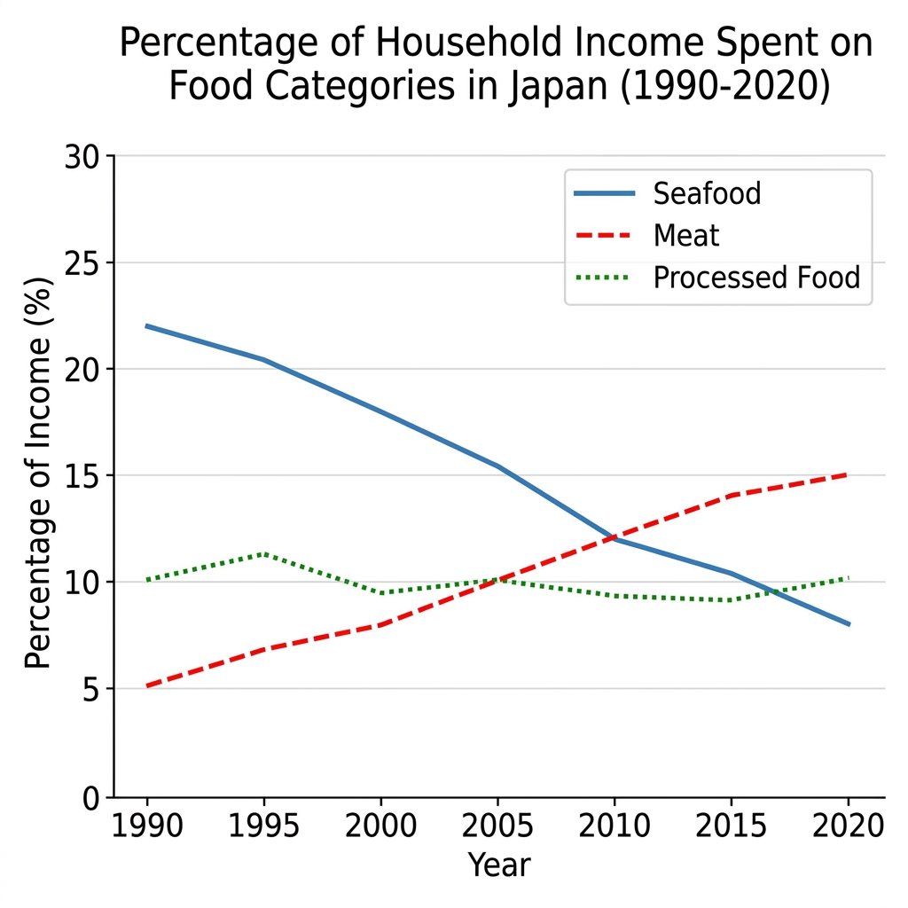
Example Answer:
The line graph compares the percentage of household income spent on three food categories, seafood, meat, and processed food, in Japan between 1990 and 2020.
In broad terms, seafood spending fell sharply across the period, while meat spending rose steadily, with the two categories crossing around 2010. Processed food spending remained broadly stable throughout, hovering near 10% across the entire 30-year period.
Seafood was the largest category in 1990, accounting for 22% of household food spending, but it declined steadily across the entire period. The figure fell to around 20% in 1995, 18% in 2000, and 15% in 2005, before continuing down to 12% in 2010, 10% in 2015, and just 8% by 2020. By the end of the period it was the smallest of the three categories.
Meat spending followed an almost mirror-image trajectory. It began at just 5% in 1990 and rose gradually to 7% in 1995, 8% in 2000, and 10% in 2005, where it briefly matched processed food. Meat then continued to rise to 12% in 2010 and 15% by 2020, overtaking seafood as the largest of the three categories.
Question 20
Prompt: The graph below shows the population figures of three different native bird species in New Zealand between 1990 and 2020.
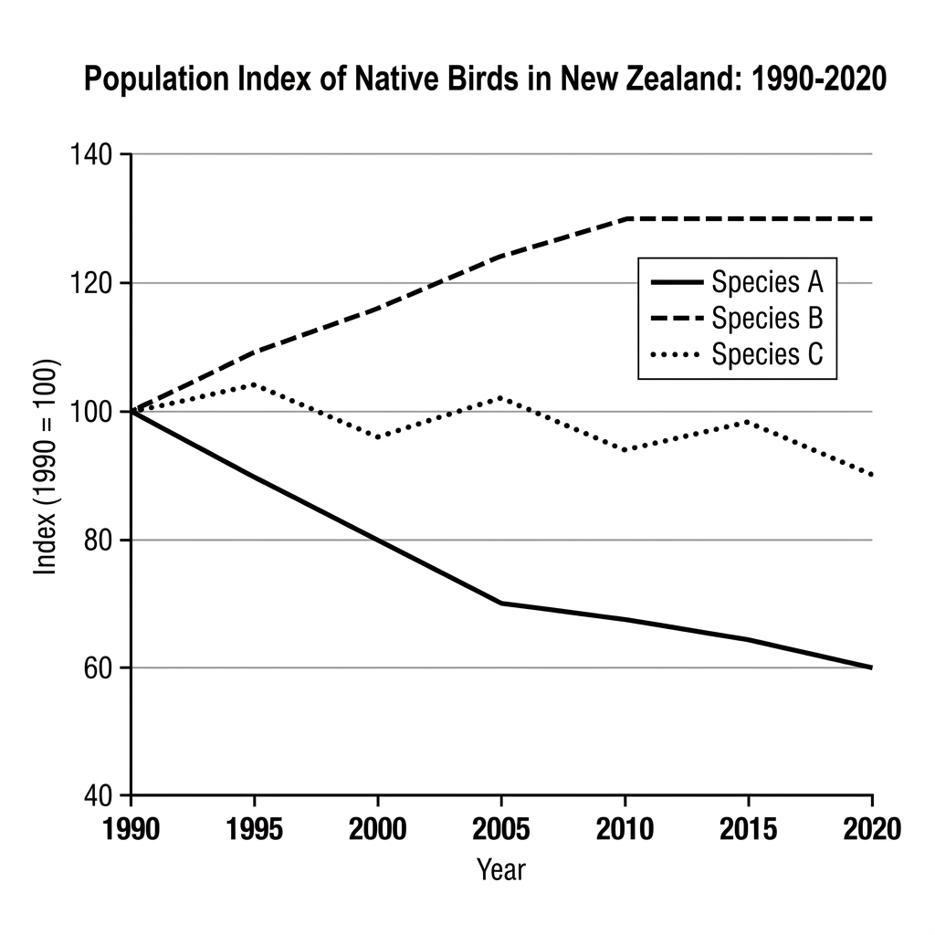
Example Answer:
The line graph shows the population index of three native bird species in New Zealand between 1990 and 2020, with 1990 set at 100 for each species.
Looking at the chart as a whole, the three species followed very different trajectories. Species B grew steadily, Species A declined sharply, and Species C fluctuated within a narrow band before ending slightly below its starting level.
Species A showed the most pronounced decline. Starting at the index of 100 in 1990, it fell steadily to 90 in 1995, 78 in 2000, and 70 in 2005. The decline then slowed but continued, reaching 65 in 2015 and finishing at 60 by 2020, a fall of 40% and the largest drop in the chart.
Species B followed the opposite path, growing from 100 in 1990 to 105 in 1995, 117 in 2000, and 125 in 2005, before reaching a peak of 130 in 2010 and then plateauing at that level for the remainder of the period. Species C was the most stable of the three, oscillating between roughly 95 and 105 throughout, before falling slightly to 90 by 2020.
Question 21
Prompt: The graph below shows global water consumption by three different sectors from 1900 to 2000, with projections until 2050.
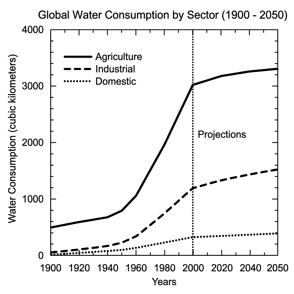
Example Answer:
The line graph compares global water consumption, in cubic kilometres, by three sectors (agriculture, industrial, and domestic) between 1900 and 2050, with figures from 2000 onwards shown as projections.
Overall, all three sectors saw rising water consumption across the period, with agriculture consistently the largest user by a wide margin. The industrial sector grew most rapidly in proportional terms, while domestic use remained the smallest throughout.
Agriculture dominated water consumption in every year. The figure rose modestly from around 500 km³ in 1900 to 700 km³ by 1940, before climbing more sharply to 2,000 km³ in 1980 and 3,000 km³ by 2000. Projections suggest a slower increase to around 3,300 km³ by 2050.
Industrial water use grew from a near-zero base of about 50 km³ in 1900, edging up gradually until 1940 before accelerating to 500 km³ by 1960, 1,000 km³ by 2000, and a projected 1,500 km³ by 2050. Domestic use remained the smallest sector throughout, rising slowly from 20 km³ in 1900 to 300 km³ by 2000 and a projected 400 km³ by 2050.
Question 22
Prompt: The chart below shows the percentage of adults in New Zealand who participated in four different outdoor activities in 2021, grouped by age.
Example Answer:
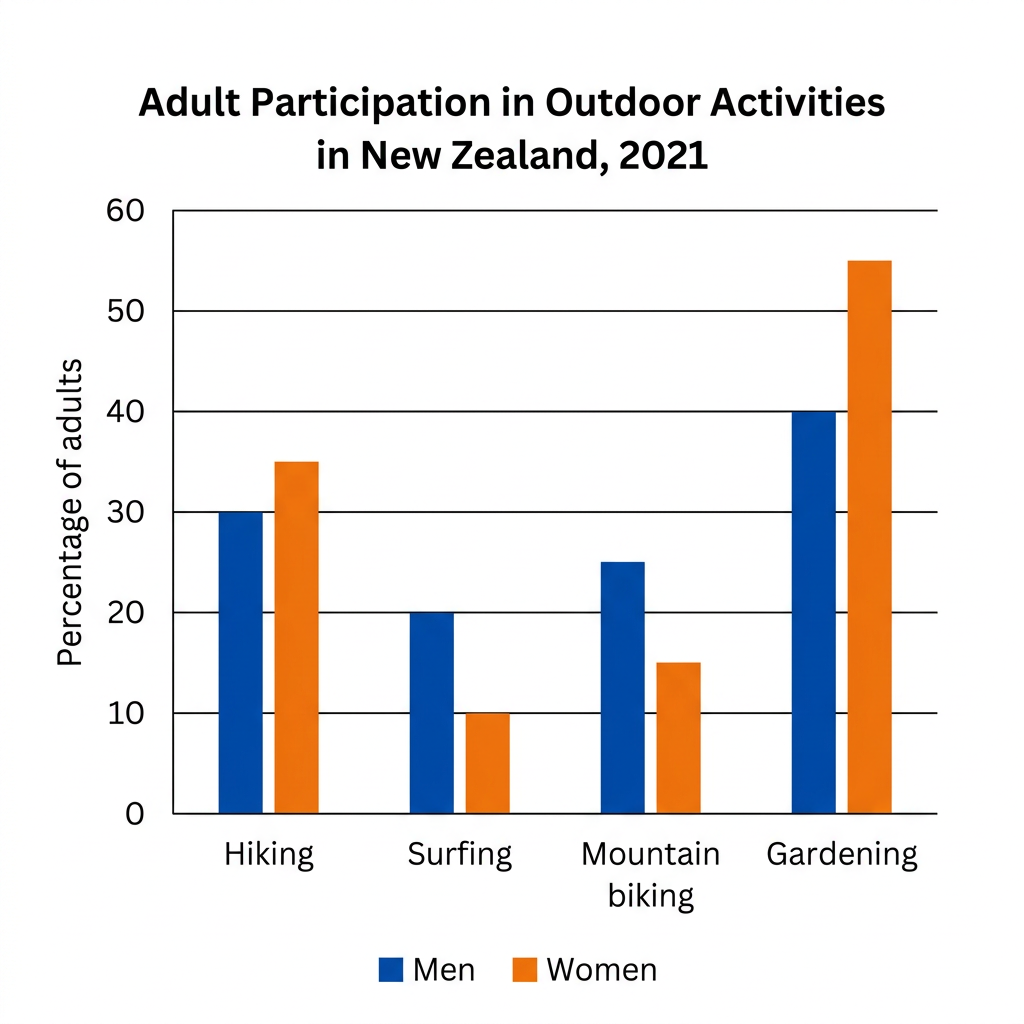
The bar chart compares the percentage of New Zealand men and women participating in four outdoor activities (hiking, surfing, mountain biking, and gardening) in 2021.
Broadly speaking, gardening was by far the most popular activity for both genders, while surfing attracted the lowest participation rates. Women had higher participation than men in hiking and gardening, while men were more active than women in surfing and mountain biking.
Hiking and gardening were both more popular among women than men. For hiking, the female participation rate of 35% was just five percentage points higher than the male rate of 30%. Gardening, the most popular activity in the chart, recorded a much wider gap, with 55% of women participating compared with 40% of men.
Surfing and mountain biking, by contrast, were dominated by men. Surfing had the lowest participation overall, with 20% of men and just 10% of women taking part, making it the only activity where the male rate was twice the female rate. Mountain biking attracted 25% of men and 15% of women, leaving men ahead by ten percentage points.
Question 23
Prompt: The line graph below gives information about the percentage of the population holding gym memberships in four different countries between 1990 and 2020.
Example Answer:
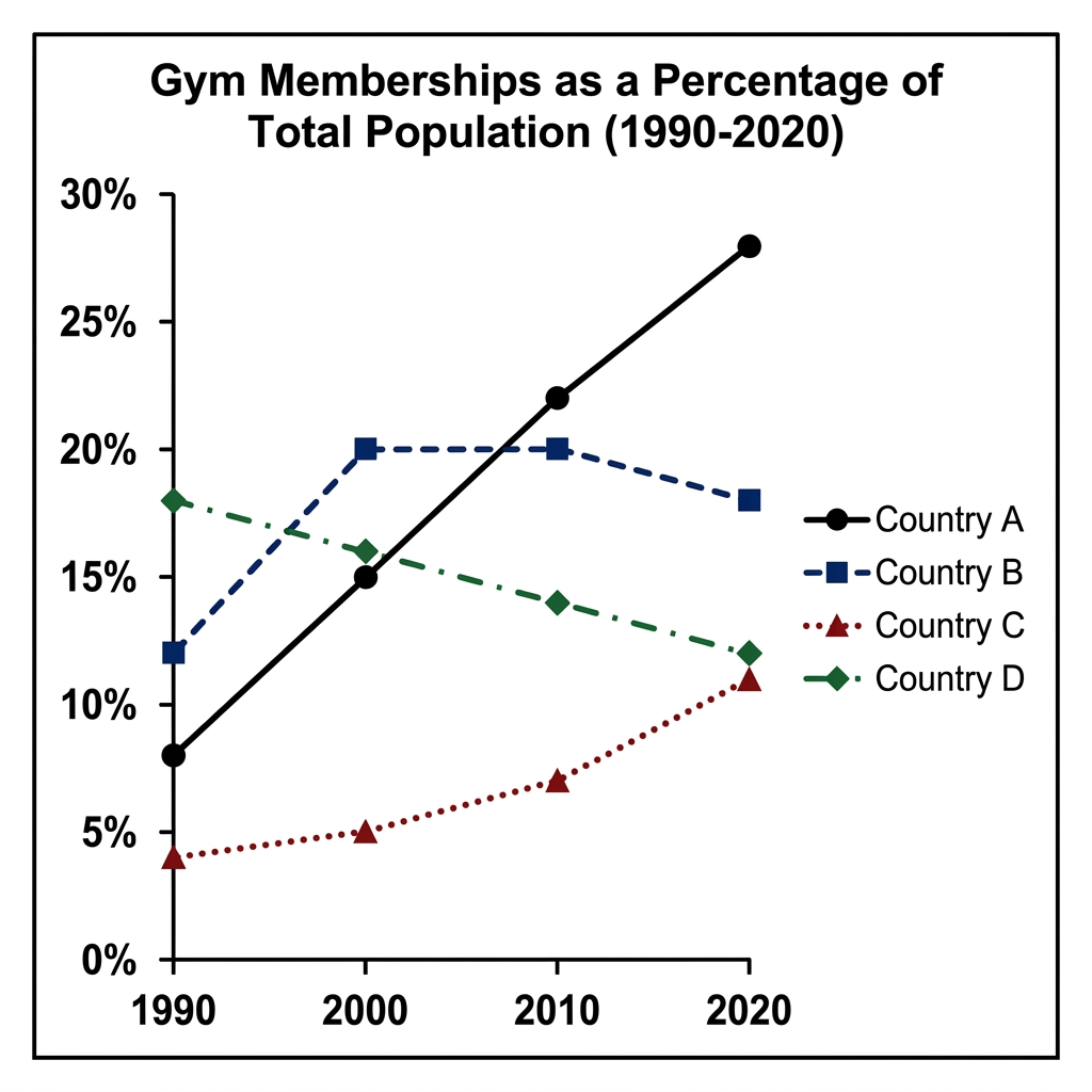
The line graph compares gym memberships as a percentage of the total population in four countries, labelled A to D, between 1990 and 2020.
On the whole, the four countries followed contrasting paths. Country A saw the most dramatic growth, climbing from the lowest level in 1990 to the highest by 2020. Country D moved in the opposite direction, while Countries B and C followed less extreme trajectories.
Country A showed by far the strongest growth. Beginning at just 8% in 1990, its membership rate rose to 15% in 2000, 22% in 2010, and 28% by 2020, more than tripling. Country C also grew, although much more modestly, from 4% in 1990 to 11% by 2020, ending the period as the lowest of the four.
Country B and Country D both peaked early and then declined. Country B rose from 12% in 1990 to a peak of 20% in 2000 and 2010, before easing back to 18% by 2020. Country D was the highest in 1990 at 18%, but its rate fell steadily to 16% by 2000, 14% by 2010, and 12% by 2020.
Question 24
Prompt: The chart below shows the percentage of households that owned smart home devices and electric vehicles in five European countries in 2022.
Example Answer:
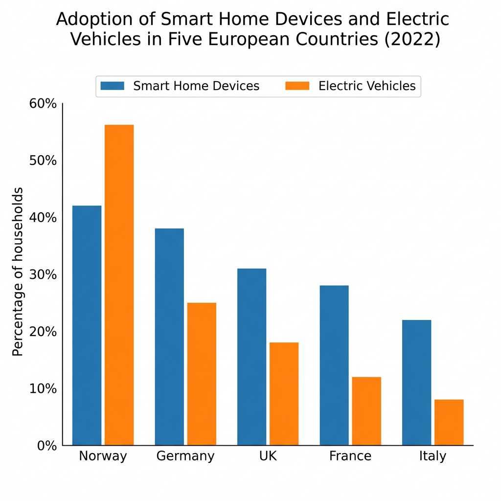
The bar chart compares the percentage of households in five European countries (Norway, Germany, the UK, France, and Italy) that had adopted smart home devices and electric vehicles in 2022.
In broad terms, Norway led both categories by a clear margin, while Italy recorded the lowest adoption in both. Smart home devices were more widely adopted than electric vehicles in every country except Norway, where the order was reversed.
Norway was the standout in both categories, with 56% of households owning an electric vehicle and 42% having adopted smart home devices. It was the only country in which electric vehicle adoption exceeded smart home device adoption, suggesting an unusually strong shift toward electric transport relative to home technology.
In the other four countries, smart home devices were ahead of electric vehicles. Germany recorded 38% smart home devices and 25% electric vehicles, followed by the UK at 31% and 18% respectively. France had figures of 28% and 12%, while Italy reported the lowest adoption rates in the chart, with 22% of households owning smart home devices and just 8% an electric vehicle.
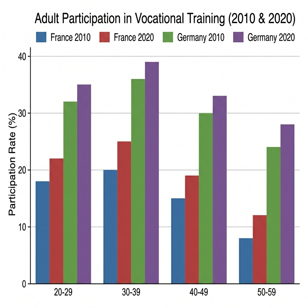
Question 25
Prompt: The bar chart below shows the percentage of adults who participated in vocational training across four different age groups in France and Germany in the years 2010 and 2020.
Example Answer:
The bar chart compares adult participation in vocational training in France and Germany across four age groups in 2010 and 2020.
Overall, participation rates rose across every age group in both countries. Germany consistently recorded much higher participation than France in every group and year, although both countries showed a similar age pattern, with the highest engagement among adults in their thirties.
Participation peaked in the 30 to 39 group in both countries. In France, this group rose from 20% in 2010 to 25% in 2020, while in Germany the corresponding figures were 36% and 39%, the highest in the chart. The 20 to 29 group followed closely behind, with France climbing from 18% to 22% and Germany from 32% to 35%.
Participation fell with age beyond 40, but the German lead remained substantial throughout. The 40 to 49 group recorded 15% to 19% in France versus 30% to 33% in Germany. The 50 to 59 group showed the lowest engagement in both countries, with France at 8% and 12% and Germany at 24% and 28%, still ahead of every French age group.
Question 26
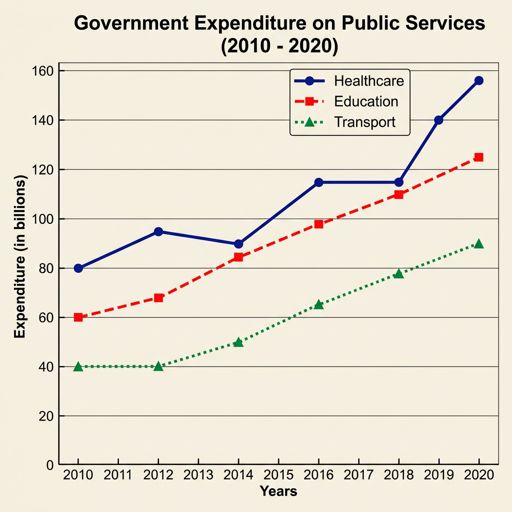
Prompt: The line graph below shows the total government expenditure on three public services (education, healthcare, and infrastructure) in millions of dollars in a specific country between 2010 and 2020.
Example Answer:
The line graph compares government expenditure, in billions, on three public services (healthcare, education, and transport) in a country between 2010 and 2020.
Overall, spending on all three services rose over the period, with healthcare consistently the largest expenditure category and transport the smallest. Healthcare also recorded the steepest absolute increase, almost doubling between 2010 and 2020.
Healthcare spending rose from 80 billion in 2010 to around 95 billion in 2012, before dipping slightly to 90 billion in 2014 and then climbing to 115 billion by 2016. Spending plateaued at 115 billion in 2018 before rising sharply to 140 billion in 2019 and 156 billion by 2020, almost doubling its 2010 figure.
Education and transport spending also grew steadily but at lower absolute levels. Education rose from 60 billion in 2010 to 85 billion in 2014, 110 billion in 2018, and 125 billion by 2020. Transport began the period at 40 billion, where it stayed until 2014, and then climbed gradually to 65 billion in 2016, 78 billion in 2018, and 90 billion by 2020.
Question 27
Prompt: The bar chart below shows the percentage of the workforce employed in agriculture in five different regions of the world in 1990, 2010, and projected figures for 2030.
Example Answer:
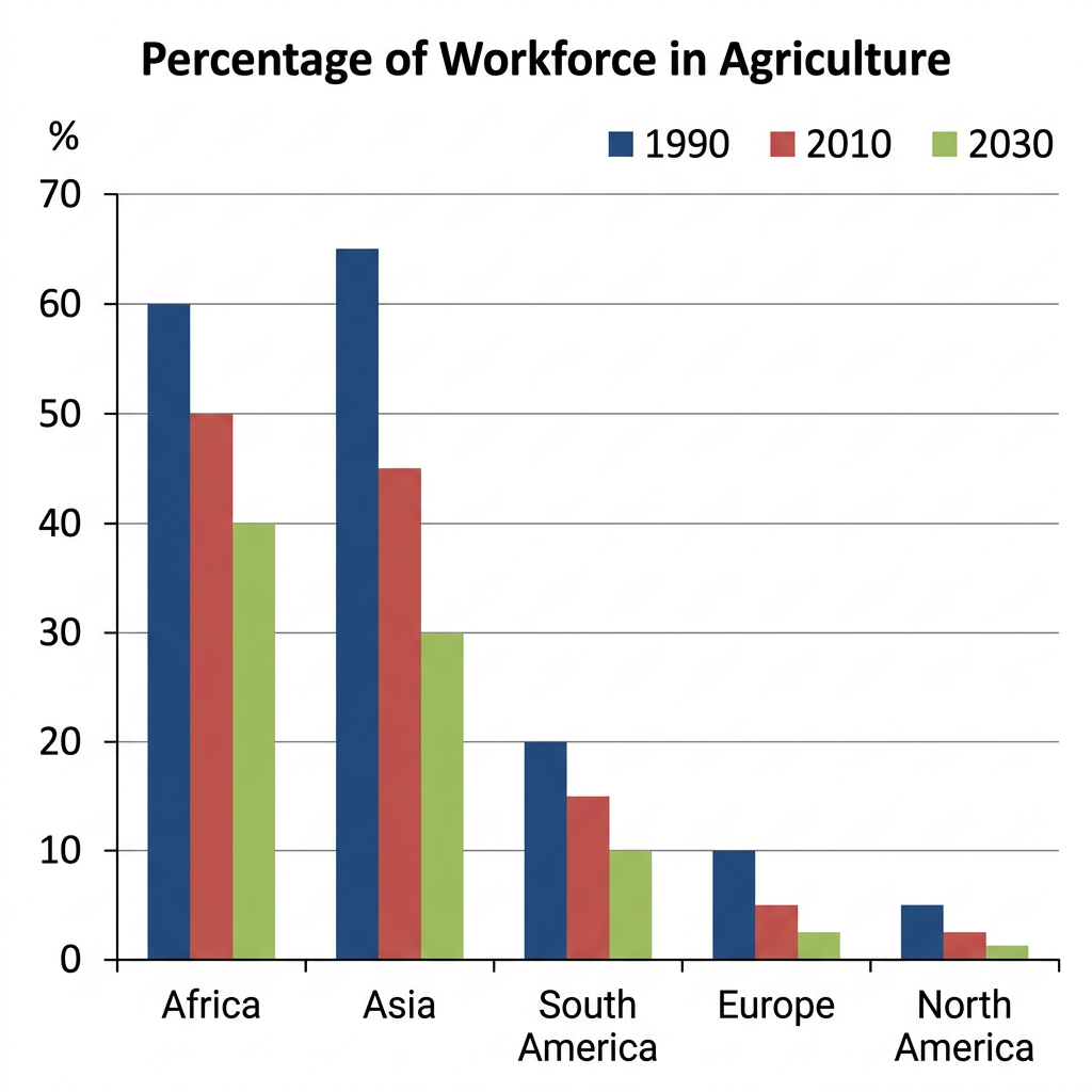
The bar chart compares the percentage of the workforce employed in agriculture in five world regions in 1990, 2010, and 2030.
Broadly speaking, the share of the workforce in agriculture is projected to fall in every region across the period. Africa and Asia consistently had by far the largest agricultural workforces, while North America had the smallest in every year.
Africa had the highest share of agricultural workers throughout. The figure stood at 60% in 1990, fell to 50% in 2010, and is projected to drop further to 40% by 2030. Asia followed a similar but steeper decline, falling from 65% in 1990, the highest single figure in the chart, to 45% in 2010, with a projected 30% by 2030.
The other three regions had much smaller agricultural workforces. South America fell from 20% in 1990 to 15% in 2010 and a projected 10% by 2030. Europe declined from 10% to 5% over the same period, with a projection of around 2.5% by 2030. North America had the smallest share throughout, falling from 5% in 1990 to a projected 1% by 2030.
Question 28
Prompt: The chart below shows the average weekly working hours for male and female employees in four different professions in Canada in 2021.
Example Answer:
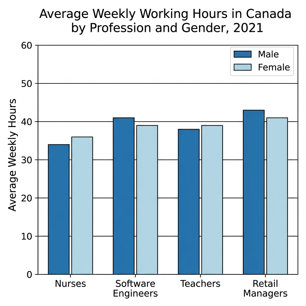
The bar chart compares the average weekly working hours of male and female workers in four professions (nurses, software engineers, teachers, and retail managers) in Canada in 2021.
Overall, working hours were broadly similar across the four professions, ranging from around 34 to 43 hours. Retail managers worked the longest hours and nurses the shortest. The pattern of male versus female hours varied by profession, with no consistent gender gap in either direction.
Retail managers worked the longest hours of the four professions, with male managers averaging 43 hours per week and female managers averaging 41 hours, the highest figures in the chart. Software engineers also worked above-average hours, with men at 41 hours and women at 39 hours. In both of these professions, men worked longer hours than women.
Nurses and teachers showed the opposite pattern. Female nurses averaged 36 hours per week, slightly above the male figure of 34 hours, the lowest in the chart. Female teachers averaged 39 hours per week compared with 38 hours for men. The differences in both professions were small, around one to two hours per week.
Question 29
Prompt: The chart below shows the main reasons why expatriates returned to their home country in 2020, based on the number of years they lived abroad.
Example Answer:
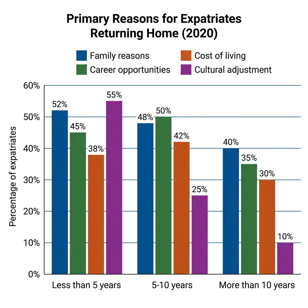
The bar chart compares the percentage of expatriates citing four primary reasons for returning home in 2020, broken down by length of time spent abroad.
In broad terms, the relative importance of the four reasons shifted significantly with time abroad. Cultural adjustment was the leading reason among recent arrivals but fell sharply over time, while family reasons remained important across all groups and cost of living grew in relative importance.
Among expatriates abroad for less than 5 years, cultural adjustment was the most-cited reason at 55%, narrowly ahead of family reasons at 52%, career opportunities at 45%, and cost of living at 38%. The four reasons were closely grouped, with all over a third of respondents.
For those abroad for 5 to 10 years, cultural adjustment fell to 25%, with family reasons leading at 48%, narrowly ahead of career opportunities at 50% and cost of living at 42%. Among expatriates abroad for more than 10 years, cultural adjustment dropped to just 10%, while family reasons remained the leading factor at 40%, followed by cost of living at 35% and career opportunities at 30%.
Question 30
Prompt: The provided bar graph illustrates the proportion of male and female teaching staff in six different educational settings in the UK in 2015.
Example Answer:
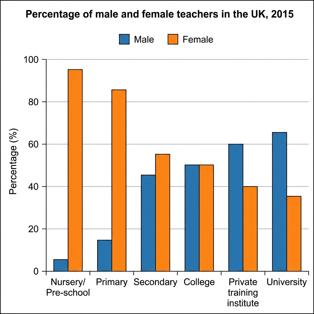
The bar chart compares the percentage of male and female teachers across six education stages (nursery/pre-school, primary, secondary, college, private training institute, and university) in the UK in 2015.
Overall, female teachers heavily outnumbered male teachers in the early stages of education, while male teachers were the majority at higher levels. The split was almost exactly equal at college, marking the crossover point between the two groups.
Women dominated the early stages of UK teaching. At nursery and pre-school level, 95% of teachers were female and just 5% were male, the most lopsided split in the chart. The pattern was similar at primary level, with 85% of teachers female and 15% male. Secondary education showed a much narrower gap, at 55% female versus 45% male.
From college onwards, the balance shifted in favour of male teachers. At college level, men and women were almost evenly represented, both at around 50%. At private training institutes, men accounted for 60% of teachers and women 40%, while in universities men accounted for 65% and women 35%, the highest male share in the chart.