30 IELTS Writing Task 1 (Mixed Visual) Practice Questions with Sample Answers
In this article, we will look at 30 practice IELTS Writing Task 1 prompts based on mixed visuals, with full sample answers. Writing Task 1 asks you to describe the information in at least 150 words, summarising the main features and making comparisons where relevant. Mixed visual prompts present two related diagrams or charts together, for example: a natural life cycle paired with a production process or two related data visuals (a pie chart and a table, a bar chart and a line graph). Each sample answer is written at a Band 7 level, the most common target for university and immigration applicants.
If you want the format, scoring rules, and strategies explained in depth, read our complete guide to IELTS Writing Task 1 first, then use the questions below to practice.
Question 1
Prompt: The diagrams below show the life cycle of a honeybee and the stages in commercial honey production.
Example Answer:
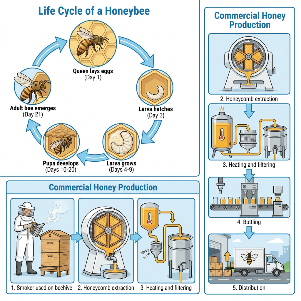
The diagrams illustrate two related processes: the life cycle of a honeybee from egg to adult, and the commercial process by which honey is produced for distribution.
Taken together, the two diagrams show that the honeybee life cycle is a circular process completing in approximately 21 days, while commercial honey production is a linear five-stage process from beehive to dispatch.
The life cycle of a honeybee begins when the queen lays eggs on day 1. By day 3, the eggs hatch into larvae, which grow rapidly between days 4 and 9. From day 10 to day 20, the larvae develop into pupae inside the honeycomb cells. Finally, on day 21, fully formed adult bees emerge, completing the cycle.
Commercial honey production consists of five steps. In stage 1, a beekeeper uses a smoker on the beehive. In stage 2, the honeycomb is collected and the honey is extracted by centrifuge. The extracted honey is then heated and filtered in stage 3, bottled in stage 4, and finally loaded onto a delivery vehicle in stage 5.
Question 2
Prompt: The diagrams below show the life cycle of a pearl oyster and the stages in the production of cultured pearls.
Example Answer:
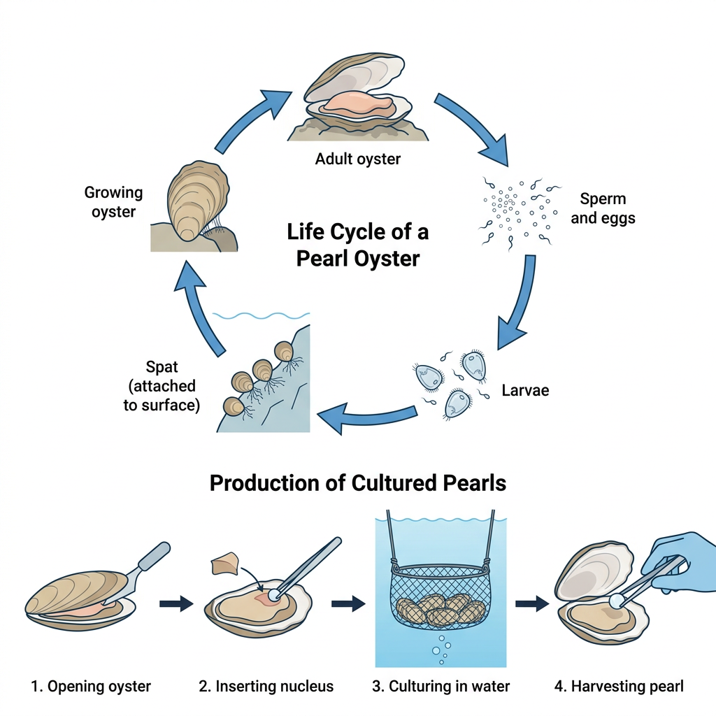
The diagrams illustrate two related processes: the natural life cycle of a pearl oyster, and the commercial process by which cultured pearls are produced from farmed oysters.
Looking at the two visuals as a whole, the oyster life cycle is a five-stage circular process ending with a new adult oyster, while cultured pearl production is a linear four-stage process ending with a harvested pearl.
The life cycle of a pearl oyster begins with an adult oyster releasing sperm and eggs into the water. The eggs hatch into free-swimming larvae, which drift through the sea before settling on a hard surface as spat. The spat then grows into a juvenile oyster, which gradually develops into an adult oyster, completing the cycle.
Cultured pearl production runs in four steps. In step 1, a worker opens a mature oyster shell. In step 2, a small spherical nucleus is inserted into the oyster. In step 3, the seeded oysters are placed in mesh baskets and cultured in the water of a pearl farm. In step 4, the finished pearl is harvested.
Question 3
Prompt: The diagrams below show the life cycle of the rubber tree and the stages in the production of natural rubber.
Example Answer:
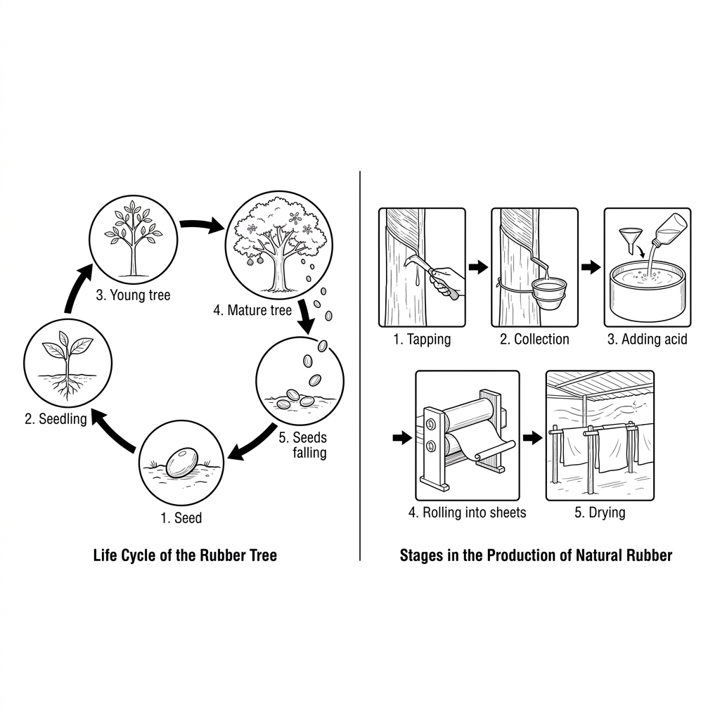
The diagrams illustrate two related processes: the life cycle of the rubber tree, and the stages involved in producing natural rubber from a mature tree.
Broadly speaking, the rubber tree life cycle is a five-stage circular process from seed back to seed, while natural rubber production is a linear five-stage process that turns latex into dried rubber sheets.
The life cycle of the rubber tree begins with a single seed in the soil, which germinates into a seedling. The seedling develops into a young tree, which matures into a flowering mature tree. The mature tree produces seeds, which fall to the ground and start the cycle again.
Natural rubber production begins with a tap being cut into the bark of a mature tree, allowing latex to drip out. In stage 2, the latex is collected from a small cup on the trunk. It is then poured into a basin and acid is added in stage 3 to coagulate it. The solid rubber is rolled into thin sheets in stage 4 and hung up to dry in stage 5.
Question 4
Prompt: The diagrams below show the life cycle of the flax plant and the stages in the production of linen cloth.
Example Answer:
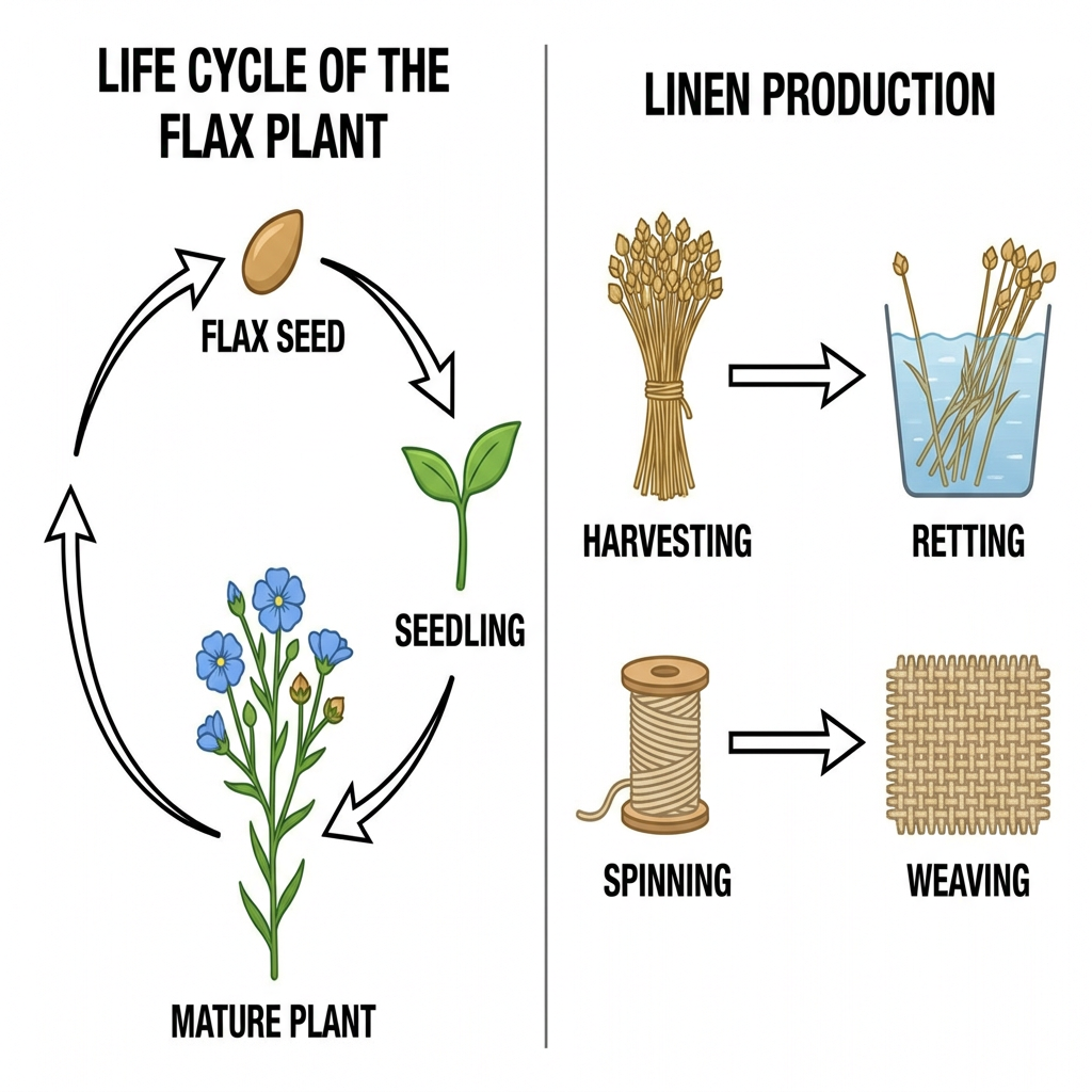
The diagrams illustrate two related processes: the life cycle of the flax plant from seed to mature flowering plant, and the stages involved in producing linen cloth from harvested flax.
On the whole, the flax plant life cycle is a simple three-stage circular process, while linen production is a linear four-stage process that converts harvested stalks into woven cloth.
The flax plant life cycle begins with a flax seed, which germinates into a small seedling with a pair of green leaves. The seedling then develops into a mature plant with blue flowers and woody stalks. After flowering, the plant produces new seeds that fall back to the ground, returning the cycle to the seed stage.
Linen production runs in four stages. In stage 1, the mature flax plants are harvested and gathered into bundles. In stage 2, the bundles are soaked in containers of water, a process known as retting, which loosens the fibres inside the stalks. The released fibres are spun onto bobbins of yarn in stage 3, and finally in stage 4 the yarn is woven into linen cloth.
Question 5
Prompt: The diagrams below show the life cycle of the Atlantic salmon and the stages in the production of smoked salmon.
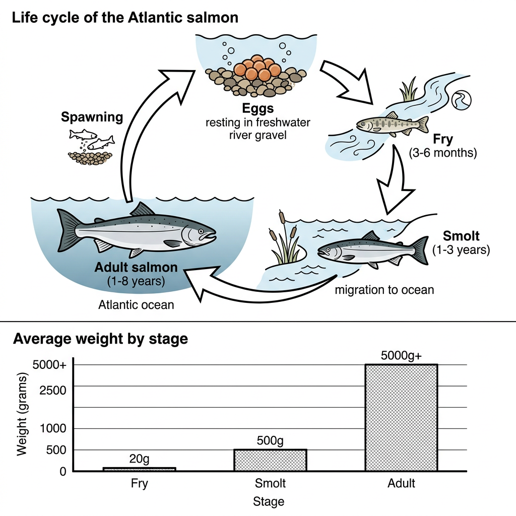
Example Answer:
The diagrams provide information about the Atlantic salmon: a life cycle across four developmental stages, and a bar chart of the average weight of the fish at three of those stages.
Across both visuals, the salmon's life cycle is a four-stage circular process between freshwater rivers and the open ocean, with the average weight rising dramatically as the fish progresses.
The life cycle begins with eggs laid in freshwater river gravel, which hatch into fry that remain in the river for 3 to 6 months. The fry then develop into smolt at 1 to 3 years and migrate downstream to the ocean. There, they grow into adult salmon over 1 to 8 years before spawning, after which the cycle returns to the egg stage.
The bar chart shows that the average weight of a salmon grows enormously through its development. At the fry stage, a salmon weighs only around 20 grams. By the smolt stage, the average has risen sharply to 500 grams, twenty-five times the earlier figure. By adulthood, the salmon reaches an average of over 5,000 grams, ten times its smolt weight.
Question 6
Prompt: The diagrams below show the life cycle of the cotton plant and the stages involved in the production of cotton cloth.
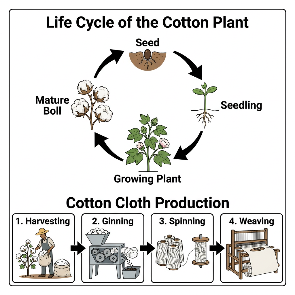
Example Answer:
The diagrams illustrate two related processes: the life cycle of the cotton plant from seed to mature boll, and the stages involved in producing cotton cloth from harvested cotton.
The two diagrams show that the cotton plant life cycle is a four-stage circular process, while cotton cloth production is a linear four-stage process that converts a harvested boll into woven fabric.
The cotton plant life cycle begins with a seed in the soil, which germinates and produces a young seedling. The seedling develops into a growing plant with green leaves and flowers, which then forms the mature boll, a white fibrous capsule containing fibres and new seeds. The mature boll opens and releases seeds that start the cycle again.
Cotton cloth production runs in four stages. In stage 1, the mature bolls are picked from the plant by hand. In stage 2, a ginning machine separates the cotton fibres from the seeds. The clean fibres are then spun in stage 3 onto bobbins of yarn, and finally in stage 4 the yarn is woven into long lengths of cotton cloth on a loom.
Question 7
Prompt: The diagrams below show the life cycle of the sunflower and the stages in the production of sunflower oil.
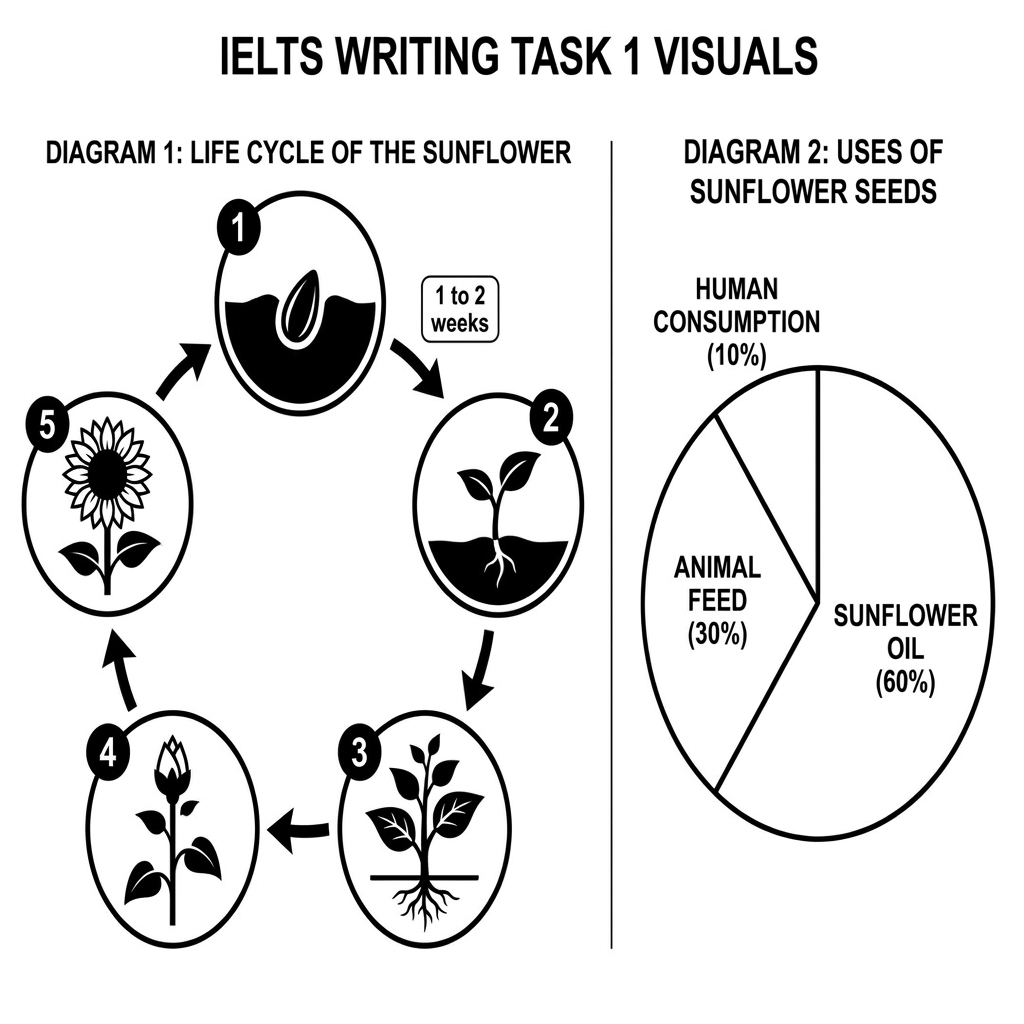
Example Answer:
The two diagrams provide information about the sunflower: a circular life cycle running across five stages, and a pie chart showing the proportions in which sunflower seeds are used.
In broad terms, the sunflower life cycle is a short cyclical process from seed to flower, while sunflower seeds are used mainly for oil, with smaller shares going to animal feed and human consumption.
The sunflower life cycle is shown as a five-stage circular process. It begins with a seed in the soil, which germinates within one to two weeks into a young seedling. The seedling grows into a maturing plant, which then forms a closed bud and finally a fully open sunflower in stage 5. Each open sunflower produces new seeds, returning the cycle.
The pie chart breaks down the uses of sunflower seeds into three categories. By far the largest share, 60%, is processed into sunflower oil. Animal feed accounts for the second largest portion, at 30%. The remaining 10%, the smallest share, is consumed directly by humans. Oil and animal feed together therefore account for 90% of all use.
Question 8
Prompt: The diagrams below show the life cycle of the alpaca and the stages in the production of alpaca wool garments.
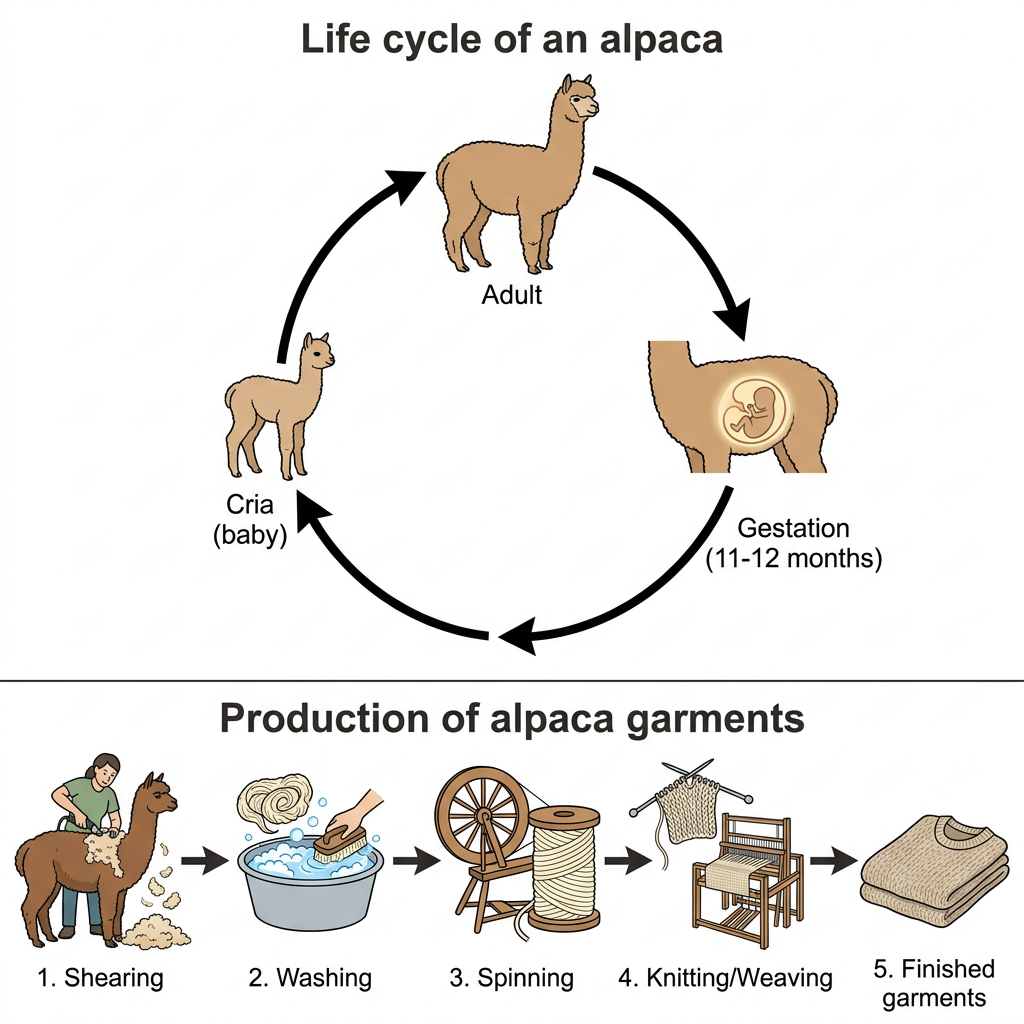
Example Answer:
The diagrams illustrate two related processes: the life cycle of the alpaca, and the stages involved in producing alpaca garments from the animal's wool.
Overall, the alpaca life cycle is a three-stage circular process built around a gestation period of 11 to 12 months, while garment production is a linear five-stage process that turns raw wool into finished clothing.
The life cycle of an alpaca begins with an adult animal. After mating, the female enters a gestation period lasting 11 to 12 months, after which she gives birth to a young alpaca, known as a cria. The cria grows into an adult, completing the cycle. The diagram presents this as a continuous loop with three named stages.
Alpaca garment production runs in five stages. In stage 1, the wool is cut from the adult alpaca. In stage 2, the wool is washed in a basin of water to remove dirt and grease. The wool is then spun into yarn in stage 3, knitted or woven into fabric in stage 4, and finally cut and sewn into finished garments in stage 5.
Question 9
Prompt: The diagrams below show the life cycle of the cochineal insect and the stages in the production of red food dye.
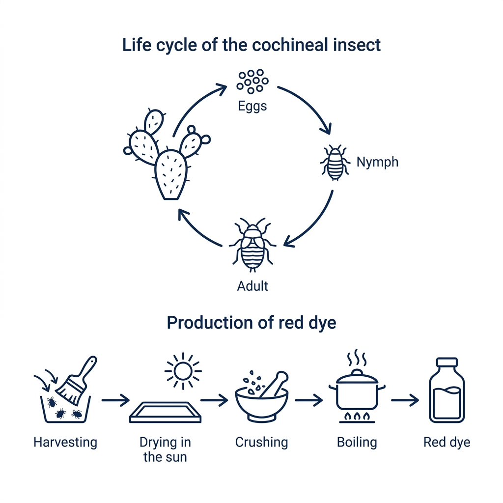
Example Answer:
The diagrams illustrate two related processes: the life cycle of the cochineal insect, and the stages involved in producing natural red dye from the harvested insects.
Taken together, the cochineal life cycle is a simple three-stage circular process on cacti, while red dye production is a linear five-stage process that turns the harvested insects into a finished bottle of dye.
The cochineal life cycle is shown as a three-stage cycle on a cactus pad. It begins with a cluster of small eggs, which hatch into nymphs. The nymphs develop on the cactus into adult insects, which produce new eggs and return the cycle to its starting point.
Red dye production runs in five stages. In stage 1, the adult insects are harvested from the cactus pads using a small brush. In stage 2, the harvested insects are dried in the sun. The dried insects are then crushed into a fine powder in stage 3, boiled in a pot of water in stage 4, and finally the resulting liquid is poured into a bottle as finished red dye.
Question 10
Prompt: The diagrams below show the life cycle of a coffee plant and the stages in the production of roasted coffee beans.
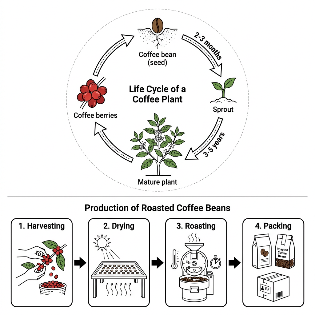
Example Answer:
The diagrams illustrate two related processes: the life cycle of a coffee plant from seed to mature plant, and the stages involved in producing roasted coffee beans from harvested berries.
Looking at the two visuals as a whole, the coffee plant life cycle is a four-stage circular process spanning several years, while bean production is a linear four-step process from picking the berries to packing the beans.
The coffee plant life cycle begins with a coffee bean, which acts as the seed. Within two to three months, the seed germinates into a sprout. The sprout then grows over three to five years into a mature plant. The mature plant produces clusters of coffee berries, which contain new beans and return the cycle to its starting point.
Roasted coffee bean production runs in four steps. In step 1, ripe berries are harvested by hand. In step 2, the berries are spread on a flat surface and dried under the sun. The dried beans are placed in a roaster in step 3 and heated. Finally, in step 4, the roasted beans are weighed and packed into bags.
Question 11
Prompt: The diagrams below show the life cycle of the cocoa tree and the stages in the production of chocolate.
Example Answer:
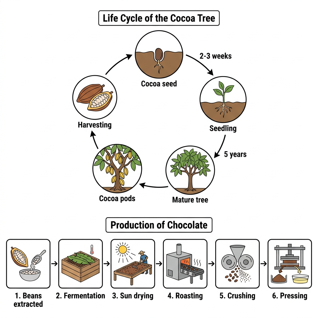
The diagrams illustrate two related processes: the life cycle of the cocoa tree, and the stages involved in producing chocolate from harvested cocoa beans.
Broadly speaking, the cocoa tree life cycle is a five-stage circular process taking several years from seed to fruiting tree, while chocolate production is a linear six-stage process that turns the harvested beans into cocoa mass.
The cocoa tree life cycle begins with a single cocoa seed in the soil. Within two to three weeks, the seed germinates into a seedling. Over the following five years, the seedling matures into a fruit-bearing cocoa tree. The mature tree produces cocoa pods, which are then harvested, releasing fresh seeds that start the cycle again.
Chocolate production runs in six stages. In stage 1, beans are extracted from the harvested pods. In stage 2, the beans are placed in wooden boxes for fermentation. In stage 3, the fermented beans are spread on racks and sun-dried. The dried beans are then roasted in stage 4, crushed into smaller pieces in stage 5, and finally pressed in stage 6 to extract cocoa mass for chocolate making.
Question 12
Prompt: The diagrams below show the life cycle of a sheep and the stages in the production of wool cloth.
Example Answer:
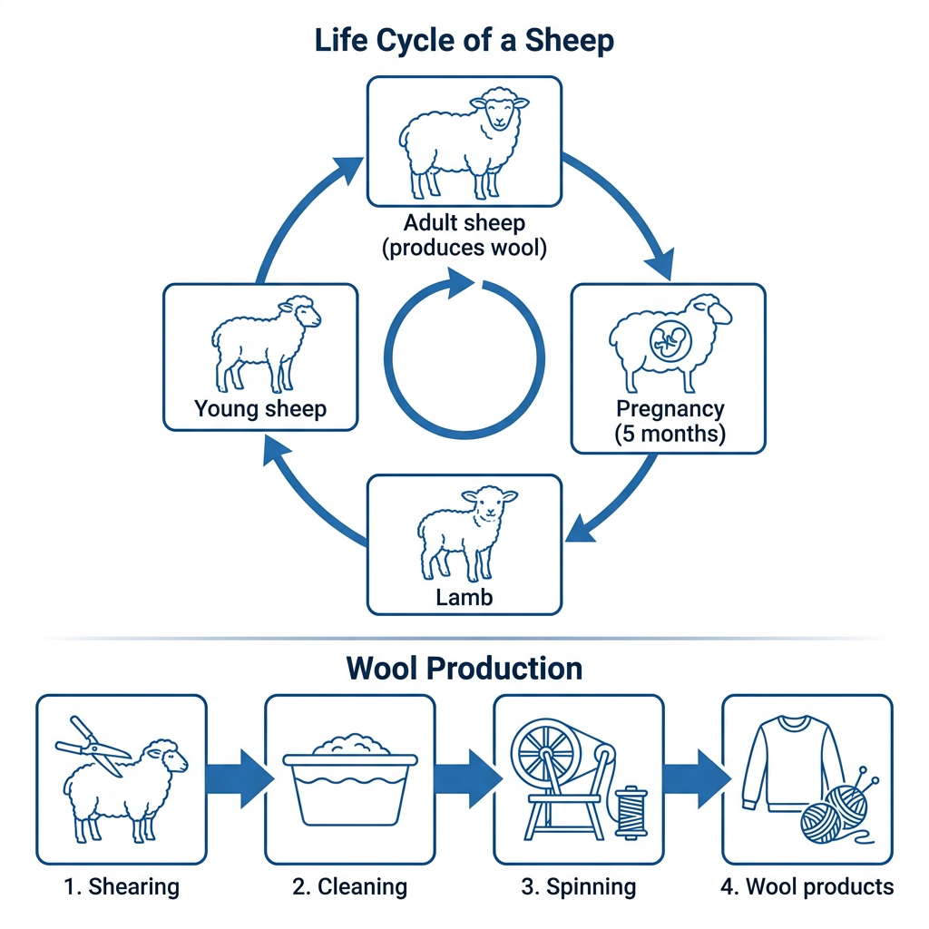
The diagrams illustrate two related processes: the life cycle of a sheep, and the stages involved in producing wool products from the animal's fleece.
On the whole, the sheep life cycle is a four-stage circular process structured around a five-month gestation period, while wool production is a linear four-stage process that turns raw fleece into finished wool products.
The life cycle of a sheep begins with an adult sheep, which produces wool. After mating, the ewe enters a pregnancy of around five months and then gives birth to a lamb. The lamb grows into a young sheep, which becomes an adult capable of producing wool, completing the cycle. The diagram presents this as a continuous loop.
Wool production consists of four stages. In stage 1, the fleece is cut from the adult sheep. In stage 2, the raw fleece is washed in a tub of water to remove dirt and lanolin. The clean fleece is then spun into yarn in stage 3, and finally in stage 4 the yarn is knitted into finished products such as jumpers, scarves, and balls of yarn.
Question 13
Prompt: The diagrams below show the life cycle of the Monterey pine tree and the stages involved in the production of paper.
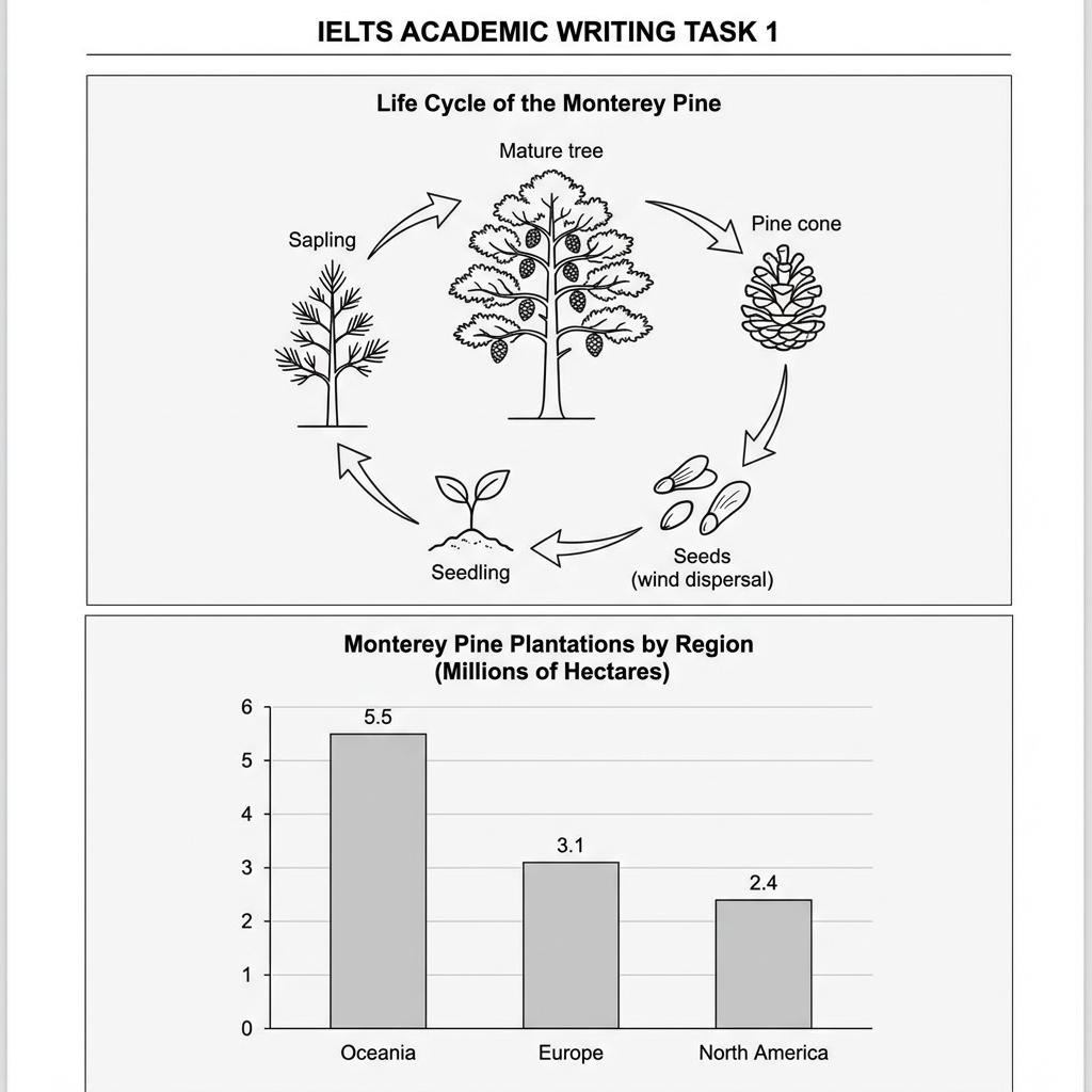
Example Answer:
The diagrams provide information about the Monterey pine: a circular life cycle of the tree itself, and a bar chart showing the size of Monterey pine plantations across three world regions in millions of hectares.
Across both visuals, the Monterey pine has a five-stage natural life cycle running from seedling back to seedling, while Oceania has by far the largest area of plantation, more than twice that of North America.
The Monterey pine life cycle is shown as a five-stage circular process. It begins with a small seedling, which grows into a thin sapling. The sapling then matures into a tall tree, which produces large pine cones. The cones release seeds that are scattered by the wind, which germinate as new seedlings to complete the cycle.
The bar chart compares plantation area in three world regions. Oceania has the largest area at 5.5 million hectares, well ahead of the others. Europe comes second with 3.1 million hectares, about 57% of Oceania's figure. North America has the smallest area at 2.4 million hectares, less than half of Oceania's total but only marginally lower than Europe.
Question 14
Prompt: The diagrams below show the life cycle of the olive tree and the stages in the production of olive oil.
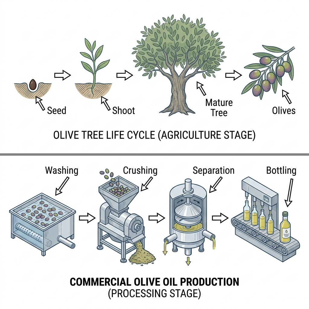
Example Answer:
The diagrams illustrate two related processes: the life cycle of the olive tree from seed to fruiting tree, and the commercial process by which the olives are converted into bottled olive oil.
The two diagrams show that the olive tree life cycle is a four-stage linear sequence from seed to mature tree, while olive oil production is a separate four-stage process that turns olives into a bottled product.
The olive tree life cycle begins with a single seed. The seed germinates into a small shoot with green leaves. The shoot grows into a mature tree with a thick trunk and a wide canopy. The mature tree then produces clusters of olives, which are harvested for use in oil production.
Commercial olive oil production consists of four stages. In stage 1, the olives are rinsed in a washing trough. In stage 2, the olives are transferred to a crushing machine, which grinds them into a paste. The paste is passed into a centrifugal separator in stage 3, where the oil is separated from the residue. Finally, the oil is bottled in stage 4.
Question 15
Prompt: The diagrams below show the development of a pearl oyster and the steps involved in producing commercial pearl jewelry.
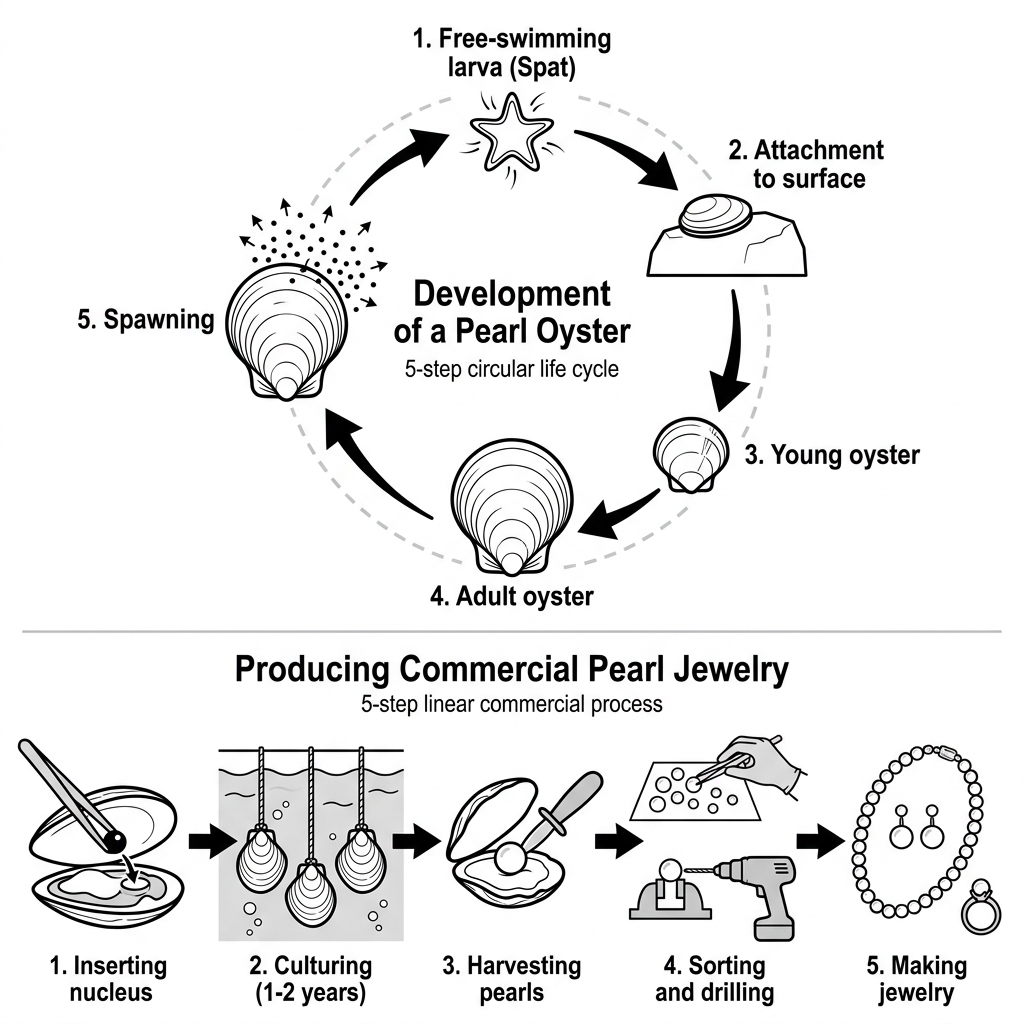
Example Answer:
The diagrams illustrate two related processes: the natural development of a pearl oyster across five stages, and the commercial process by which farmed oysters are used to produce pearl jewelry.
In broad terms, oyster development is a five-step circular life cycle ending in a new round of spawning, while pearl jewelry production is a linear five-stage process that begins with farmed oysters and ends with finished pieces.
The development of a pearl oyster begins with a free-swimming larva, or spat. The spat attaches itself to a hard underwater surface in step 2. Over time, it develops into a young oyster in step 3 and grows into an adult oyster in step 4. The adult spawns in step 5, releasing new larvae that begin the cycle again.
Commercial pearl jewelry production runs in five stages. A worker first inserts a small nucleus into an opened oyster. The seeded oysters are suspended on lines and cultured in seawater for one to two years. The pearls are then harvested, sorted, and drilled, and finally assembled into finished necklaces, earrings, and rings.
Question 16
Prompt: The pie chart below shows the distribution of online retail sales by product category in a European country in 2021. The table illustrates the percentage change in sales volume for each category in 2022 compared to 2021.
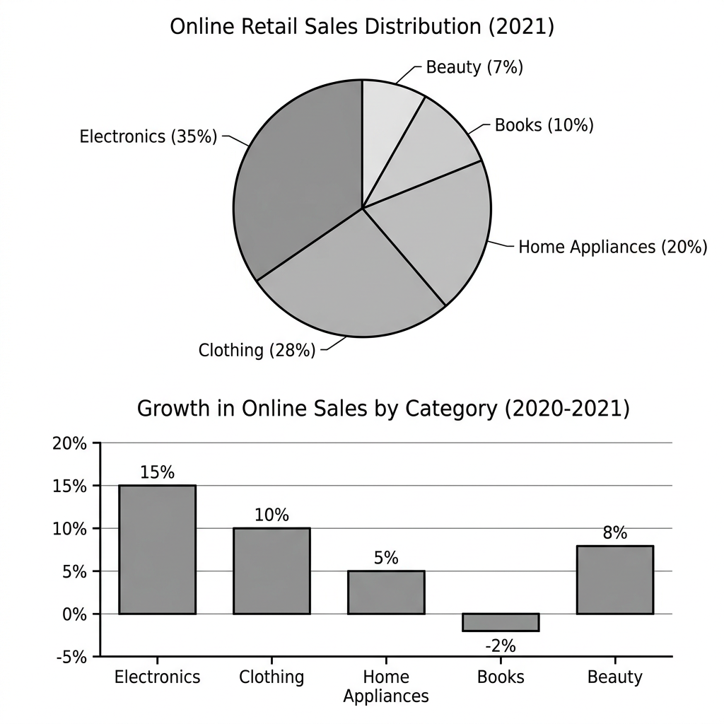
Example Answer:
The pie chart shows the distribution of online retail sales by product category in 2021, while the bar chart shows the percentage growth in online sales by category between 2020 and 2021.
Overall, electronics dominated both visuals, accounting for the largest share of sales in 2021 and the fastest growth between 2020 and 2021. Books were the only category where online sales fell over the period.
Electronics made up the largest share of online retail sales in 2021 at 35%, followed by clothing at 28% and home appliances at 20%. The two smallest categories were books at 10% and beauty at 7%. Electronics and clothing together accounted for 63% of sales, with the remaining three categories making up just over a third of the market.
Growth varied widely across the five categories between 2020 and 2021. Electronics led with a 15% rise, followed by clothing at 10% and beauty at 8%. Home appliances grew more modestly, at 5%, while books were the only category to record a decline, with online sales falling by 2%. Despite this, books still made up 10% of total online sales.
Question 17
Prompt: The chart and table below give information about the primary modes of transport used by commuters in a European city in 2010 and 2020, and the average commuting time for each mode in 2020.
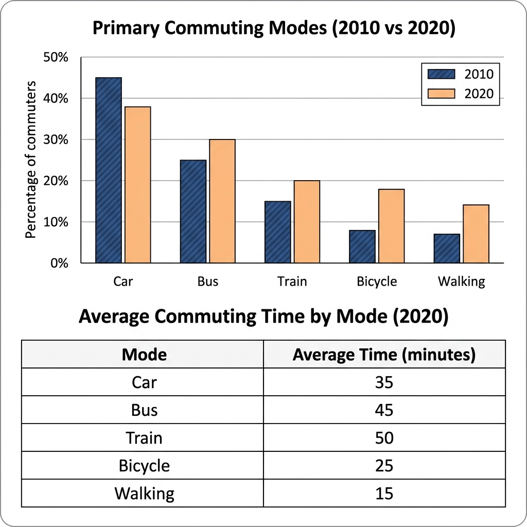
Example Answer:
The bar chart shows the percentage of commuters using five primary modes of transport in 2010 and 2020, while the table shows the average commuting time by mode in minutes for 2020.
Taken together, the data show a shift away from car commuting and toward public and active transport between 2010 and 2020, with the longest commuting times in 2020 recorded for the two modes that grew the fastest.
In 2010, car was the dominant mode at 45% of commuters, with bus second at 25%, train at 15%, and bicycle and walking at just 8% and 7% respectively. By 2020, the car share had fallen to 38%, while bus rose to 30% and train to 20%. Bicycle and walking more than doubled, reaching 18% and 14% by 2020.
The table shows that train was the longest commute mode in 2020 at 50 minutes, narrowly ahead of bus at 45 minutes and noticeably longer than car at 35 minutes. Walking and bicycle had the shortest times at 15 and 25 minutes respectively, suggesting that they were used mostly for shorter distances.
Question 18
Prompt: The chart below shows the number of households in three regions of a country in 1990 and 2010, with projections for 2030. The table shows the percentage of different household sizes in these three regions in 2010.
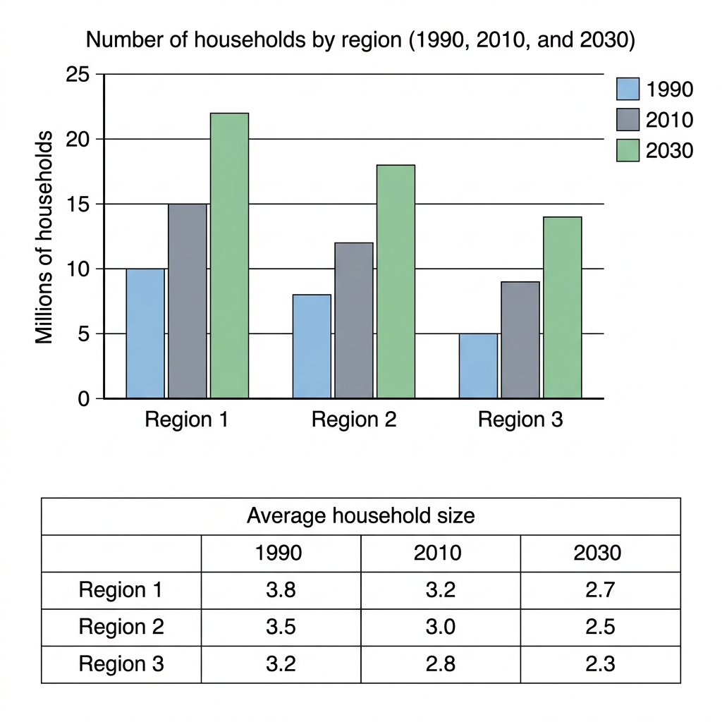
Example Answer:
The bar chart shows the number of households in three regions in 1990, 2010, and 2030, while the table shows the average household size for each region in those years.
Looking at the two visuals as a whole, the number of households is projected to rise sharply in all three regions, while the average household size is projected to fall in every region over the same period.
Region 1 had the largest number of households in every year, beginning at 10 million in 1990 and rising to 15 million by 2010, with a projection of 22 million by 2030. Region 2 followed the same path, growing from 8 to 12 to 18 million. Region 3 was the smallest, climbing from 5 to a projected 14 million by 2030.
The table shows a contrasting trend in household size. Region 1 had the largest average size in every year, falling from 3.8 in 1990 to 3.2 in 2010 and a projected 2.7 by 2030. Region 2's average declined similarly from 3.5 to 2.5, while Region 3's average dropped from 3.2 to a projected 2.3.
Question 19
Prompt: The bar chart below shows the number of international students enrolled in universities in four different countries in 2010 and 2020. The pie chart illustrates the primary sources of funding for these students in 2020.
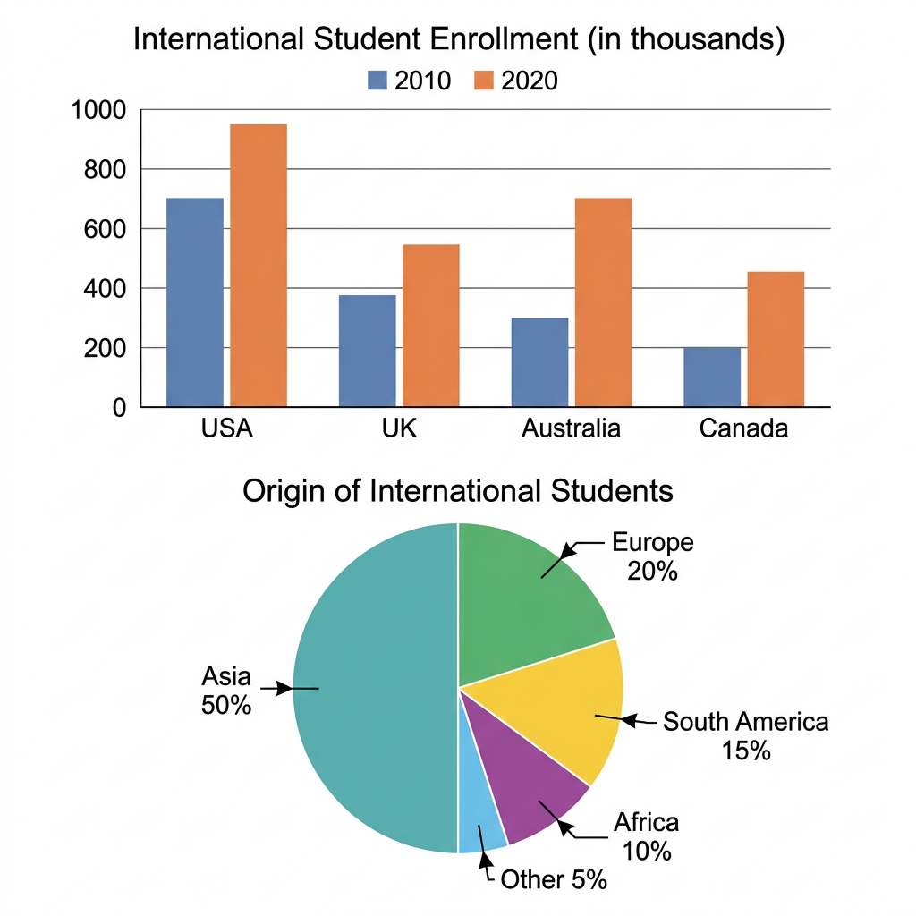
Example Answer:
The bar chart shows the number of international students enrolled at universities in four countries in 2010 and 2020, while the pie chart shows the regional origin of international students in 2020.
Broadly speaking, international student enrolment rose in every country between 2010 and 2020, with the USA recording the highest absolute numbers throughout, and Asia was the dominant source region in 2020.
The USA hosted the largest number of international students in both years, rising from around 700,000 in 2010 to 950,000 in 2020. Australia recorded the fastest growth of the four countries, more than doubling from 300,000 to 700,000 students. The UK rose from 380,000 to 550,000, while Canada more than doubled from 200,000 to 450,000, the smallest absolute figure throughout.
The pie chart shows that Asia was by far the largest source of international students in 2020, accounting for exactly half of all enrolments. Europe was the second largest source at 20%, followed by South America at 15% and Africa at 10%. The remaining 5% came from other regions. The Asian share alone was larger than all the other regions combined.
Question 20
Prompt: The line graph below shows the number of domestic and international tourists visiting a European city from 2010 to 2020. The table illustrates the average length of stay for different age groups in the years 2010 and 2020.
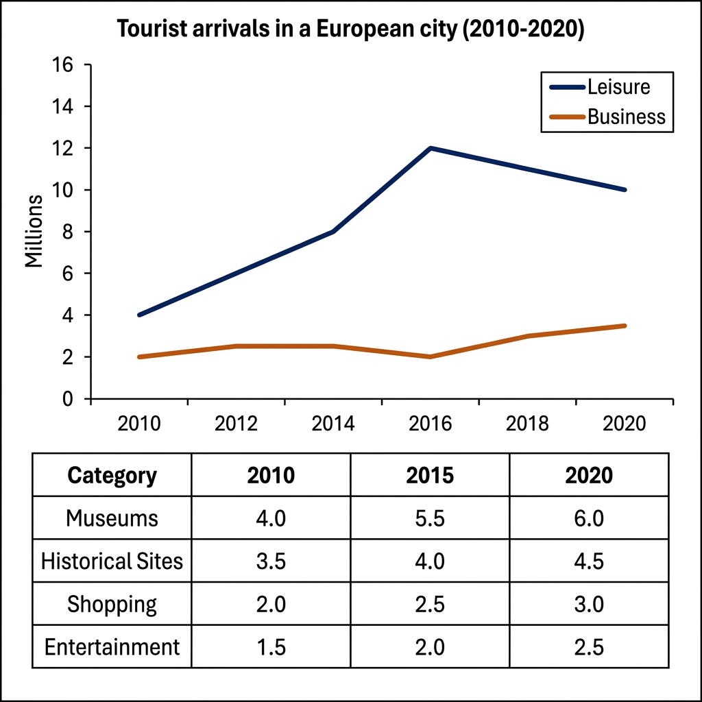
Example Answer:
The line graph shows the number of leisure and business tourists visiting a European city between 2010 and 2020, while the table shows tourist participation in four activity categories in 2010, 2015, and 2020.
On the whole, leisure tourism grew far more rapidly than business tourism, peaking in 2016 before easing back. All four activity categories grew steadily, with museums consistently the most popular.
Leisure tourist arrivals rose sharply from 4 million in 2010 to a peak of 12 million in 2016, before falling back to 10 million by 2020. Business tourism remained smaller, at 2 to 2.5 million between 2010 and 2016 before rising to 3.5 million by 2020. Leisure tourists outnumbered business tourists by two to four times.
The table shows steady growth across all four activity categories. Museums attracted the largest numbers, rising from 4.0 million visitors in 2010 to 5.5 million in 2015 and 6.0 million in 2020. Historical sites came second, growing from 3.5 to 4.5 million. Shopping rose from 2.0 to 3.0 million, while entertainment, the smallest category, grew from 1.5 to 2.5 million.
Question 21
Prompt: The table and charts below give information on the collection size of a university library in 2015 and 2022, and how students utilized the library services in those two years.
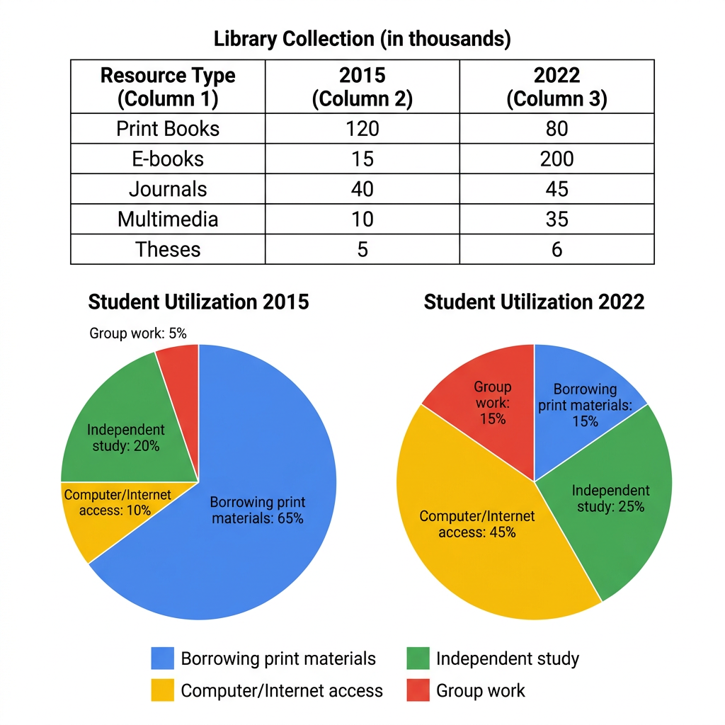
Example Answer:
The table shows the size of a university library's collection in five resource types in 2015 and 2022, while the pie charts show how students used the library in each of those two years.
Across both visuals, the library has shifted away from physical resources towards digital ones between 2015 and 2022, with the collection mix changing in parallel with the way students actually used the library.
Print books fell sharply from 120,000 to 80,000 between 2015 and 2022, while e-books grew more than thirteenfold from 15,000 to 200,000 to become the largest category. Multimedia rose from 10,000 to 35,000, journals edged up from 40,000 to 45,000, and theses increased only marginally from 5,000 to 6,000.
Student utilization shifted in line with the collection. In 2015, 65% of students used the library for borrowing print materials, with independent study at 20%, computer or internet access at 10%, and group work at 5%. By 2022, computer and internet use had risen to 45% to become the largest activity, while borrowing print fell to 15%. Independent study and group work grew to 25% and 15% respectively.
Question 22
Prompt: The pie chart below shows the distribution of global wealth across different regions in 2021. The bar chart shows the percentage of the population living in urban areas in those same regions.
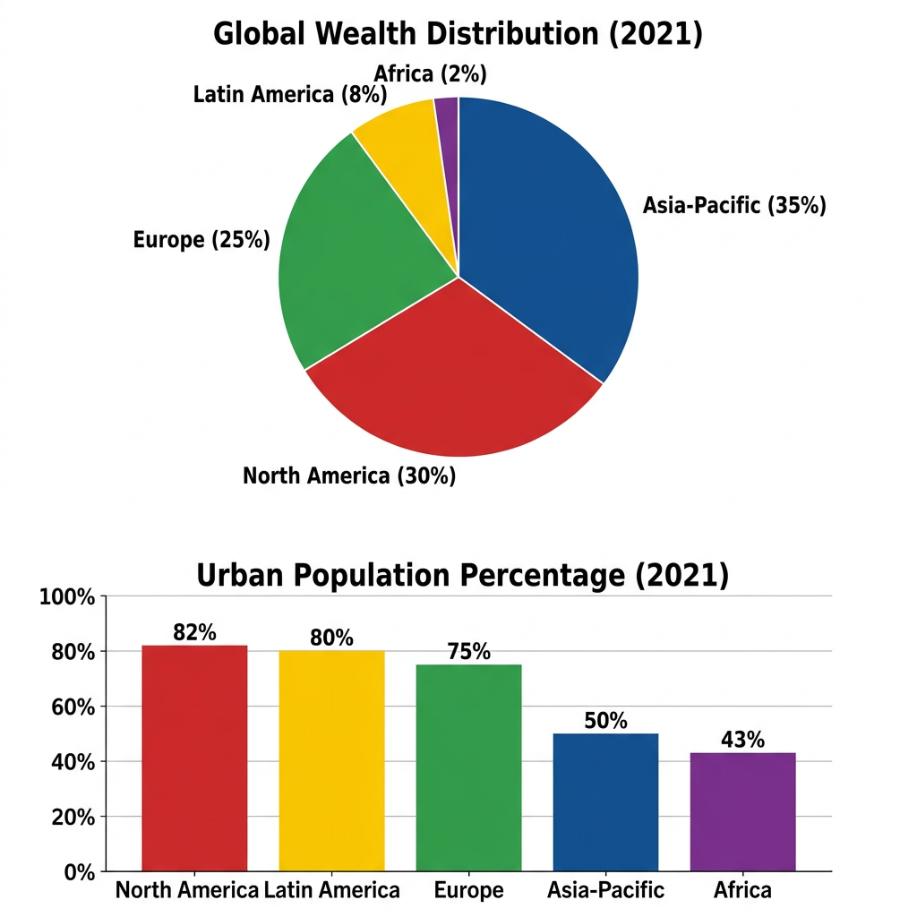
Example Answer:
The pie chart shows the distribution of global wealth across five world regions in 2021, while the bar chart shows the urban population percentage in those same five regions in the same year.
The two diagrams show that global wealth was concentrated in Asia-Pacific and North America in 2021, while the highest urbanisation rates were recorded in the Americas and Europe, with Africa and Asia-Pacific lagging well behind.
Asia-Pacific held the largest share of global wealth in 2021 at 35%, followed by North America at 30% and Europe at 25%. Latin America accounted for a much smaller 8% of global wealth, while Africa held just 2%. The three wealthiest regions, Asia-Pacific, North America, and Europe, therefore held 90% of all global wealth between them.
Urbanisation ranked the regions differently. North America had the highest urban population share at 82%, narrowly ahead of Latin America at 80% and Europe at 75%. Despite holding the largest share of global wealth, Asia-Pacific was only half urbanised, at 50%. Africa had the lowest urban share at 43%. The urbanisation ranking therefore did not match the wealth ranking.
Question 23
Prompt: The pie chart below shows the primary sources of fresh water in the region of Southland in 2022. The table illustrates the water consumption by various sectors in the region in the years 2012 and 2022.
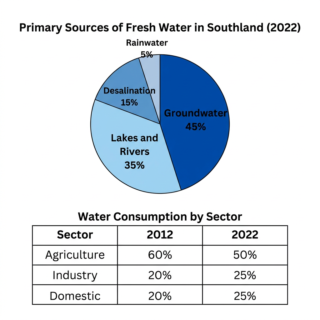
Example Answer:
The pie chart shows the primary sources of fresh water in the region of Southland in 2022, while the table shows water consumption by three sectors in 2012 and 2022.
In broad terms, groundwater was the dominant source of fresh water in Southland in 2022, while agriculture remained the largest consumer in both years, although its share fell over the period as industry and domestic use rose.
Groundwater was by far the largest source of fresh water in Southland in 2022, supplying 45% of the regional total. Lakes and rivers were the second largest source at 35%, followed by desalination at 15%, while rainwater contributed the smallest share, at just 5%. Groundwater and lakes and rivers together supplied 80% of the region's fresh water.
Water consumption shifted between sectors over the decade. In 2012, agriculture accounted for 60% of all water use, with industry and domestic use sharing the remaining 40% equally at 20% each. By 2022, agriculture's share had fallen to 50%, while industry and domestic use had both risen to 25%. The overall pattern shows a rebalancing away from agriculture.
Question 24
Prompt: The pie chart below shows the global distribution of water usage by sector in 2020. The bar chart shows the average cost of water per cubic meter in five countries during the same year.
Example Answer:
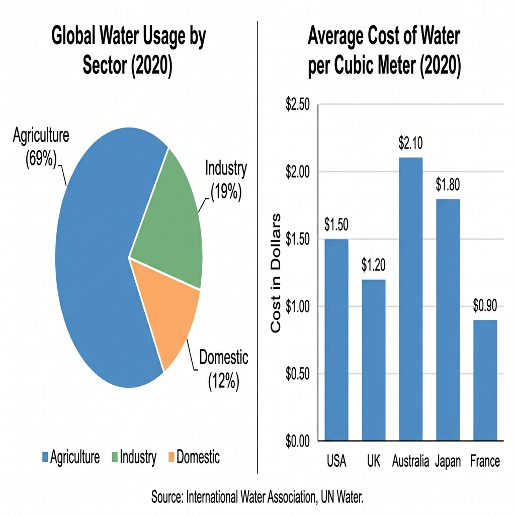
The pie chart shows the global distribution of water usage by sector in 2020, while the bar chart shows the average cost of water per cubic meter in five countries that year.
Taken together, the two visuals show that agriculture dominated global water usage in 2020, while the cost of water varied widely across the five countries, with Australia paying more than twice the price seen in France.
Agriculture was by far the largest consumer of water in 2020, at 69% of all global use. Industry was a distant second at 19%, with domestic use the smallest at 12%. Agriculture's share was more than three times that of industry and almost six times that of domestic use, indicating a heavy concentration in farming.
The bar chart shows wide variation in the cost of water across the five countries. Australia had the highest price at $2.10 per cubic meter, followed by Japan at $1.80. The USA and the UK sat in the middle, at $1.50 and $1.20. France had the cheapest water at $0.90, less than half the Australian figure and 60% of the USA price.
Question 25
Prompt: The chart below shows the percentage of residents living in different types of housing in a Canadian city in three different years. The table shows the proportion of households of various sizes in the same city in 2020.
Example Answer:
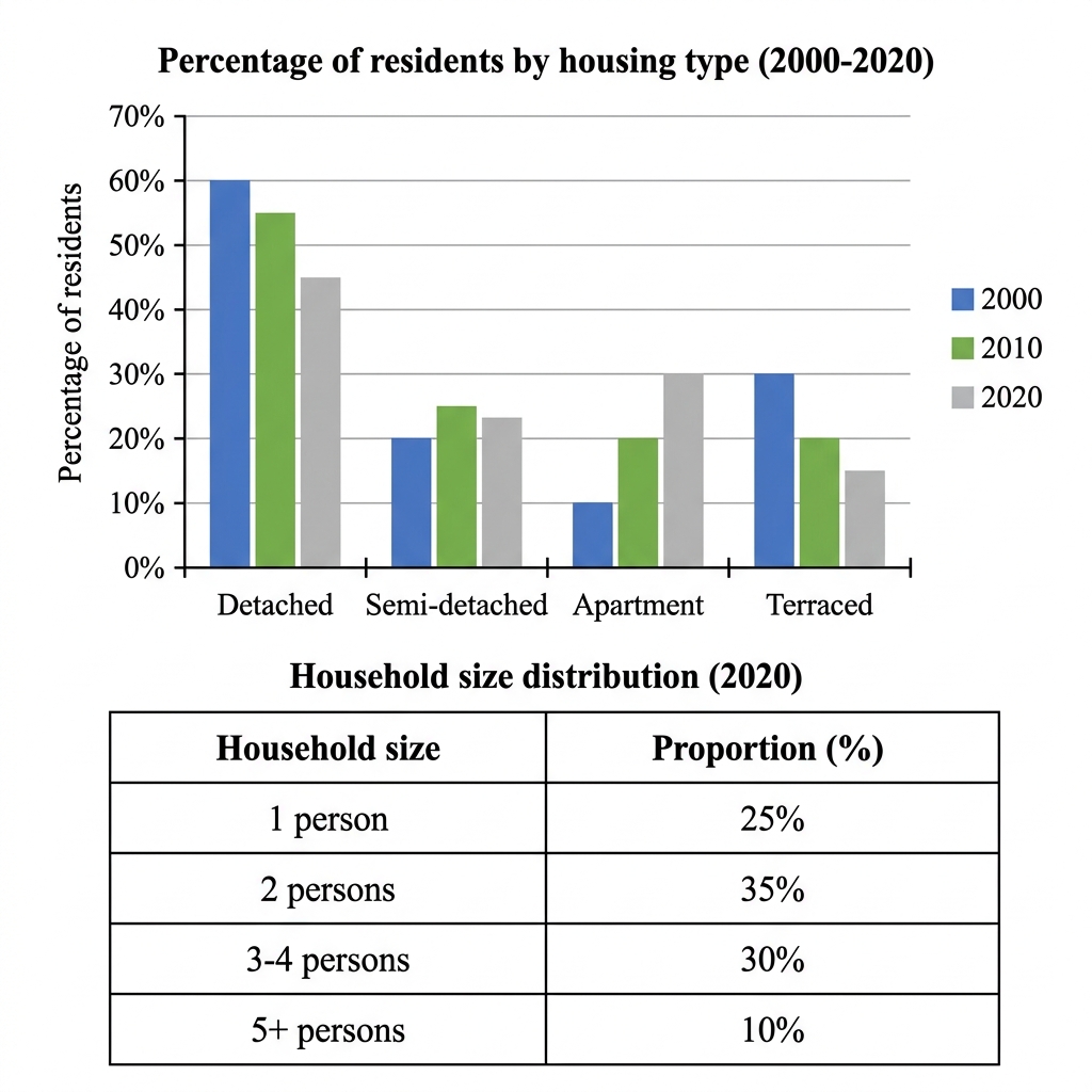
The bar chart shows the percentage of residents living in four types of housing in 2000, 2010, and 2020, while the table shows the proportion of households of different sizes in 2020.
Looking at the two visuals as a whole, the country has shifted away from detached and terraced housing toward apartments and semi-detached homes, alongside a household structure now dominated by smaller households of one or two people.
Detached houses remained the most common housing type throughout, but their share fell steadily from 60% in 2000 to 55% in 2010 and 45% in 2020. Apartments rose sharply from just 10% to 20% to 30% over the same period, while semi-detached houses grew modestly from 20% to 23%. Terraced houses halved from 30% in 2000 to 15% in 2020.
The table shows that two-person households were the most common in 2020 at 35%, with three to four-person households second at 30%. One-person households accounted for 25%, while only 10% of households had five or more members. Smaller households of one or two people therefore made up 60% of the total, pulling demographics toward apartment living.
Question 26
Prompt: The line graph and pie chart below give information about the population distribution in a South American country between 1980 and 2020, and the employment sectors of its urban residents in 2020.
Example Answer:
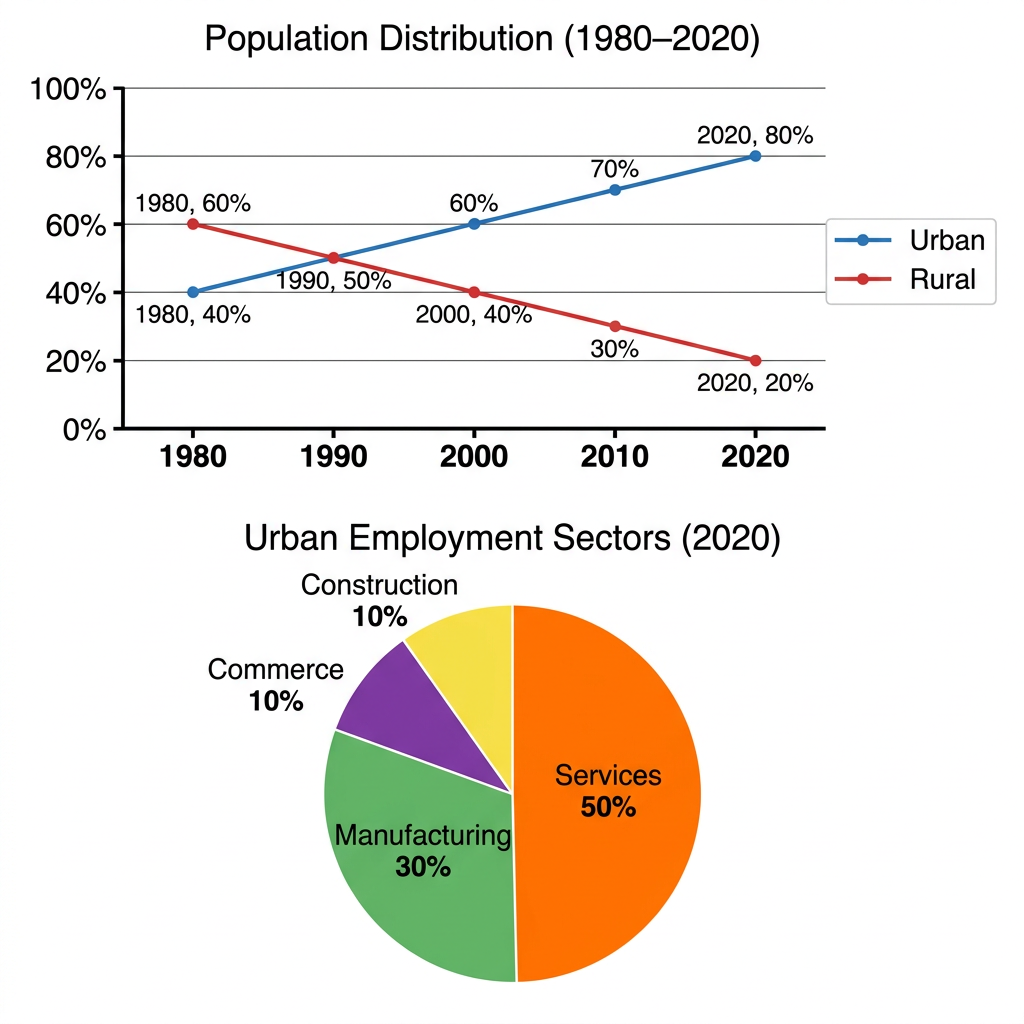
The line graph shows the percentage of urban and rural population in a South American country between 1980 and 2020, while the pie chart shows the distribution of employment across four sectors for urban residents in 2020.
Across both visuals, the country urbanised steadily over four decades, with the urban share doubling between 1980 and 2020, and the urban workforce concentrated in services and manufacturing.
In 1980, only 40% of the country's population was urban, with the remaining 60% living in rural areas. The two figures crossed at 50% in 1990, after which the urban share climbed to 60% in 2000, 70% in 2010, and 80% by 2020. Rural population fell to 20% by 2020, mirroring the urban gain.
The pie chart shows that services employed the largest share of urban workers in 2020, at 50% of the total. Manufacturing came second at 30%, followed by commerce and construction, each at 10%. Services and manufacturing together accounted for 80% of urban employment, indicating a workforce dominated by office work and factory production, with relatively little commerce or building.
Question 27
Prompt: The graph and table below give information about international student enrollments at universities in Canada between 2005 and 2020.
Example Answer:
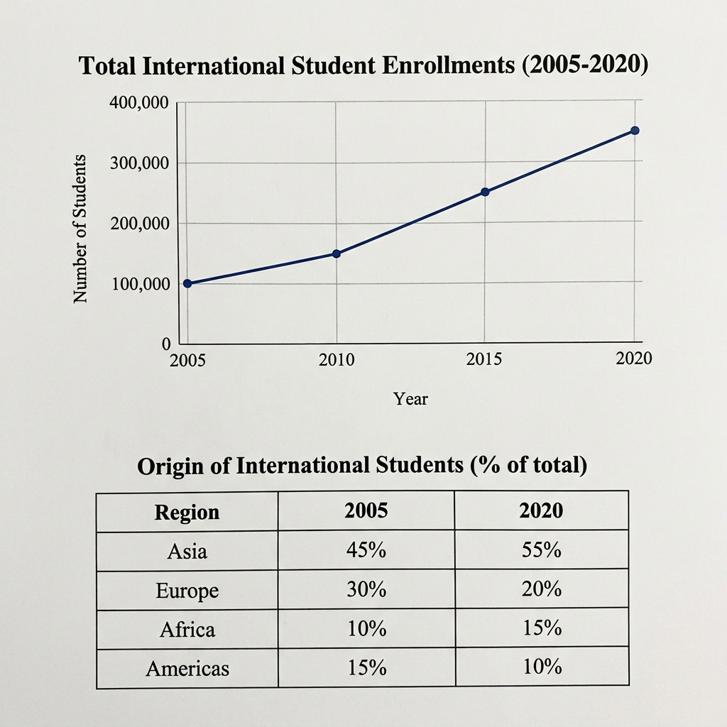
The line graph shows the total number of international students enrolled at universities in a country between 2005 and 2020, while the table shows the regional origin of those students in 2005 and 2020.
Overall, total international student enrolment more than tripled between 2005 and 2020, while the origin mix shifted markedly toward Asia and Africa and away from Europe and the Americas.
International enrolment stood at around 100,000 students in 2005 and rose modestly to 150,000 by 2010. Growth then accelerated, with the figure climbing to 250,000 by 2015 and 350,000 by 2020. The total therefore grew by about 250,000 students, with most of that growth concentrated in the second half of the period.
The table shows a significant rebalancing of where these students came from. Asia was the leading source in 2005 at 45% of all international students, and its share grew further to 55% by 2020. Africa also rose, from 10% to 15%. Europe fell sharply from 30% to 20%, while the Americas dropped from 15% to just 10%. The Asian and African shares together rose from 55% to 70%.
Question 28
Prompt: The graph below shows the amount of energy consumed by a university campus from three different sources between 2012 and 2022. The table illustrates the proportion of the total energy budget spent on each source in the year 2022.
Example Answer:
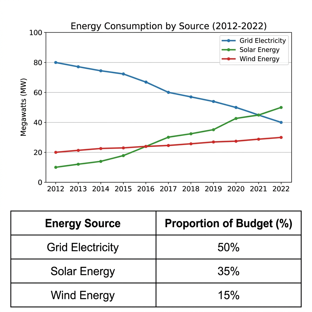
The line graph shows the energy consumed by a university campus from three sources between 2012 and 2022, while the table shows the proportion of the budget allocated to each source.
Broadly speaking, the university shifted from grid electricity toward solar and wind energy over the decade, and the 2022 budget reflects this shift, with grid electricity still the largest item but renewables now accounting for half of the budget.
Grid electricity was by far the largest source in 2012, at around 80 megawatts. Its consumption fell steadily, dropping to 60 MW by 2017 and 40 MW by 2022, a fifty percent reduction. Solar energy followed the opposite path, climbing from 10 MW in 2012 to 50 MW in 2022. Wind energy grew more modestly, from 20 MW to 30 MW.
The table shows the 2022 budget allocation across the three sources. Despite its falling consumption, grid electricity still received the largest share at 50% of the budget. Solar energy received 35%, while wind energy received the smallest share at 15%. Solar and wind together therefore made up 50%, exactly matching the grid electricity share.
Question 29
Prompt: The chart and table below give information about vehicle ownership figures in Italy from 1990 to 2030.
Example Answer:
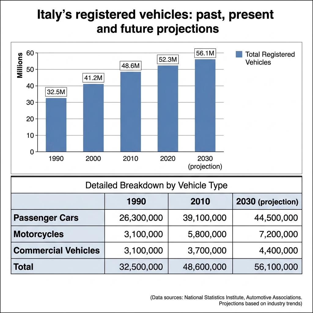
The bar chart shows the total number of registered vehicles in Italy in 1990, 2000, 2010, and 2020, with a projection for 2030, while the table breaks the totals down by vehicle type for 1990, 2010, and 2030.
On the whole, vehicle ownership in Italy has grown steadily over four decades and is projected to keep rising to 2030, with passenger cars accounting for the largest absolute increase but motorcycles showing the fastest proportional growth.
Italy's registered vehicles totalled 32.5 million in 1990 and grew steadily, reaching 41.2 million by 2000 and 48.6 million by 2010. Growth then slowed, with the figure rising to 52.3 million in 2020 and a projected 56.1 million by 2030. The total grew by around 24 million over four decades.
The table shows that passenger cars dominated throughout. They rose from 26.3 million in 1990 to 39.1 million in 2010 and a projected 44.5 million by 2030, around 80% of the total. Motorcycles grew the fastest in relative terms, more than doubling from 3.1 to 7.2 million. Commercial vehicles edged up from 3.1 to a projected 4.4 million.
Question 30
Prompt: The bar chart below shows the percentage of first-year university students opting for different types of accommodation in 2010 and 2020. The table illustrates the average weekly cost of these accommodation types for the same two years.
Example Answer:
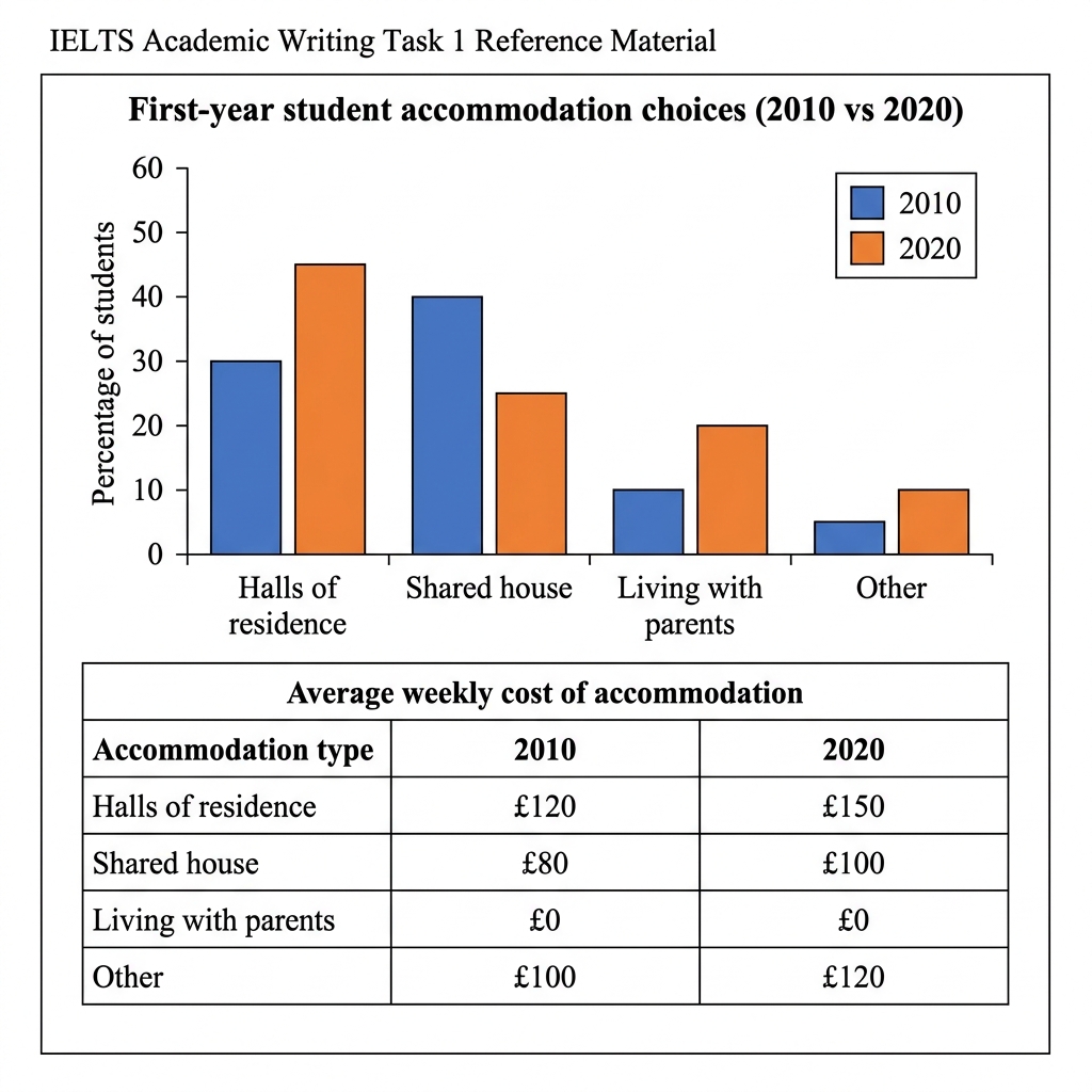
The bar chart shows the percentage of first-year university students living in four types of accommodation in 2010 and 2020, while the table shows the average weekly cost of each type in the same two years.
Across both visuals, first-year students have moved away from shared houses toward halls of residence and parental homes between 2010 and 2020, with the cost of every paid accommodation type rising over the period.
Halls of residence were chosen by 30% of first-years in 2010 and rose to 45% in 2020, becoming the most popular choice. Shared houses, which led in 2010 at 40%, fell to 25% by 2020. Living with parents doubled from 10% to 20%, while the other category also doubled from 5% to 10%.
The table shows that the cost of accommodation rose for every paid option between 2010 and 2020. Halls of residence climbed from £120 to £150 per week, the highest figure throughout, while shared houses rose from £80 to £100. The other category increased from £100 to £120. Living with parents remained the only free option in both years.